|
CHART DATA COMPILED FROM SEPTEMBER 9-SEPTEMBER 13, 2002 A SPECIAL REPORT BY ALAN M. NEWMAN, EDITOR LONGBOAT GLOBAL ADVISORS CROSSCURRENTS |
| We were lucky
to be able to publish our last update at the almost the precise moment
that we believed the Bears were about to suffer a "time out." Please
be advised that we do not plan our updates accordingly and typically do
not practice short term timing on this website feature, which is primarily
an overview of the long term potential for stocks. As you will see
from the pictures presented today, the long term environment for investors
is still precarious if not outright calamitous, but has at least improved
for the intermediate term on one count. Certainly, what
can
be said in favor of stocks is that they sell for far lower prices today
than they did two years ago.
Meanwhile, the subsequent move from the July 24th print low to the August 22nd print high measured 20.5% and sent bull flutters through the talking heads and all those who have had enough of the bear market. But bear markets have never turned into bull markets simply because investors wanted them to end. The current bear market should play out as a very long term affair, to unwind the excesses created during the mania that still appears to be in progress. Indeed, history has shown that bear markets do not end until most investors believe they will never end, far from the attitude displayed by most professionals. Today's gallery of "pictures" presents more evidence of the mania that was and the mania that still is. But if the mania is still ongoing after all that has transpired, when in heaven's name will it end? And when will the environment for stocks turn positive again for the long term? Hopefully, we have at least begun to answer those questions below.
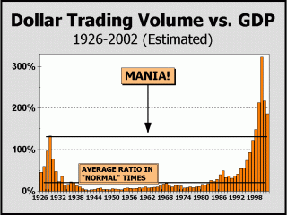
Dollar Trading Volume is our primary measurement of how involved the public and professionals are with stocks and is our best perspective for determining if a genuine mania is still in force. Despite the evidence of a continuing bear market, DTV refuses to languish and remains stuck at close to double the nation's Gross Domestic Product. For every dollar of goods or services produced by the economy, about $1.87 in transactional volume is generated by the trading of stocks. In the incredible hysteria of the Roaring Twenties, where stocks could be purchased for a 10% down payment and where even shoeshine boys played the game, transactional volume (at 133%) came nowhere near the peak of the current mania (at 322%). Some of our readers have asked why any comparison would be valid, since fixed commissions were far higher in 1929, their rationale being that discounted commissions have catalyzed the huge surge in trading. Our response is that no amount of trading can be justified by even zero commissions unless a speculator or investor can get the direction right! The huge expansion in DTV of the Roaring Twenties took place because of persistently higher prices. The huge expansion in DTV from 1995 to 2000 took place because of persistently higher prices. Only persistently higher prices can catalyze a mania. But once it is place, a mania cannot end until there is widespread recognition of a ongoing bear market and utter revulsion for stocks as an investment. Despite July's record
mutual fund outflows, this phase has not yet occurred.
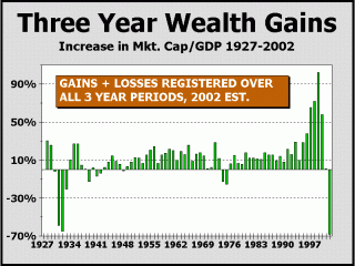
Incredibly, the three-year loss of wealth versus GDP at 68.2% is now actually worse than in the earlier mania, measured against 1930's reading of 58.7% and 1931's measure of 64.5%. Can it be that the same or similar fate will eventually befall the U.S. as the effects of the lost wealth continue to reverberate? Perhaps. We do not know. Incredibly, DTV is still higher than in any year but the prior three years. There appears to be a sustained hope that prices will recover. In fact, it is this sustained hope that enables DTV to continue to trade at manic levels. Unfortunately, the longer this hope remains unfulfilled, the greater the odds that stocks are facing a worse fate than that experienced to date. Participants, particularly professionals, still seem to be hanging on to the long term mantra for comfort. In the face of the compelling evidence we have presented on these pages, most investors do not want to believe the magic and the fun has concluded, thus they are still invested. The "velocity" of trading
is still well beyond any years except 1999-2001
The mania endures.
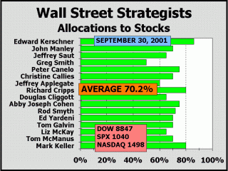
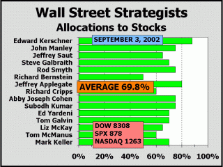
The sustenance of hope appears most vividly in the stock allocations of Wall Street's highly paid "strategists." We use the term "strategist" loosely since there has been no apparent variation of "strategy" utilized for several years other than buy, buy more and buy still more. As measured by Merrill Lynch's Richard Bernstein, allocations to stocks increased from about 61% at the 2000 peak to near 72% by the spring of 2001 and have only nominally pulled back to about 68%-69% in recent months. Bernstein's "model" generates buy signals at 50% and sell signals at 61.1%, so stock allocations by strategists have actually been on a sell signal since very early in 2000, concurrent with the actual peak in prices! Nearly a year ago, we showed strategist allocations to stocks and today we compare current allocations with then to illustrate just how constant is their sustenance of hope. More than a week beyond the 911 disaster and even after the Dow Industrials had collapsed by more than a thousand points in only a month, a Wall St. Journal tally of strategists showed they had brought allocations to stocks up to 70.2%. A year later, prices are substantially lower but hope remains quite robust, with allocations virtually the same as before at 69.8%. For the three major indexes after one year, the losses have ranged from 6.1% for the Dow to 15.6% for the S&P 500 to 15.7% for Nasdaq. Seems to us that any like minded individual would have suffered a loss of approximately 12%-15% on the 70% of assets allocated to stocks (perhaps more?) from a year ago. But if 70% of one's assets depreciate by 15%, the other 30% must appreciate by 35% just to get back to where one was to begin with! To equal the rate earned by 10-year T-bonds, the other 30% would have had to appreciate by 52%! Clearly, the constant high stock allocations by top "name" strategists has cost their customers dearly. We can only ask, when does the vendor of bad advice receive a just reward? Strategists are amongst the most highly paid individuals on Wall Street. Of course, this is not a blanket indictment. In particular, Doug Cligott and Richard Bernstein have all shown a great respect for the bear market. However, the consensus has clearly been overwhelmingly bullish and has remained bullish despite the near constancy of lower and still lower prices. The point was long ago reached at which we might wonder just what circumstance would turn strategists bearish. Given their staunch bullish outlook, we can only assume there are no circumstances to turn them bearish. It would appear that strategists have been afraid to turn bearish for many months and are certainly afraid to turn bearish now, now that the S&P 500 and Nasdaq have already fallen 50% and 76% respectively from their highs. Heaven forfend that a strategist turn bearish now and the market subsequently turns up; this would virtually guarantee the loss of the strategist's position. Thus, they have "stuck" themselves into perma-bull mode and now virtually guarantee that as long as they remain bullish, stocks will not be a great place to invest for the long term. Simply put, if all are buyers, who is left to buy? [see our perspective on this subject from a year ago]
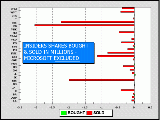
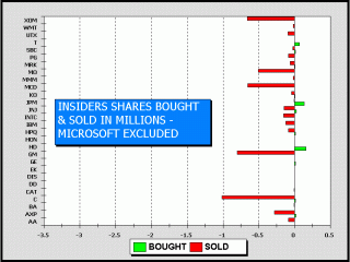
Fasten your seat belts, because we are about to present a picture that may have bullish implications for the intermediate term. In March, we covered the apparent revulsion insiders had for their own shares. Although the traditional perspective deals only with the number of individual buyers and sellers and the ratio derived from same, we believe it is far more informative to consider how many shares are actually purchased and sold. In our view, very small buys are not meaningful versus very large sales. Our first article on the subject was presented in Crosscurrents on February 18, 2002, showing a grand total of 89,000 shares purchased versus a grand total of 33,989,000 shares sold for the 30 Dow Industrial issues, a ratio of 381.9 to 1. Below left illustrates the ratio excluding the sales at Microsoft, which would have taken the chart clear off the page and a couple of feet to the left. We do not have that much room! For comparison's sake, we are eager to reveal that there were 6.13 sales for each buy and the average sale was 62.3 times the size of the average buy. Below right illustrates the current picture. Incidentally, "current" means all insider transaction of the prior six months. We have used the same scale so the relative size of all transactions in easily visible. At first glance, there is no mistaking the fact that total shares of insider sales are way, way down, the most bullish picture we have shown since our website first went up on January 15, 1999. However, we're not completely sure how meaningful this is since the total shares purchased seems pretty lukewarm at best. Also relatively bullish, the ratio of individual insider sales to buys has declined significantly to 2.56. As well, the grand totals are now 466,000 shares purchased versus 15,970,000 million sold, which takes that ratio down from 381.9 to 34.3. Sure looks like a significant improvement. The average sale fell from 62.3 times to 13.4 times the average buy. If only things were that easy. So, we're stuck trying to figure out whether insiders are now bulls or are they just less bearish? If they are turning bullish, at least their view would go hand-in-hand with ours in that the autumn is likely to afford a tradeable bottom, one that could conceivably foster six to nine months of at worst, modestly positive price action. Caution: an autumn bottom could come from much lower levels. Insiders are not clearly bullish, but are significantly less bearish than they have been. [see our earlier perspective]
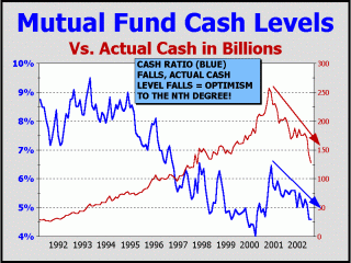
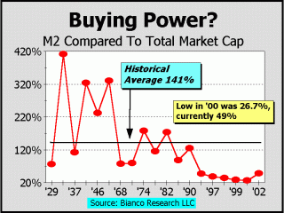
We showed the picture at bottom left in the September 9, 2002 issue of Crosscurrents and believe it may be the chart of the year. It has always been our contention that as more perspectives are visible, the better the picture that is formed. Our commentary read, "By measuring both the ratio of mutual fund cash to assets AND the actual level of cash on hand, we hope to portray a better perspective of institutional behavior. Clearly, there can be only four separate directions for the lines to traverse. The ratio of cash and actual cash can both be up. They can both be down. Or, they can move in opposite directions, one up and the other down. When both are up, the implication must be bullish, although it is no guarantee of immediate upside. However, with both the percentage of cash rising in portfolios and actual cash rising, a substantial reservoir of buying power is likely in the process of forming. When either the cash ratio OR the actual level of cash rises, we are typically witnessing at worst, a shift to a more conservative attitude by institutions OR the likely establishment of a reservoir of potential buying power. Our chart actually goes back to 1984 but we have not shown the earlier years since absolute cash levels are so much lower it is difficult to make out any hills and valleys. Nevertheless, until late in 2000, we could not find what we see now, both the percentage of cash assets and actual cash levels falling and falling rapidly at that for such a protracted period of time! Actual cash levels topped at $256.7 billion at the end of October 2000. The cash assets ratio topped a month later at 6.5%. Since then, actual cash levels have been more than cut in half to $127.4 billion and the cash assets ratio is nearly as low as anytime in the last 32 years at 4.6%." Can there be any doubt that the mania endures? Low relative levels of cash assets. Low absolute levels of cash. These are very bearish developments! The chart below right is courtesy of Bianco Research (www.biancoresearch.com) and the superb research team headed by Jim Bianco. The influence of the mania for stocks is vividly portrayed here. Where did M2 go? To buy stocks. We note with alarm that even the current bounce back from the all-time lows leaves M2 versus market cap below every reading from the beginning of the mania all the way back to 1929. If the secular bear market continues to unwind, this indicator should rise substantially as it has before at the end of two prior secular bull markets. Stocks as a percentage of household net worth bottomed in 1953 at under 20% and ran to nearly 47% in 1968. This secular bull market, in which money ran a poor second place to stocks, is plainly visible on our chart (see drop in ?M2 relative to stocks). The subsequent secular bear market ran to 1982, and stocks as a percentage of household net worth ran back down to 21%, also visible on our chart as M2 surged vis-a-vis stocks. From 1982, stocks as a percentage of household net worth surged to 55%, a new record by a wide margin. This phase is also quite visible on our chart, resulting in the lowest readings ever for M2 vs. stocks. We expect that stocks as a percentage of
household net worth
If we are correct, M2 must climb versus market cap. A conservative view might only place M2 at 125% of total stock market cap at the conclusion of the current secular bear market. We must stress that this is simply hypothesis and is not based on any facts other than those illustrated in our picture and our commentary. If we assume the process takes five years to 2007 and M2 expands by a robust 10% per year, total market cap would have to fall by another 37% for M2 to equal 125% of total capitalization. Positing a return to the historical average of 141% a decade out and M2 growth of 10% annually would still result in nearly a 10% loss for market cap by 2012.
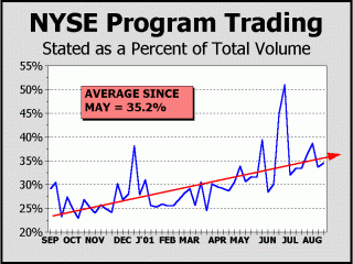
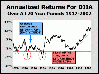
We commented on this subject extensively after the Crash of '87 and program trading has been a subject of continued interest since. At some point, we intend to take this chart further back in time to prove our contention that program trading was at much lower levels just a couple of years ago, about 15% of total New York Stock Exchange volume. Over the last year, programs have expanded significantly and are now averaging more than 35% of daily volume. Although the programs do not represent index arbitrage to any significant degree, they are nevertheless, of sufficient size to move the markets rapidly. Given the proliferation of hedge funds, we should not be surprised. The latest tallies place 6000 hedge funds in operation, so many that there are now "funds of funds," funds that buy only the hedge funds they believe will be the most successful. By comparison, there are "only" 4799 stock mutual funds tallied by the Investment Company Institute! We cannot prove conclusively that programs have resulted in the recent huge expansion in volatility but the empirical evidence is sufficient to engender our fears. Programs proliferated in 1987 and coincidence or not, volatility soon expanded to the worst of all time. Is it happening again? As we commented in the August 26th issue of Crosscurrents, " In the span of only one month, the 21 trading sessions between the close of July 10th and the close of August 8th, the Dow Jones Industrials traversed a total of 4419 points from each daily print high to each daily print low. In the interim, the Dow lost 101 points, starting not far at all from where it began the month long journey of gyrations. As it did, the Dow had traveled more than half its value, a circumstance this observer does not remember ever having seen before in 37 years. In one six day period, the closing value of the Dow first fell 693 points (7.9%) in three days and then rose 668 points (8.3%) in the next three days. Although the Dow's percentage gain was more than its percentage loss, it nevertheless ended 24 points lower than when the six day zig zag began to unfold......The stock market is no longer a proper place for investors......Why is this so anathema for investors? One simple reason is that programs can move prices very rapidly and this effect makes the concept of "current price" undependable......We are astounded that the exchange has allowed programs to proliferate to this extent. Where does it end? 50% of total trading volume? In our view, the expansion of programs is further proof of the public be damned attitude." We have not shown the 20-year annualized return since April. No that much seems to have changed but fresh perspectives are always interesting. The ex-dividend view is meaningful, since dividends are still invisible relative to the past. History shows half the returns from stocks have come from dividends, which have averaged 4.6% over time. Dividends currently amount to 1.77% for the S&P 500. As seen below, the average return for all 20-year periods has been 4.72%, dating back to 1917. However, when we remove the influence of the mania, which we measure from the beginning of 1995, returns fall to 4.02%! But for the purpose of this exercise, we'll stick with the "complete" history of 1917-2002. Given that returns have traded below the annualized average more than half the time (53.6% of the time, to be precise), it is certainly fair to expect they will trade back to at least the average at some point, particularly if we are in a secular bear market. Of course, annualized returns can fall even if prices rise just slightly over a very long period of time. Or, prices need not decline dramatically. Let's just assume prices move sideways from the Dow 8427 close of September 6, 2002. In this circumstance, the historical average return of 4.72% would finally be achieved on April 24, 2012! If instead, we look for prices to eventually return to the same point at which Fed Chairman Alan Greenspan posed the question of "irrational exuberance" (Dow 6437 - December 6, 1996), the historical average return would not be achieved until July 13, 2007! Incidentally, from the market technician's point of view, a break of the trendline on this chart will be quite significant. That break could be only a few weeks away. While we certainly cannot rule out a trip or two back to Dow 10,000 in the next decade, we would be more inclined to look for far lower prices and a long period of underperformance by stocks.
We can only conclude that the mania has not yet ended. Transactional volume is still extremely strong. Strategists never turned bearish and are still very bullish. Insiders are still selling 34 times as much stock as they are buying. Mutual fund managers appear to be as bullish as anytime in the last five years. Incredibly, all of the above have occurred
Ignorance of the environment has already played a huge role in the decision making process of strategists. They hear and see only what they wish to. Until they recognize their own blind hopes, the mania will endure. At least investors have begun to act. The June and July outflows of $18 billion and $52 billion from mutual funds are evidence that eyes are slowly opening. But as we showed in the September 9th issue of Crosscurrents, these outflows are not yet very significant. When outflows appear for month after month, when the ratio of mutual fund cash to assets surges to levels consistent with a major market bottom, when strategists turn bearish on stocks, only then will the mania be over. Only then will stocks represent a decent bet for the long term. Incredibly, the mania for stocks endures.....
Certain of the charts and analyses presented here are shown in our newsletter weeks and months in advance of their appearance on this site. If you haven't already, we urge you to take advantage of our FREE 3-issue trial (see link below). We have now hit all our targets for 2000, 2001 and 2002. We invite you to check out the archives, check out our other features and check out our performance records (links are on our index page). Our downside targets
(offered at 2 in 3 odds) for 2002 have been achieved.
The low prints of Dow
7532 / SPX 775 / Nasdaq Composite 1192
Better support should
be expected at:
The odds for a downside
break below "better support" are probably 10%-20%,
Our best case scenario
for the remainder of 2002 has been adjusted to:
Alan M. Newman, September 14, 2002
All information on this website is prepared from data obtained from sources believed reliable, but not guaranteed by us, and is not considered to be all inclusive. Any stocks, sectors or indexes mentioned on this page are not to be construed as buy, sell, hold or short recommendations. This report is for informational and entertainment purposes only. Longboat Global Advisors, Alan M. Newman and or a member of Mr. Newmans family may be long or short the securities or related options or other derivative securities mentioned in this report. Our perspectives are subject to change without notice. We assume no responsibility or liability for the information contained in this report. No investment or trading advice whatsoever is implied by our commentary, coverage or charts. |