HOME | SUBSCRIBER SECTION | CHART OF THE MONTH | TECH OUTLOOK | COMMENTARY | LINKS | | ARCHIVES
|
- THE GREATEST STOCK MARKET MANIA OF ALL TIME - DATED JULY 25, 2016 A SPECIAL REPORT BY ALAN M. NEWMAN, EDITOR CROSSCURRENTS This free feature is now updated only three or four times each year. Our next update will probably be published sometime durting the month of November 2016 |
|
since we first published this website on January 15, 1999. Our readership spans 185 countries.
Our paid
subscription stock market newsletter has only two rationales for its existence;
Please check out the testimonials on our Kudos page. Printable
files of this report accompanied by our forecast are available only to
paid subscribers.
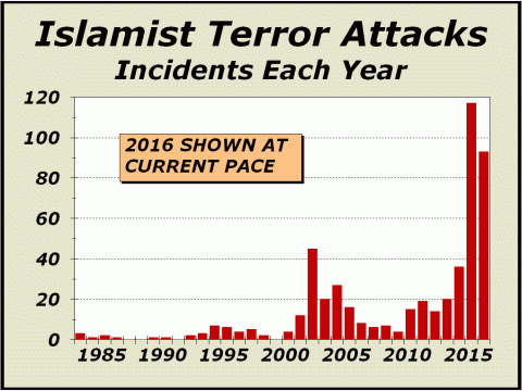
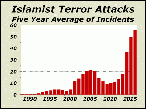
and are chosen for their timeliness and relevance. Dark Legacy REPRINTED FROM THE APRIL 30th ISSUE OF CROSSCURRENTS When the World Trade Center was brought down in September 2001 with the loss of 2977 innocent lives, we were convinced the world had changed. We claimed the birth of a super bull market for gold, whereby the growing possibility of terror attacks on the worlds citizenry and perhaps eventually the financial markets, would likely require a resurgence of the safest and most immutable currency ever known to mankind. While we have not seen a new high for gold since August 2011, gold is still up 364% since 911 compared to only 85% for the Dow Industrials. The dark legacy of terror we feared has thus far been confined to the incidence of terror attacks on the worlds citizenry, still accelerating at an alarming pace. Our first chart below illustrates a dramatic escalation in just the last two years. There were 117 separate incidents of terror in 2015 and 30 in just the first four months of 2016. At the current pace, there will be 90 attacks for the full year. In a word, harrowing. There were only three attacks in April. The first on April 20th targeted a security team responsible for protecting government VIPs in Kabul, Afghanistan. The attack killed 64 people and wounded 347 and was the Taliban's biggest attack on an urban area since 2001. Three days later, attackers hacked a university professor to death in the city of Rajshahi, Bangladesh. ISIS claimed responsibility for the attack stating he was assassinated "for calling to atheism." Two days later, two gay rights activists were hacked to death in the capital of Bangladesh, Dhaka. An Al-Qaeda affiliated group claimed responsibility for the attack and stated the two were killed for practicing and promoting homosexuality in Bangladesh. Shockingly, by recent standards, April was a quiet month.
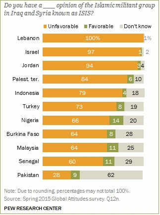
A recent Pew poll showing much disdain for ISIS from nations with significant Muslim populations seems encouraging at first glance but when one looks just a bit more deeply, the perspective completely changes. Below, this is perhaps the scariest chart on this page; despite the large percentage of unfavorable opinions of ISIS, we are quite concerned with the percentage of those with favorable opinions. While the chart indicates very few citizens in Lebanon, Jordan or Israel may have a favorable opinion of ISIS, wouldnt any number be too many?
In Senegal, there are as many
as 1.5 million who favor ISIS.
Now consider that Pakistan
is thought to have
The Pew poll illustrates between
We believe the threats of future
terrorist attacks
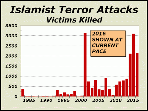
Frankly, the pictures are terrifying. The primary reason attacks have increased so substantially is that they have been effective in recruiting more terrorists. The objective seems simply to murder as many citizens as possible. In fact, the loss of life has been horrific. Immediately above, although the biggest bar includes the 911 terror event, a closer examination clearly implies the specter of a rising trend in the number of victims killed. Even more depressing, terrorism
is clearly not confined
There are more than 300
terrorist groups designated by
The list shown at http://bit.ly/1Kret0Y excludes groups that might be widely considered terrorist, but who are not officially designated as such. However, all one needs is to peruse this list to comprehend this rapidly growing phenomenon and how it may impact all of us in the years ahead, quite possibly reaching the worlds financial markets. Several years ago, in our traditional year end look at the year ahead, we assigned odds to terror attacks as a possibility for driving stock prices. While there is no science that can determine fair odds vis-à-vis terror attacks, stock prices were clearly impacted in 2001. Prices will be impacted significantly
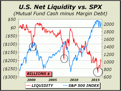
Repeat Performance REPRINTED FROM THE MAY 30th ISSUE OF CROSSCURRENTS We have been tightly focused on margin debt for quite awhile and given how our analysis aptly caught the massive dangers stocks were exposed to at both the March 2000 tech mania top and the October 2007 major peak, we see no reason to shift our focus. We are students of history and in 1968, out of sheer curiosity, we took on the task of researching certain aspects of the madness of the Roaring Twenties. This left an indelible impression. There will never be another period like the years 1926-1929. At the top, New York stock exchange margin debt equated to 11% of total market capitalization. Since then, the highest margin debt has been relative to total market cap was last year at 2.15%. Compared to 1929, it may not sound like much, but its fully double the average from 1935-1999. Our current analysis typically measures total margin debt versus GDP, which we believe gives us an even better picture of the dynamics at work. Obviously, the larger margin debt is versus GDP, the more speculation is concentrated in stocks. During the tech mania of 1999-2000 and the housing and stock manias of 2007, margin debt approached but never quite made it to 3% of GDP. However, in April of 2015, margin debt actually got to the 3% level relative to GDP, the worst measurement since the madness of 1929 and solid evidence of the third mania for stocks within the last 15 years. We repeat, there will never be another period like the years 1926-1929 but there likely will also never be another 15-year stretch that witnesses three separate stock manias. The situation for risk is as dire as we have seen in over five decades of observation. Its not only the massive exposures, its valuations, which have remained at extremely elevated levels since roughly 1998, when the tech mania really began to take off, with only a brief time out into the 2009 lows. You can find a chart of Shillers cyclically adjusted p/e (CAPE) going back to 1880 at bit.ly/1pOuH9F. The chart below lays out the best case for a substantial price decline. Since the major indexes peaked a full year ago in May 2015, we believe a bear market is already in progress. While our indicator has moved off the low of $272.7 billion established in June 2015, the current measurement of $200 billion is nonetheless enormous and has only been exceeded 19 times. All of the higher measurements have come in the period since December 2013. The last month in which liquidity was positive was May 2002. Given our chart data has a limited history, one might be excused for believing negative liquidity episodes such as those pictured were the rule rather than the exception. One would be wrong. The three instances of extreme negative liquidity shown here are the only instances we have found dating back over five decades.
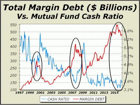
The chart below contains some of the same basic information as our first chart but presents a different perspective, perhaps even more emphatic. What the picture tells us is simply this; when the mutual fund cash-to-assets ratio plunges and margin debt rises, the odds greatly favor a significant price reversal in the form of a bear market. The first two occurrences resulted in bears that cut prices in half. Although we are not looking for a similar downside move at this time, we also cannot entirely rule it out. The obvious problem is that the gap between the cash ratio and margin debt is so much greater than it has ever been. Also of concern is the fact that the cash-to-assets ratio has been so low for so long. Clearly, we understand that the rapid growth of exchange traded funds (ETFs) has made a difference. ETFs carry very little cash, near zero in most cases. In rising markets, the only way equity mutual funds can compete is to keep their cash ratio as low as possible in order to have more invested. However, this has been an awful strategy. The downside has been far greater exposure to risk and the results have been two horrific bear markets and another now likely in progress. Ironically, the perception that mutual funds could only compete with extremely low cash levels to perform well enough and secure new investment was quite flawed. Despite the popularity and rapid growth of ETFs, they remain a minor player in the overall scheme, capturing just 14% of all monies invested in both equity ETFs and equity mutual funds. By following the 86% portion of the pie invested in equity mutual funds, we can obtain a much clearer picture of the potential for reward and the risk for the downside.
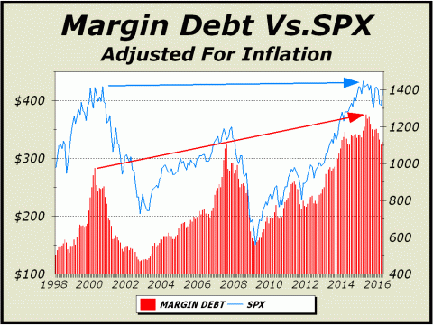
Below, you can see just how awful the fund manager strategy of keeping cash ratios low has worked. Not only do you see the tremendous drawdowns of capital in the two previous bear markets but also obvious is even after the passage of 16 years, the last six of which have been a bull market, stocks as measured by the broad based S&P 500, are only nominally higher when adjusted for inflation. The top tick monthly close of February 2015 was a mere 2.1% higher than the actual monthly close of July 2000. Again, adjusted for inflation, the index is currently 1.5% lower than it was 16 years ago. Could there be a worse condemnation of fund manager strategy of retaining as little cash as possible? Worse yet, as the red bars clearly illustrate, risks in the form of margin debt have risen at a much faster pace, even when we adjust for inflation. At the peak last summer, margin debt was 32.5% higher than the 2000 peak and remains 16% higher at this time.
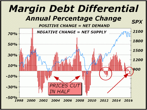
Below, we devised this indicator several years ago. After tinkering with our spreadsheets for many weeks, it appeared that a 12-month differential in total margin debt was a pretty good predictor of bad times ahead. Of course, the point can be made that the differential is coincidental, rather than predictive, but no matter, well take it. At the very least, whether predictive or coincidental, it is a valuable perspective. The first drop into negative territory came in December 2000 with the S&P 500 at 1328. The next monthly close was 2.9% higher but thats all she wrote. From that point, stocks began a horrendous decline and didnt bottom out until February 2003, 38.5% lower. The second trip to negative occurred in April 2008 with the S&P 500 trading at 1386. Again, the next monthly close was up, this time a mere 1%, followed by a humongous 47.5% collapse in only nine months, arguably the second worst crash in stock market history. The third dip into negative was October 2011 and it proved uneventful, however it came near the tail end of a 9.6% correction from an April 2011 peak. In this case, margin debt had peaked and was falling along wih stock prices.
The annual percentage
change for total margin debt actually traded at
At minus 6.6%,
We should not be surprised
to see both
The charts clearly imply a repeat performance.
REPRINTED FROM THE JUNE 27th ISSUE OF CROSSCURRENTS
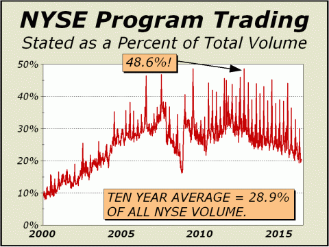
The rape of the market by so many modern technologies having to do very little if anything with investing, was accentuated on April 29th as the New York Stock Exchange said they would no longer report statistics for program trading. We have railed against program trading since 1987 and have commented at length in this newsletter regarding the many new mechanical approaches to trading now used for profit at the expense of individual investors. At the very least, it is peculiar that the NYSE announced it has ended all reporting of program trading statistics, when said programs has accounted for roughly 30% of all volume over the last decade. In fact, programs accounted for almost half of NYSE volume one week back in September 2012, . Media coverage of HFT and all other forms of program or mechanical trading has been conspicuously absent for years. Theres simply no rationale for exchanges or purveyors to educate the public, since understanding these processes can only serve to illustrate how the public gets ripped off as programs often trade ahead and get the best bids and offers. There has been some speculation from time to time that the Federal Reserve supports U.S. stock prices by stepping in to actively buy stocks when prices go in the wrong direction. There are precedents, as Japans central bank has shown by repeatedly buying stocks on the Nikkei index for years. Two months ago, the Bank of Japan announced it may double its ETF holdings from 3.3 trillion Yen to as much as 7 trillion (roughly $70 billion).
Given the background of a seven-year
bull market despite
If the Fed is indeed buying, clearly they are utilizing programs. We are troubled that the NYSE
has concluded that
Maybe were just a bit too
sensitive
Program trading hasnt gone awayit still exists.
Our specific
price forecasts are available only to subscribers.
THE CONTENTS OF THE ENTIRE WEBSITE ARE COPYRIGHT 2016 CROSSCURRENTS PUBLICATIONS, LLC I hope you have enjoyed your visit. Please return again and feel free to invite your friends to visit as well. Alan M. Newman, July 25, 2016 The entire Crosscurrents website has logged over four million visits. All information on this website is prepared from data obtained from sources believed reliable, but not guaranteed by us, and is not considered to be all inclusive. Any stocks, sectors or indexes mentioned on this page are not to be construed as buy, sell, hold or short recommendations. This report is for informational and entertainment purposes only. Persons affiliated with Crosscurrents Publications, LLC may be long or short the securities or related options or other derivative securities mentioned in this report. Our perspectives are subject to change without notice. We assume no responsibility or liability for the information contained in this report. No investment or trading advice whatsoever is implied by our commentary, coverage or charts. |
|
|