|
- THE GREATEST STOCK MARKET MANIA
OF ALL TIME -
DATED SEPTEMBER 28, 2007 A SPECIAL REPORT BY ALAN M. NEWMAN, EDITOR CROSSCURRENTS This feature is now published on roughly a quarterly basis. Our next update will likely be published early in January 2008. |
|
A world map of readers from 153 countries can be viewed HERE. Run your mouse over each country! This report is now mostly a compilation of articles that have previously appeared in the Crosscurrents newsletter. Our paid subscription stock market newsletter has only two rationales for its existence; powerful commentary and unique perspectives that cannot be found anywhere else. Please check out the testimonials on our Kudos page. To see a free sample copy of the Crosscurrents newsletter, CLICK HERE To purchase
a printable file of this report for only $10, please CLICK
HERE
Our last report was titled "A Record Setting Stock Market." One can only wonder what the stock market might have done for an encore during the last three months? Well, wonder no longer. How about new records, just about everywhere we turn? To say nothing has changed would be quite misleading. Not only have things changed, they have changed appreciably....and in all the wrong directions. ....Read on to view some very eye opening pictures.
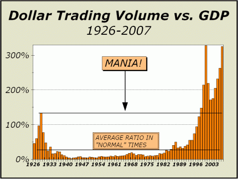
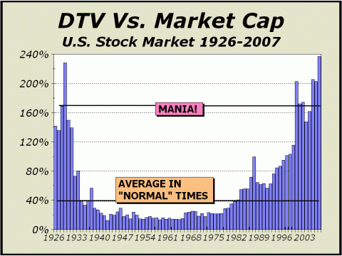
Since this web site was first published on January 15, 1999, we have focused on total Dollar Trading Volume to measure potential excesses in the U.S. stock market. By comparing how swiftly money passes through stocks in relation to both gross domestic product (GDP) and total stock market capitalization, we can see how the relative importance of the stock market rises and falls over the course of the last 80 years. Quite obviously, in 1929, nothing was more important than stocks and when the corresponding mania peaked, trading was 133% of gross domestic product stock market and 228% of total stock market capitalization. In 2000, trading was 328% of gross domestic product and 203% of total stock market capitalization, a mania fully equivalent to the madness of the "Roaring Twenties." Today, trading is 326% of gross domestic product and 237% of total stock market capitalization. For all intents and purposes, the current environment represents the greatest velocity of trading ever seen. However, by the end of the year, we expect that the current stats will be far more extreme, a bizarre circumstance that lends itself to only one description - a continuing stock market mania, the greatest mania of all time. From July to August, in the span of just one month, the New York Stock Exchange reported that the monthly total for dollar trading volume had risen 21.7%. Share volume surged 29.7%. The number of trades soared 39.6%. The sheer speed at which our capital markets are evolving and metamorphosing is frightening. The theme of investment is for all intents and purposes, dead. As you see below, the U.S. stock market is now all about trading. Nothing else matters. There was only one time in history when the average holding period for stocks was shorter than now and the difference between now and then is inconsequential. On nearly every aspect, we see shocking parallels with 1929. Clearly, as shown below, the current focus on stocks can only be compared to the two prior peaks in 1929 and 2000. The period of "'normal' times" as labeled above extends from 1934 to 1982, a 49 year stretch in which DTV did not exceed 25% of GDP. Both the Roaring Twenties and the 26 year period from 1982 would argue that we are wrong, that "normal" is a lot higher than we imply. Using the entire time frame of 1926-2007 captured by our chart, DTV has been less than 50% of GDP, still far, far lower than today's 325%. If we suppose the entire 82 year average is "normal," then "normal" transactional velocity over the course of time has been roughly 15% of what it is today! Then, when comparing dollar trading volume versus total market capitalization, we see an even more bizarre and pronounced focus. We have finally achieved a brand new record, an outcome even we never believed would actually occur.
There is absolutely no way
to ignore the obvious.
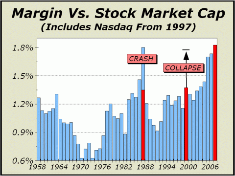
The following article is reprinted from the June 4th issue of Crosscurrents. "Mystical Potions" There can be no question that demand for stocks is extremely robust. The many new all time index highs attest to a fervent accumulation. Despite the lip service paid by some observers to the obvious requirement that prices cannot go up without interruption, that is precisely what they are doing and they have been doing it for the second longest stretch in history unimpeded by a 10% or greater correction. That stretch now totals 1068 trading sessions, well over four years and almost triple the span of time in which history has shown a 10% correction to be a perfectly normal event. As tenacity goes, we note a similar environment existed from late 1999 to early 2000 when sanity completely disappeared. Perhaps the only difference between then and now is the continuing under performance of the formerly so-called "new era" Nasdaq market, a fantasy that hallmarked greed as well as any episode in history, including Holland's Tulipmania in 1636, the South Sea Bubble in 1711 or even the Roaring Twenties. Clearly, the persistence of the upside for the other major indexes has been at least as emphatic as it was seven years ago. Of course, as we showed in our last issue, in some cases the indexes make the fait accompli an easy task. We recently showed that the Dow Jones Industrials Average is rigged for the upside, since its very construction assures more positive than negative outcomes. Most importantly in our view, much of the upside has been and is still being built upon leverage. Despite the arguments that the supply of stock for sale has fallen dramatically in the last few years, as private buy outs have proliferated, there is always more to the phenomenon than first meets the eye. Just the six recent deals involving Chrysler, TXU, First Data Corp., SLM Corp., Harrah's and Clear Channel removed over $144 billion from stock market supply. Given the basic economic tenet that a reduction in supply is as good as an increase in demand, it is no wonder that stock prices are higher. Thus, it must be obvious that there has been a huge expansion in demand. But the more revealing truth is that the increase in demand is as dependent upon leverage as anytime in history, with perhaps the single exception of 1929's madness. The six companies cited above were removed from play with the necessary addition of leverage. According to Reuters Loan Pricing Corp., loans to companies bought by private equity firms rose to $317.3 billion in 2006 from $51.5 billion in 2002. At the end of 2006, margin debt was $303 billion, less than the sum tallied for buyouts. Also, although the deals are bigger than before, borrowing has also risen relative to the cash generated by the companies that have been bought. And clearly, as our featured chart illustrates, the prices of the 5000 companies remaining are moving higher, thanks to leverage. Todays featured charts includes updated stats for NASD firms, which were released last Friday. Margin debt for NYSE member firms increased 8.5% in April to nearly $318 billion, $40 billion higher than at the top in March 2000. Total margin debt, including NASD firms, now stands over $342 billion. [ED NOTE: AS OF THE END OF JULY, TOTAL MARGIN DEBT IS 21.8% HIGHER, AT $416.4 BILLION!] A few weeks ago in Barron's, Alan Abelson covered recent remarks by Henry Kaufman about liquidity. Clearly, prices do not rise in a vacuum. Demand for stocks is driven by liquidity and liquidity is as apparent now as it has ever been. As Abelson relates, "Liquidity is the magic and somewhat mystical potion that is destined to dissolve any little thing that might impede a bull market." And while liquidity used to be a function of access to assets, in Kaufman's words, "....it is now commonplace to think of access to liabilities." Thus, margin debt has become a huge driver of liquidity. Some observers have noted that margin debt as a percentage of market capitalization was higher in 1987, but that was after the crash, not before. Lest we forget, prices collapsed by 22% in only one day and 35% in only a month. The divisor in the computation was reduced significantly overnight. Our featured chart only shows year end levels and the current level for 2007. We have highlighted the approximate levels of margin debt at the August 1987 highs, the 2000 highs (see arrow) and today. Note that leverage has been extremely high since the end of 2005 and currently stands at a record for the modern era.
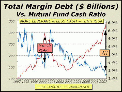
Next, we compare the six month differential in margin debt versus the six month differential in prices, as measured by the S&P 500. Although the choice of a six month period is indeed arbitrary, we believe it is a fair representation of how the two measures correlate. Of course, it can be argued quite vehemently that stock prices necessarily impact margin levels and not the other way around but there is only one important point to consider; increased leverage equates to increased risk. A huge gap between the percentage differentials in margin and price suddenly appeared in March 2000. Our simple posit is that prices had ratcheted up to such extreme levels that no amount of the "mystical potion" of "access to liabilities" was then sufficient to drive prices higher. The current divergence is muted by comparison but then again, so is the hysteria that accompanied the final highs seven years ago. Instead of the mass delusion that permitted Nasdaq to trade at 250 times current earnings, we now have the delusion that stocks are cheap at more than 18 times earnings. Meanwhile, in the first four months of the year, margin debt soared almost 13% while prices are only ahead by 4.5%. Clearly, the push for higher prices requires larger "potions" of leverage. Like many other charts we have shown in recent months, total margin debt is never a timing indicator and can only illustrate rising risks. However, the three year extension in leverage should be sufficient to convince even the most stalwart bull that risks may have risen to an intolerable level. Clearly, the "mystical potion" clearly has a counterpart in the vastly increased exposure of mutual funds to a major reversal in prices as our next chart illustrates. As we have repeatedly noted, mutual funds can no longer compete for investment dollars against fully invested index funds and all stock Exchange Traded Funds. The battle for survival has been met by the requirement to "dissolve any little thing that might impede a bull market," you know, like common sense.
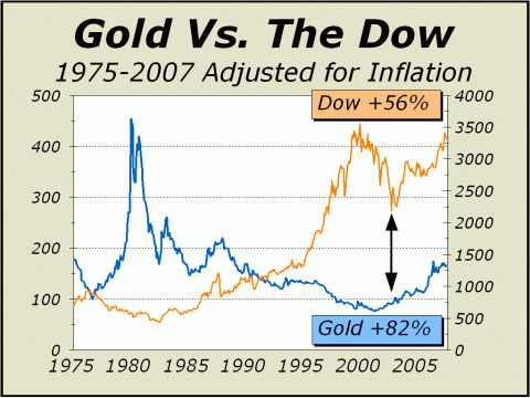
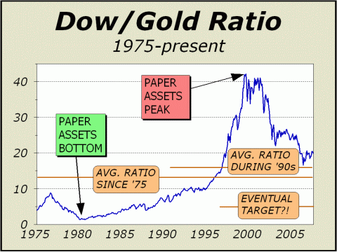
The following article is reprinted from the June 25th issue of Crosscurrents. "Inflation Matters" The celebrations since last October, when the Dow Industrials broke above its 2000 all time closing high, have been tumultuous. Each new record has been trumpeted by CNBCs anchors as if nirvana had been achieved. The passing of the 13,000 Dow milestone was immediately followed by speculation, not of 14,000, but when 15,000 might be achieved. While we see a smattering of caution voiced by several observers, very few appear at all committed to a lower exposure to stocks and in our view, most semi skeptics are simply playing the not-to-be-blamed game if a sudden tumble should bring their followers to their knees in pain. Truth be told, optimism is rife. The best evidence of continuing optimism is seen in prices, which have ratcheted up on the most consistent and persistent incline in decades. Although back in February, the market did manage to conclude the second longest stretch in history without a 2% correction, we are still very much in the midst of a streak that is either the longest or second longest in history, depending upon which major average you use, without a 10% correction. It bears repeating that during the 20th century, corrections of 10% or greater occurred on average every 17.3 months. The current run extends over 51 months. The persistency of gains has resulted in the most amazing display of optimism ever shown by market letter writers. Steve Hochberg notes in the June 1st issue of The Elliott Wave Forecast, Since 1963, when Investors Intelligence first began monitoring investment advisors, there have been 2,136 sentiment readings (www.Investorslntelligence.com). During this period bulls outnumbered bears 1,569 times, or in 73.4% of the surveys. The bears surpassed the bulls a total of 567 times, or in 26.5% of the surveys. But since the week of October 14, 1998, a bearish plurality registered in only 9 of 451 weeks or less than 2% of the time. This is truly amazing because this time period includes one of the worst bear markets in at least 34 years. The stock market is in a super-rarified realm in which a bearish consensus doesn't form no matter what the market does. The record streak without a net bearish reading now extends back four and a half years! Ironically, the Dow is the only major average to exceed its 2000 all-time high, but actually remains below that high on a constant dollar basis. Prices do not rise (or fall) in a vacuum. The value of a dollar has depreciated significantly since stocks peaked in March 2000. According to the CPI, the cost of living is now 20.7% higher than the manic peak. Simply put, if your investment in stocks has gained 20.7% since March 2000, you can buy no more today with your portfolio than you could have more than seven years ago. Inflation matters. Remarkably, the best protection against the ravages of inflation seems to be getting little attention despite very big gains. Measured from the Dow high, Gold has shone brilliantly, up 91% in inflation adjusted terms, while the Dow is 4% lower. And Gold has also done quite well compared to the Dow since stocks bottomed in October 2002. While the Dow is up very nicely, 56% higher, Gold has advanced by 82%. To be sure, stocks have better accommodated the ravages of inflation back to 1982, when the great bull market for paper began, but as our second chart patently suggests, the age of paper assets now has competition and the demand for alternative investments, or inflation hedges, is likely in its infancy. Our bull market call for gold was initiated with the horrendous event of 911, but now we see another more important reason than the need to protect against uncertainty or upheaval. Clearly, until recently, we hugely underestimated the potential influence of 1.3 billion consumers in China and an additional 1 billion in India, together roughly 38% of the population of the entire planet. We cannot expect either country to languish in pre twenty-first century conditions forever and it is obvious that China has made enormous economic strides in recent years. As wealth increases world-wide, so will the demand for goods of all kinds and especially commodities. We expect prices to reflect increased demand, equating to higher inflation. Sans a worldwide economic slide, we even expect U.S. stocks to retain a modicum of sponsorship as wealth continues to build, just at a far slower pace than realized in the past generation and at a far slower pace than other selected asset groups, like precious metals.
As our second chart illustrates, the Dow/Gold Ratio has finally traded back to near the same range as the average from 1990 to 1999, just before the mania peaked. However, there is a considerable distance for the ratio to travel before it equals the average since 1975 and an enormous ways to go before a test of where the ratio bottomed when gold futures hit their all time high in January 1980. Our postulated eventual target of a Dow/Gold ratio of 5 would clearly place gold in a favored status over stocks. If achieved, even a Dow as low as 9000 would mean gold at $1800 per ounce. The Dow at 15,000 would mean gold at $3000 per ounce. Of course, our target is only mere speculation. But even if we see an eventual retrace to the average ratio since 1975 at 12.77, gold will clearly shine compared to stocks. At the higher ratio and Dow 9000, gold would still trade at $705, above todays price. At Dow 15,000, gold would trade at $1175 per ounce. So, how likely are these levels?
Our last chart [ED NOTE: NOT SHOWN] reveals our resistance levels, which have increased from our last presentation to account for subsequent increases in inflation. Here one can clearly see that the bull market began concurrently with 911. Our resistance levels correspond with prior significant peaks and we expect that only the January 1980 equivalent peak may be problematic. The lower resistance levels may take some time to overcome, but we believe they inevitably will fall just as worldwide wealth inevitably rises. In our January 8th issue, we suggested that the 2008 Olympics in Beijing represents a very important event for the planet. Given the tremendous boost this event will provide for the Chinese economy, we see adequate reason to expect gold to achieve our first resistance level of $873 per ounce soon thereafter. In the meantime, although the wait may be tested by the expected scary correction in U.S. stocks, we do not expect more than a modest correction in gold. Gold, and more importantly gold stocks, should be well worth the wait. [ED NOTE: THIS FORECAST
WAS RIGHT ON THE NOSE. FROM THE DATE OF OUR ANALYSIS,
The following
article is reprinted from the September 10th issue of Crosscurrents
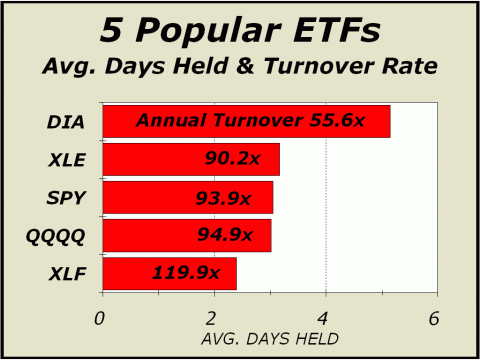
"The Death Of Investment" The chart before your eyes is without any reservation, the most stunning we have ever presented in these pages, concrete proof that the U.S. is no longer a market of stocks and is no longer an investment arena. In a speech before the International Federation of Technical Analysts in Washington, D.C., close to four years ago, your Editor claimed that "The nature of investment has changed dramatically." You can read the text of the speech at http://www.cross-currents.net/archives/dec03.htm. The metamorphosis of the U.S. stock market has continued without interruption since that point and the nature of investment has deteriorated to the point where we may fairly imply that as a technique to capture gains or profits, investment is no longer even relevant. On the other hand, trading is not only relevant, but appears to have permanently supplanted investment as the primary driver of stock prices. At present, there is every reason to believe that active managers can no longer compete with the growing dollar amount of assets under the passive management of index funds and Exchange Traded Funds. The growth of ETFs has been nothing short of spectacular as total assets have soared at a rate of 46.3% since 1999, before the zenith of the greatest stock market mania of all time. By comparison, total assets in mutual funds have grown at an annualized rate of only 5.8% over the same period of time and much of the growth has been in index funds, not actively managed portfolios. Since index funds and ETFs have zero cash components or cash reserves, active managers of traditional mutual funds must spend down their own cash reserves in any attempt to compete. As a result, more money has been thrown at stocks regardless of valuations or prospects. Yes, prices have moved higher but at a significant cost - as the cash component contracts, exposure and thus risk, must expand. In the 15 years from the beginning of 1984 through the end of 1998, the cash-to-assets ratio of mutual funds averaged 8.6%. Since the beginning of 1999, the cash-to-assets ratio has averaged only 4.6%. In the last year, the monthly ratio has dropped to a mere 3.5%. The cash component of mutual funds is rapidly disappearing. On the other hand, trading has exploded. In the span of time the country's Gross Domestic Product has doubled, total dollar trading volume has soared more than 11-fold. The advent of ETFs has both allowed and encouraged all participants to suspend any notion of fair values to trade, rather than invest. The greatest investment market of all time has been corrupted and now serves principally as a casino for hedge funds, day traders and performance oriented mutual fund managers. The financial industry's buy-and-hold for the long term mantra is a lie, and is no longer even the slightest bit relevant. Only the short term matters. The proof is obvious. As our featured chart on the front page clearly illustrates, turnover is enormous. Compare today's chart with the original chart we ran in our March 12th issue (see www.cross-currents.net/c031207c.pdf). Please note that the scale has changed from ten days to only six days. In our last review of this situation, the entire capitalization of the Dow Diamonds (DIA) were turned over 26 times in one year. They now turn over at a rate of 56 times a year. The S&P Syders (SPY) turned over 41 times and now turn over 94 times. The Nasdaq 100 Trust (QQQQ) turned over 54 times and now turn over 95 times, with an average holding period of 3 days. Yet, in a supreme display of ignorance and arrogance, the Trust's sponsor still claims that, "over 1 million people are harnessing the power of PowerShares QQQ through the implementation of various investment strategies....These strategies include a diversified, long-term investment approach and the provision of a full suite of derivative products that may be used in conjunction with the PowerShares QQQ." The use of the words long-term in this description would appear to be a blatant lie. The use of the word investment in a description
of a product
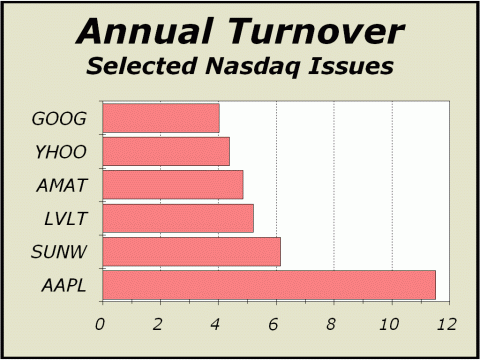
Our next chart clearly indicates that you can kiss the concept of "investment" good-bye. The average holding period for equities validates that statement. It's not just ETFs, it is stocks. Google's (GOOG) entire share capitalization will turn over more than four times this year. Apple Inc.'s (AAPL) entire share capitalization will turn over 11.5 times. Undeniable logic; if the average holding period of Apple is just over one month, then traders must be making the price, not investors. Simply put, the shorter the holding period, the less likely it is that a purchaser is interested in the issue as an investment. The more individual share prices are influenced by traders, the less those prices must be influenced by investors. Consequently, the price of the shares will not reflect their fair investment value. In the March 12th issue of Crosscurrents, we showed how the average time stocks were held on the NYSE and AMEX had slipped from a full year back in 2002 to as few as six months in 2006. We should not be at all surprised to learn that average holding periods have again fallen to new all time lows. But what could one possibly expect when the most popular source of financial news prominently displays the time, not just in hours and minutes, but with seconds and hundredths-of-seconds as well? The implication is clear; everything is of and for the moment and we define moment as the merest fraction of a second. How in heavens name can investment be possible in this environment?
Of course, there is another reason why trading has exploded and it does not encompass the traditional notion of a trader, an individual who might nevertheless still be somewhat concerned about committing capital to a grossly overvalued situation. The explosion in trading also has everything to do with the inordinate sway of program activity. Over the last ten weeks, programs have accounted for 34% of all transactions on the NYSE. The buy program executed by a firm such as Credit Suisse or Deutsche Banc might be unwound in a matter of days, perhaps even hours. But whether an arbitrage was based on a price discrepancy between the actual issues in the program and futures or some mathematical model that suggested the stocks were momentarily under priced, it is obvious that the rationale for these transactions was not investment. In the week ending June 22nd, 46.8% of all share volume on the NYSE was attributed to program transactions. Investment has been dis-incentived in favor of trading. Stocks are priced in relation to one another, to indexes and to sectors. Sadly, participants have apparently decided that the determination of fundamentals and prospects are too time consuming and too expensive. Our estimate of total dollar trading volume
in June implied
The same indicator implied an average position holding period of 5.26 months in 1929. Need we say more?
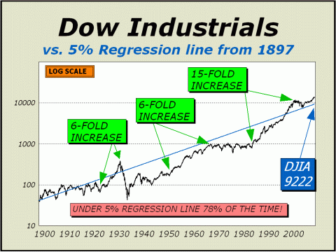
Our favorite chart of market potential has become the Dow Industrials versus a 5% regression line imposed since 1897, a period of 110 years. As you can see below, the Dow has traded UNDER this line 78% of the time, affording us the logic that over the very long term, the regression line should at the very least, approximate price. We can also see how the super bull market from 1982 took prices up 15-fold, the most significant rise in modern history. The regression line was actually touched for only one day in October 2002 but we should expect at least another touch of the line, perhaps many touches in the decade ahead. The regression line now stands at Dow 9222, roughly 33% below today's price. We believe that going forward, the line may now represent a worst case for a bear market. The good news is that this means the October
2002 lows
The bad news is that we do expect an eventual return journey to the regression line. For the sake of conjecture,
if the regression is not touched until three years from now,
Caveat: our bearish analysis has been trumped over the last year by phenomenal increases in liquidity, brought about by foreign investors, hedge funds and most significantly, by the use of leverage. Liquidity could conceivably increase from current levels, affording a continuing environment that encourages trading and optimism. However, recent events leading to the near 10% brief turndown in prices lead us to believe that risks are still incredibly high. See http://tinyurl.com/2ggp2y for a disturbing analysis. We quote an excerpt below: ".....a coordinated withdrawal
of liquidity among an entire sector of hedge funds could have disastrous
consequences
These are strong words, but what would you
expect if investment was no longer an issue and only trading was.....?
30%
odds the closing highs for 2007 have already been achieved
UPSIDE POTENTIAL LIKELY TO BE NO MORE THAN 1% to 2% HIGHER Low
Targets for 2007
In our
view, the odds still imply a 15% correction from the highs
THE CONTENTS OF THE ENTIRE WEBSITE ARE COPYRIGHT 2007 CROSSCURRENTS PUBLICATIONS, LLC I hope you have enjoyed your visit and please return again. If you know anyone who might be interested in seeing what we have to offer, we'd be happy to have them visit as well! Alan M. Newman, September 28, 2007
All information on this website is prepared from data obtained from sources believed reliable, but not guaranteed by us, and is not considered to be all inclusive. Any stocks, sectors or indexes mentioned on this page are not to be construed as buy, sell, hold or short recommendations. This report is for informational and entertainment purposes only. Persons affiliated with Crosscurrents Publications, LLC may be long or short the securities or related options or other derivative securities mentioned in this report. Our perspectives are subject to change without notice. We assume no responsibility or liability for the information contained in this report. No investment or trading advice whatsoever is implied by our commentary, coverage or charts. |