|
- THE GREATEST STOCK MARKET MANIA
OF ALL TIME -
DATED OCTOBER 15, 2009 A SPECIAL REPORT BY ALAN M. NEWMAN, EDITOR CROSSCURRENTS This feature is now published on roughly a quarterly basis. Our next update will likely be published in the latter half of January 2010. |
|
Our readership
continues to grow.
This report
is primarily a compilation of articles that have previously appeared in
the Crosscurrents newsletter.
Please check out the testimonials on our Kudos page. Printable
files of this report accompanied by our forecast are available only to
paid subscribers.
Disclaimer: well over a year ago, we admitted that the data for our lead charts on Dollar Trading Volume were becoming increasingly difficult to find and to rely on. However, we had claimed our charts were likely off by no more than 2% from actual activity. We have since found a source and will continue to compile the data as we find it but we continue to stress that our presentations can only be construed as estimates. Interestingly, our previous estimate was purposely constructed as conservatively as possible and wound up grossly underestimating Dollar Trading Volume. Our new estimate is far higher but is likely quite close to the mark.
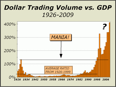
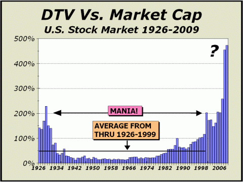
As of the last article in June, our estimates of Dollar Trading Volume were compiled from data in much the same fashion as in the years before. Unfortunately, the market has metamorphosed to such a degree in the last few years that almost nothing is as it appears. For example, the reported volume sound bites we have been accustomed to hearing on the six o'clock news every day are not only suspect - they are hopelessly inaccurate. For example, back in early 2006, NYSE volume was roughly 75% of NYSE composite volume across all exchanges. By mid-2007, it was only 50%. By the spring of 2008, it was only 30%. Thus far in 2009, it has only been as high as 40%, but has been as low as 15% and is averaging only 25%. That's right. The NYSE trades only one-quarter of the volume traded on all exchanges for NYSE listed stocks. In the month of August, the NYSE averaged 1985.3 million shares per day. The BATS exchange traded 1139.2 million shares per day, Direct Edge traded 1750 million shares, Nasdaq 2148.19 million shares and Amex/ARCA traded another 348.8 million. They are all intertwined in such a fashion that constructing a total from the break down of components as in the past seems an almost impossible task. In fact, in the market activity section of the NYSE website, they have separate listings for activity in Amex, ARCA and even Nasdaq issues traded under NYSE auspices. Inconsequential? Hardly. So far in 2009, NYSE dollar volume in Nasdaq listed issues alone is running at a pace of well over $1.6 trillion. Throw in the existence of so-called "dark pools" (see http://tinyurl.com/mtch75 for a teaser), and who knows what is what today? We simply cannot get a handle on everything that is traded anymore. However, given the fact that NYSE only volume is roughly 25% of NYSE composite volume across all exchanges, we can make some back of the envelope calculations and guess how much trading has actually expanded. After a bit of further analysis and duoble checking, you see the result below. Stunning, no?
Again, please bear in mind that the above chart now only represents our estimate and that we also believe we could again be significantly UNDERSTATING the matter. Just one look at how BATS breaks down notional values of daily trading (see http://tinyurl.com/yagc3qc) is certainly sufficient to throw all kinds of doubt into our equations. When we last checked on Wednesday, October 7th, BATS claims consolidated notional values had averaged $243.5 billion over the preceding five days. At that pace for one year, total dollar trading volume would be $61.37 TRILLION, quite close to the $58.05 trillion we have estimated for this report. Thus, we have good reason to believe we are quite close in our estimate, but simply cannot account for whatever may not be reported. Q: what might not be reported? A: possibly some transactions in so-called "dark pools" (see http://tinyurl.com/5kknks). In 2005, dark pools accounted for less than 2% of all traded equity volume but are now in excess of 12%, or one of every eight dollars traded. The pools are unregulated. Given the extreme metamorphosis of the U.S. markets, we are in an environment where almost nothing can be trusted, including trading statistics.
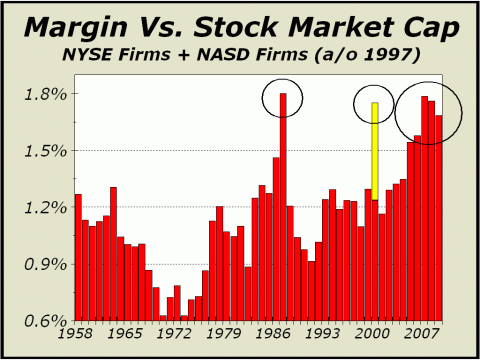
Is our estimate above close to accurate? If not, it is likely understated. Could our chart be understated significantly? Perhaps it is. We can only wonder. Amazingly, as in the previous two bubbles, margin debt is once again expanding to levels that indicate yet another bubble is in progress. The only prior instance in which margin debt recorded a worse extreme was in 1929, which was followed by the most devastating bear market in history. The peaks in 1987, 2000 and 2007 were the greatest of the last 50 years. They were followed by either a crash or a horrific bear market. Margin debt vs. GDP fell rapidly after 1929, 1987 and 2000. Margin is holding at relatively
high levels now,
Investment is dead. It's all about trading.
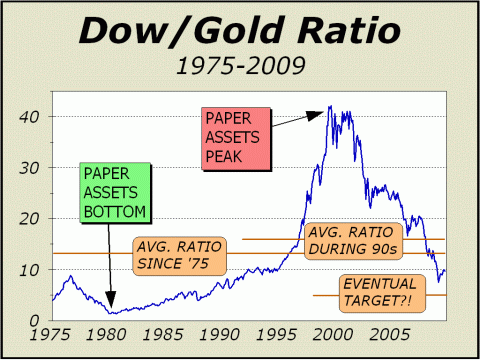
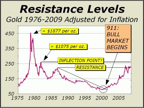
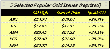
The following article was the lead article in our September 7, 2009 issue. Gold: Upside To $2000 Per Ounce After a six month hiatus, it is time to revisit the outlook for gold and gold stocks. We last examined the potential for the yellow metal and the more well known gold mining companies in our March 9th issue (see http://www.cross-currents.net/m030909r.pdf), the same issue in which we cited the "best reward/risk ratio in years" for the stock market. We highlighted five "selected popular" gold issues and offered an average upside potential of 70%. Our call on the gold stocks came right on the nose and the subsequent rally took our five selections up an average of 29% over the next two months and change. Underwhelming? Not at all. Most importantly, we posited that "the five gold stocks....offer excellent potential for the long term and will eventually exceed their old highs, likely with much room to spare." Given the consolidation mode in place for both bullion and gold stocks, we believe our forecast is still on the mark. We have been super bullish on both bullion and gold stocks since the terrorist attacks of 911 and have repeatedly stated that although the catalyst may have been terror and the uncertainty promoted by same, our principal rationale was the threat of a derivative event unlike any seen before. Clearly, the fiasco that unwound last year and into the spring of 2009 met our criteria. The meltdown threatened to rupture the financial system and likely came within hours of causing irreparable damage. We have continued to follow the course of the derivative markets and believe huge threats to the system still exist. We're satisfied that another shoe is not likely to drop tomorrow, but inevitably, the other shoe will drop. These threats will most likely be covered in the November 9th issue of Crosscurrents, so mark your calendar in anticipation of several amazing charts. We expect our rationale for the continuing super bull market in gold and gold issues to morph again soon, from terror to derivatives to an unexpected surge in inflation when the secular bear market finally concludes in the latter half of 2010. Given that the threat of terror has not yet been eradicated and that another derivative event is inevitable, the rationales for gold grow brighter and brighter every day. Despite the phenomenal rally in stocks, up as much as 48.2% from the March 6th print low, the Dow/Gold ratio has "corrected" only nominally from the February low of 7.5 to 1. Interest in gold and gold issues has not declined and instead, appears to be tracing out a very bullish consolidation pattern within the super bull market. Our "eventual target" ratio of 5:1 was last seen in the latter part of 1988 and we see no reason to prevent a return to these levels. Even a return to the February '09 level would likely mean a significant rise in bullion and gold stocks. If the Dow traded at only 8000, a Dow/Gold ratio of 7.5 to 1 would equate to bullion trading at $1067, 14% higher than today. At Dow 10,000, a Dow/Gold ratio of 7.5 to 1 would equate to bullion trading at $1333 per ounce. At Dow 10,000, a Dow/Gold ratio of 7.5 to 1 would equate to bullion trading at $1333 per ounce, 43% higher than today. And if we are correct about an end to the secular bear market for stocks and the Dow trades at 15,000 within five years, bullion has the potential to reach at least $2000 per ounce.
To date, the resistance levels shown in previous charts have worked quite well, but we have made a slight adjustment to the chart at left below. While the first resistance level is precisely the same as before, the labeling for the second level has been altered to read inflection point. Technically, this level should still represent resistance, but once breached, we expect a sudden and widespread realization that the rationale for ownership of bullion has changed again, this time to the fear that inflation is about to rapidly erode the value of fiat money. Despite the negative rate in the CPI since May 2008, there is clearly a precedent for a surprising reversal. The CPI bottomed in June 1972 at a modest 2.7% but a year later was at 6%. Another year later, the CPI was 10.9%, before peaking at 12.3% in December 1974. Given the background of the greatest debt intensification ever seen, it makes sense that we inflate our way out of the mess. Deficit reduction and tax increases can go only so far towards paying down $9 trillion (see http://tinyurl.com/mjquse). Thus, our inflection point now takes on a special significance and once bullion is past $1075 per ounce, clear sailing should be expected. Bear in mind, higher inflation will raise our targeted levels by roughly the same amount.
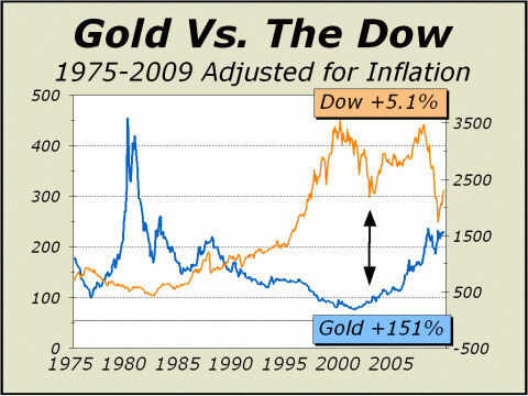
The veracity of golds bull market is illustrated in our chart below right. We have arbitrarily selected the inflation adjusted September 2002 low for the Dow vs. gold for our comparison. In the span of time since that date, the Dow has risen just 5.1% versus a 151% surge in gold. Despite the huge run up in stocks since the March 09 lows, the inflation adjusted Dow is only bumping up against the 02 low while bullion is fighting to break out to a new generational high and indeed, seems destined to achieve the pinnacle. The last time the inflation rate went bonkers, gold prices exploded from the August 1976 low of $102 per ounce to $850 per ounce in January 1980. The annualized rate of inflation as measured by the CPI, reached over 14%. A similar run from the 2001 lows for bullion would place the precious metal above $2000, an additional precedent for our forecast.
Regarding the five issues we selected for our March 9th issue focus, there should still be plenty of upside remaining once bullion breaks through resistance and especially when the inflection point is breached. The list has been updated for your perusal. The upside shown simply represents the old highs. Given an environment of sustained high inflation, we would expect the old highs to be surpassed by a country mile.
[prices above as of September
7th]
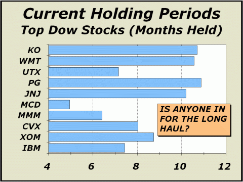
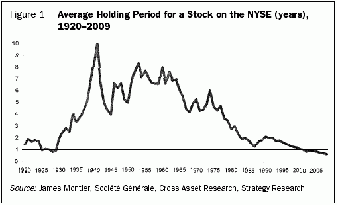
Below, reprinted from the August 17, 2009 issue of Crosscurrents. Buy And Hold Is Dead Two greatly respected observers, James Montier and Marc Faber, have recently shown the average holding period for stocks on the NYSE is now down to six months. We have covered this aspect of the market several times, most recently in our March 30th issue (see link on page 2, first column) wherein we illustrated turnover for certain selected ETFs was down to an average of only one hour and 43 minutes! Not only is this not your father's stock market anymore, it is really not an investment market at all. Investment rules do not apply and the arena is all about high frequency trading (HFT), program trading and momentum investing. Mutual funds do not purchase individual issues based on merit or valuation, but buy them because they are bought by others. Mutual funds do not spend down cash because they have confidence in the fundamentals, rather they do so because others are doing so in order to compete. A manager who holds back cash when the market rises faces immediate career risk. Ironically, a manager who has spent cash only to face a crashing market can easily point to everyone else in the same basket. Not my fault, it was the market. Career risk avoided. It is the very same Groupthink mentality shown by David Dreman decades ago (see http://tinyurl.com/natsc7). If managers cannot act as independent authorities and utilize proper investment criteria, then they are not investment managers and are simply throwing in their lot with everyone else and with zero regard for the consequences. As shown below, using only the last months data, the average holding period for the top ten Dow constituents of the Dow Diamonds Trust (DIA) is roughly eight-and-one-half months. Given that volume is down over 37% since March, average holding periods were considerably smaller back then, probably somewhere in the neighborhood of 5.3 months. Thus, the data illustrate that investment has almost totally disappeared as a rationale for involvement in the stock market.
Below, this chart is reprinted with permission from the August 2009 issue of Marc Fabers The Gloom, Boom & Doom Report (see http://www.gloomboomdoom.com). We have taken the liberty of adding a single line at a point marking an average holding period of exactly one year. Note that the line accurately delineates the periods we have identified as certifiable stock market manias, periods during which investment criteria were totally ignored. We further note that the episode of the roaring Twenties was soon reversed while in the current era, holding periods (if you can call them that) continue to decline.
Although volatility has contracted substantially as the major averages have rallied, the short term focus will undoubtedly catalyze an opposite reaction when prices finally begin to correct. When the time horizon for participants is brief, value is not important, only movement. Since value has far less relevance, the tendency is to push prices to overvalued levels. Like now.
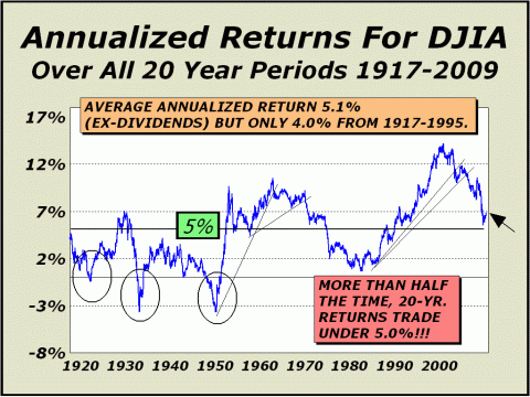
The Flip Side For The Long Term In the last article, we ended with a perspective on why the long term "may finally portend well," illustrating that the ten-year annualized return for the Dow Industrial had fallen to historically low levels and was due to rebound. Clearly, it has. From the March 2009 lows, the Dow rose as high as 55.6% print basis, and climbed over 1500 points from our June 29th report. Ten-year annualized returns were as low as minus 3.9% but are now nearly flat (minus 0.2%). Thus, the previous forecast has already proved correct. But the tremendous rally in stock prices does not mean the trend will remain in place without interruption! In fact, the 20-year perspective below illustrates tremendous risks remain on the horizon. Although we are not expecting a replay of any of the episodes of the four previous decades in which returns were negative over 20-year rolling periods, we certainly have a robust expectation that 20-year annualized returns will eventually fall to at least the 5.1% average over the life of our chart and perhaps to less than the 5% horizontal line drawn across the breadth of our chart. If the Dow simply remains at the 9864 closing level of October 9th, the 5.1% historic average would not be achieved for another four years in October 2013. At the same closing level, a 5% annualized return would be achieved less than two months later. If we instead postulate the Dow trading and remaining
at 12,000 (20% higher than today), the 5.1% historic average would not
be achieved until May 2015. At the same 12,000 level, a 5% annualized
return would be achieved one month later.
Despite the huge gains since March, risk has not disappeared. On the contrary, risks have now risen to intolerable levels. We expect annualized returns for 20-year periods to eventually revert to the average. There is no rationale to invest when everyone else trades.
To see a free sample copy of the Crosscurrents newsletter, CLICK HERE
*THIS USED TO BE OUR FORECAST SECTION Some of our readers may be aware of a recent "study" of stock market forecasters, published by an internet blogger. In our case, this blog reported accuracy ratings that we can only describe as devised and so far from accurate as to be laughable. Needless to say, our forecasts were interpeted incorrectly and denigrated. We have no desire to direct any traffic to this blog and if you are interested in seeing the "study," you will have to search for it. The blog admits "The Crosscurrents forecasts/targets frequently include qualifications/embellishments that makes testing difficult," yet the ratings were undertaken as if gospel. The blog further admits that "a few very bad forecasts make the average absolute error high." Ironically, and most disturbingly, those very same forecasts begin and end with our initial forecast of a secular bear market bottom at Dow 6400, originally published on our website as far back as 2003 and published in our Washington, DC speech before the International Federation of Technical Analysts in November of 2003. However, as our initially cited time target was pushed out with each new forecast, the aforementioned study considered the entire forecast before it to be utterly wrong and in some cases, awarded us a rating of minus 80% accuracy. That is a stunning misapplication of statistical science, in that the actual bear market low to date was Dow 6469 print basis on March 6, 2009. On a number of occasions, we also specifed an SPX low of 680, about as close as one can get to the actual 683 closing low. We not only forecasted the actual price bottom with pinpoint accuracy, we did so six years before the fact. Moreover and most importantly, we have usually cited the upside parameter as "potential" and the downside parameter as "risk," in order to highlight both the best and worst possible cases. The study incorrectly interprets each of these parameters as actual forecasts, which must, by definition, make one or the other of our parameters hopelessly wrong. The market cannot move in both directions at once. If an actual forecast has been issued in the past, it is typically not accompanied by a disclaimer, such as upside "potential" or downside "risk." It has always been accepted wisdom in our business that one does not forecast both price and time together. If a time is specified, never specify a price. If a price is specified, never specify a time. It is sufficiently difficult to forecast one of the two aspects alone. Most forecasters follow this golden rule. When we issue a forecast, we typically do not follow the golden rule. However, the denigration of our forecast results by this faulted study has cast a serious pall on our desire to continue publishing price and time forecasts for the benefit of the public on the free portion of this website. The Crosscurrents website has had more than three-and-a-half million visitors since it was established in 1999 and we are quite proud to display just a few of the many kudos accorded us by readers at http://www.cross-currents.net/kudos.htm. We did not earn these kudos by publishing wrong forecasts time after time. Despite our desire to continue serving the public, we will no longer expose our analysis to faulty studies and inadequate math on the free portion of our website. Therefore, our policy is now changed. While we will continue to publish the very popular Pictures of a Stock Market Mania feature, we will no longer provide any price and time forecasts or parameters as have accompanied this feature in the past. The subscriber portion of our website will have the same article accompanied by price and time forecasts and other parameters as we deem significant, as it always has. If you wish to see these forecasts and or parameters, we suggest you subscribe or purchase a copy of the full article for $20 [CLICK HERE]. If this policy change does not meet with your approval, we certainly understand and nevertheless, invite you to continue reading the free articles we post for the benefit of the public. THE CONTENTS OF THE ENTIRE WEBSITE ARE COPYRIGHT 2009 CROSSCURRENTS PUBLICATIONS, LLC I hope you have enjoyed your visit. Please return again and feel free to invite your friends to visit as well. Alan M. Newman, October 15, 2009 
CLICK ICON TO GO BACK TO ARCHIVE MENU All information on this website is prepared from data obtained from sources believed reliable, but not guaranteed by us, and is not considered to be all inclusive. Any stocks, sectors or indexes mentioned on this page are not to be construed as buy, sell, hold or short recommendations. This report is for informational and entertainment purposes only. Persons affiliated with Crosscurrents Publications, LLC may be long or short the securities or related options or other derivative securities mentioned in this report. Our perspectives are subject to change without notice. We assume no responsibility or liability for the information contained in this report. No investment or trading advice whatsoever is implied by our commentary, coverage or charts. |
|
|