|
- THE GREATEST STOCK MARKET MANIA OF ALL TIME - DATED MAY 19, 2010 A SPECIAL REPORT BY ALAN M. NEWMAN, EDITOR CROSSCURRENTS This feature is now published on roughly a quarterly basis. Our next update will likely be published in late August or early September 2010. |
|
Our readership
continues to grow.
This report
is primarily a compilation of articles that have previously appeared in
the Crosscurrents newsletter.
Please check out the testimonials on our Kudos page. Printable
files of this report accompanied by our forecast are available only to
paid subscribers.
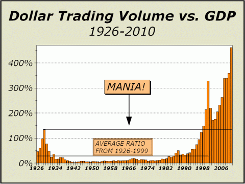
In the last few issues of this report, we have stated that the data for our lead charts on Dollar Trading Volume were becoming increasingly difficult to find and verify. There is likely now so much trading that takes place away from public scrutiny that no one can publish a completely accurate total of transactional volume. In June 2009, we believed we had underestimated DTV. In the October 2009 issue, we believed we significantly overestimated DTV. And now, we again believe we underestimated DTV in our January 2010 issue. Simply put, what you see is our best guess based on the information we have at hand. We frankly admit to being somewhat confused. It is difficult to be confident that our first two charts are accurate representations, if only for the reason they are so astounding. However, what you see here purports to be a rough but fair estimate and the sources are readily identifiable. If we are anywhere near with our estimate, the picture is clearly of a third mania in progress in only 11 years and one that in many ways, tops the tech lunacy of 2000 and the bubble echo that ended with the October 2007 highs. Our first job was to determine DTV on the New York Stock Exchange. From January 1st through April, DTV on the NYSE totaled $5.683 trillion. At this pace, DTV would total about $17.048 trillion over the course of the year. We have on several occasions estimated that the NYSE now accounts for only 25% of all trading, which would put the overall picture for the U.S. stock market at $67.19 trillion. Next, we sought confirmation and believe we have found it from the BATs exchange. While we only examined a brief history of the thirty days of trading from April 6th to May 4th, we believe the sample is reasonable and infers a decent grasp of the overall picture. Total notional volume (DTV) averaged approximately $267 billion per day, which works out to more than $67 trillion ($67.38 trillion to be a bit more precise) for the full year. Good enough. Given GDP of $14.6 trillion, DTV is more than 4-1/2 times GDP, double the ratio from 2005, almost five times the ratio of 1996, almost nine times the ratio of 1993, more than 15 times the ratio of 1990, and incredibly, more than 25 times the ratio of 1982, when the great secular bull market in stocks commenced. Thus, we see ample evidence
that the mania is ongoing,
Another new record, this time by an astounding margin!
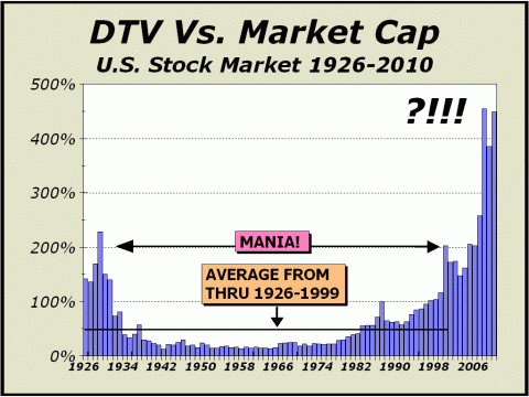
And below, Dollar Trading Volume is measured in relative terms versus total stock market capitalization. DTV in 2000 fell shy of the manic top in 1929 but over the last four years, beginning with the bubble echo in 2007, the ratio of trading to market cap has simply gone through the roof and is now nine times the average ratio from 1926 through 1999! The two most significant distinctions in this chart stem from our line marked "MANIA!" Note that stocks suffered dramatically after the 1929 peak. The 1929 Dow high was not exceeded until 1955. Investors lost interest until the great secular bull market erupted in 1982. Ironically, there is one fairly tall bar in 1987, when stocks crashed. And then, a huge bar for the year 2000, as tech stocks first soared and then crashed. And then another phenomenal
increase in DTV
While the jury may still be
out on this year's peak, it is abundantly clear that
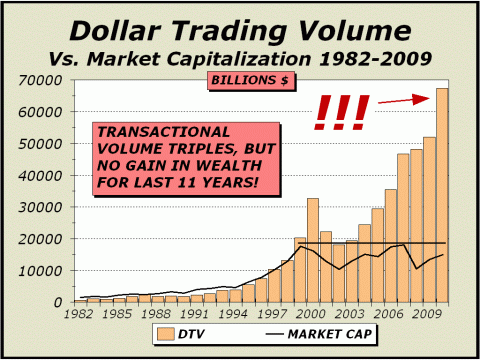
Below, we measure DTV versus market capitalization on an absolute, rather than relative basis. Clearly, the increase in trading velocity has wrought nothing good for investors. In the last issue, we cited another important comparison to the mania of 1929, turnover. "Total turnover of market capitalization peaked in the 1929 mania at 2.28, meaning that stocks were held an average of less than 23 weeks." However, in the most emphatic phase of the bubble echo, turnover peaked at 4.55. Stocks were held for only 11 weeks and 3 days...." Our question is simple; what
has the stupendous increase in trading done for investors?
Stock prices have gone nowhere for 11 years. Why? Because the stock market is no longer about INVESTING.
The following article was the
lead article in our March 15, 2010 issue.
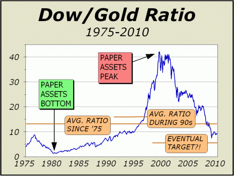
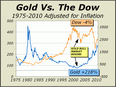
A Tale Of Two Markets. We havent covered our views on gold in depth since the September 7, 2009 issue, an entirely too long hiatus. In the interim, we proved correct on any number of posits, including a breakout above resistance and a move to record highs. Our forecast of upside as high as $2000 per ounce remains intact and there still appears to be good reason to expect another major move this year, well above the $1213 closing high registered on December 2, 2009. [EDITORS NOTE: AS OF MAY 11th, THE DECEMBER 2009 HIGH FOR GOLD WAS EXCEEDED] Our featured chart shows monthly closes only and dates from January 1975, a time frame that brackets two of the most significant financial events in the last century, a secular bottom for paper assets in 1980 as the annual rate of inflation soared to as high as 14.8% and a secular peak for paper assets as the price of Nasdaq rocketed to 250 times corporate earnings. Although the shift is tidal in nature, it is also evolving at an extremely slow pace as one financial earthquake after another shakes the system and debilitates the foundation piece by piece. There is no set rule that offers us any comfort regarding the length of each cycle. Despite the quite visible peak in 2000, paper assets remain in favor. For three years from 1992 to 1995, the Dow/Gold Ratio struggled to get above 10-1, finally breaking out without looking back. Despite a one-month plunge in the ratio to 7.5-1 as stocks cratered early in 2009, the ratio has traded well over 9 for much of the time, a sign that old resistance still attempts to function as new support. The age of paper has not yet conclusively given way but is clearly underway. The trend is unmistakable and the evidence provided by the derivative events of 2008 accompanied by the second stock market collapse in only eight years, leads us to believe the ratio will fall significantly further.
Ironically, we have lifted our eventual target upwards from 5:1 to 5.76:1, representing the average Dow/Gold ratio from 1975-1994. There is no real technical or fundamental underpinning for this decision, rather a judgment that the adjusted target seems fair considering the circumstances. We are not looking for an end of the world scenario and we are not looking for stocks to fall below the March 2009 low. What we see ahead is a world less reliant on paper and more reliant on hard assets, including real estate and pretty much anything that was not in great favor in 2000. Interestingly and especially, we would even place water into the category of desired assets. Our objective in determining a likely eventual target for the ratio is only to give us a modicum of guidance. For instance, a ratio of 5.76 might be achieved if bullion traded at only $1000 per ounce and the Dow at 5760, but we have already gone on record that we expect the March 2009 lows of Dow 6469 to hold. If we are correct, there is almost no long term downside for those who elect to own bullion. Place a 15,000 target on the Dow and couple it with a 5.76 ratio and bullion eventually runs to over $2600 per ounce. This example has the Dow up 41% while gold rises 135%. Plug in whatever numbers you like, if our target proves valid, gold will continue to outshine the Dow by a wide margin.
Above, the Dow and bullion are compared adjusted for the effects of inflation. We trace the beginning of the bull market for gold from 911, an event that closely aligns with the secular bottom. While the Dow has zigzagged, bullion has known principally one directionUP.
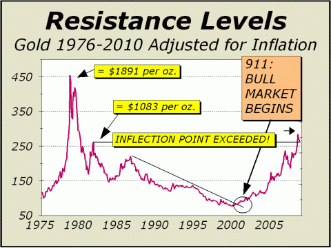
In our last chart, our inflection point provided resistance and now functions as support. Subscribers may note how the highlighted labels for dollars per ounce have risen over time, in line with the effects of inflation. Thus, when inflation begins to pick up steam, the 1980 price peak will ratchet higher than the $1891 per ounce we currently show. Again, bear in mind that our charts are based
on monthly closes only.
Below, reprinted from the February
1, 2010 issue of Crosscurrents.
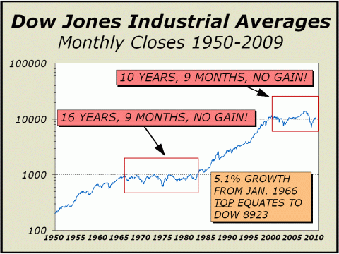
Ten Years, Nine Months, No Gain. The most significant aspect of the gigantic 1982-2000 bull market was the overwhelming mindset change that convinced investors a new paradigm had been birthed, a paradigm in which prices might correct only short term but would plod their way relentlessly higher at a rate of growth far exceeding any before seen in history. The tech mania somehow took Nasdaq to a price earnings multiple of 250, an excruciatingly insane proposition, implying a rosy scenario lie ahead for an entire generation, plus earnings that were discounted many years into the future. Eventually, the bubble imploded. But despite the damage done to 401k plans, IRAs and the like, the broadest index measures still recovered to new highs, although several years were required for the psychology to pick up again to near manic proportions. The new paradigm repeated and the second peak in belief was unwound with a resounding crash and for the second time in only six years and four months, the broadest measure of stocks was neatly sliced in half. Yet again, despite the damage done to 401k plans, IRAs and investor portfolios, belief in the new paradigm returned and professionals ratcheted up optimism to extreme levels as the broadest index measure soared 72% from print low to print high. Fund managers reduced the cash-to-assets ratio to just 3.6% of assets, one-tenth of a percent higher than the record low, and the bearish contingent of investment advisors contracted to the smallest in over a generation. However, the longer term view of the stock market clearly illustrates that the paradigm was and is out of touch with reality. Like the earlier secular bear market that commenced in January 1966 as the Dow Industrials traded over the 1000 mark for the very first time and extended sideways for over 16 years, the current secular bear remains in place, ten years and nine months after the Dow first traded above the 10,000 level.
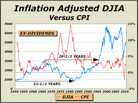
Over the last century, the stock market has averaged a 5.1% annual rate of gain, ex-dividends. Given the long history, it is fair to assume the future at some point will repeat the past and that stocks will revert to their normalized and characteristic returns. If so, our featured chart above has superb relevance. As of today, 5.1% annualized growth would place the Dow at only 8923. A year from now, the same pace would place the Dow at 9379. Go another year out to the end of January 2011 and the same rate of growth would place the Dow at 9857, less than today. Take the secular bear out yet another four years so that it equals the 1966-1982 bear, and the same rate of growth places the Dow at 12,207, still 13.8% lower than the all time high of 14,165 registered in October 2007. Far fetched? We have gone on record that we expect the bear market to conclude sometime in the fall, specifically late October of 2010. Of course, a new bull market might commence from far lower levels than today and that circumstance would make our chart significantly more believable. If prices subsequently correct to 8400 and rise to 10,000 into January 2011, the rise would certainly be more in line with what history has shown to be sustainable. If instead, we are destined to test the Dow 6469 print low of March 2009 this year, the subsequent 54% rise into January 2011 would clearly be dramatic. Ironically, if anything, we consider a scenario such as this to be quite bullish. And for those who might consider that longer term, the Dow is oversold, our front page picture says otherwise. The scenarios we present today are entirely logical. Additional problems seem inevitable. Going forward, whether a deflationary or inflationary cycle lies ahead, stocks will suffer. And a third option of modest inflation would likely be a period of stagflation, or stagnant economic growth. Below left, we see the results of the last high inflation phase. Why adjust the Dow Industrials for the effects of inflation? Why wouldnt we?! The governments Consumer Price Index has only doubled since August 1985, but can you trust the statistics? What has only doubled? Everything else we can think of, including butter, autos, furniture, fuel, health care, college tuition, you name it, has far more than doubled. If your portfolio only doubled since August of 1985, theres no way you could cash in and buy more than you could have 25 years ago. Thus, we believe the inflation adjusted Dow is a pertinent indicator. From 1950 to 1982, the inflation adjusted Dow gained zero. From 1966 to 1996, the inflation adjusted Dow gained zero. It is now ten years plus from the December 1999 inflation adjusted high and the inflation adjusted Dow has lost ground and must rise 46% to break even with the peak. Those whose portfolios remain at virtually the same price level cannot possibly buy as much as they could a decade ago if they cashed in.
By plugging in a few numbers for the years ahead, perhaps we can get some perspective on what may yet occur. For example, assuming inflation averages a mere 3% over the next three years, a Dow at 11,134 buys absolutely no improvement from here. In five years, the Dow at 11,813 buys no improvement. Factoring 5% inflation for the next five years, a Dow at 13,005 will actually equate to zero improvement. And given the economic background, we would expect more inflation, not less, which means even higher index levels will be required just to keep even with today. Thus, our expectation that the next bull market will bring only nominal gains is again confirmed. As we wrote in our previous Pictures of a Stock Market Mania update... The last secular bull market
was extraordinary.
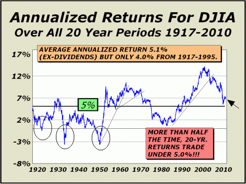
An Important Long Term Perspective CHART DATA THROUGH MAY 7, 2010 Is there any point in ignoring a history dating back 93 years? We think not. Thus, the chart you see below is one of the most fundamental we can construct. Over the long course of time, stocks as measured by the Dow Industrials, have gained on average about 5.1% per year annualized over all 2-year periods (ex-dividends). Of course, there are many who would argue that point, but those that do have been indelibly impressed by the benign history of only the last three decades. Not only is the long term average far below where it was at the 2000 peak (and even now), more than half the time, annualized returns for all 20-year periods have been below 5%! While we might be able to excuse a portion of the trip below our 5% line during the 1930's, due to the Great Depression, and similarly excuse the poor performance into 1950 as the effects of World War II were felt, thee is no reason to excuse any portion of the secular bear market that took this indicator to near zero just before the secular bull market erupted in 1982. Thus, we believe quite strongly there is a significant possibility our line once again travels much further south. Given the impact of the world wide crash of 2008-2009 and subsequent factors, such as the currency crises and debt problems we wrote about in the Year Ahead issue of Crosscurrents, there is every reason to expect we will see the 5% level again.
If we use the May 7th Dow close
of 10,380 and simply take it out every week in time,
We've already experienced eleven
years of no gains,
To see a free sample copy of the Crosscurrents newsletter, CLICK HERE
*THIS USED TO BE OUR FORECAST SECTION Some of our readers may be aware of a recent "study" of stock market forecasters, published by an internet blogger. In our case, this blog reported accuracy ratings that we can only describe as devised and so far from accurate as to be laughable. Needless to say, our forecasts were interpreted incorrectly and denigrated. We have no desire to direct any traffic to this blog and if you are interested in seeing the "study," you will have to search for it. The blog admits "The Crosscurrents forecasts/targets frequently include qualifications/embellishments that makes testing difficult," yet the ratings were undertaken as if gospel. The blog further admits that "a few very bad forecasts make the average absolute error high." Ironically, and most disturbingly, those very same forecasts begin and end with our initial forecast of a secular bear market bottom at Dow 6400, originally published on our website as far back as 2003 and published in our Washington, DC speech before the International Federation of Technical Analysts in November of 2003. However, as our initially cited time target was pushed out with each new forecast, the aforementioned study considered the entire forecast before it to be utterly wrong and in some cases, awarded us a rating of minus 80% accuracy. That is a stunning misapplication of statistical science, in that the actual bear market low to date was Dow 6469 print basis on March 6, 2009. On a number of occasions, we also specified an SPX low of 680, about as close as one can get to the actual 683 closing low. We not only forecasted the actual price bottom with pinpoint accuracy, we did so six years before the fact. Moreover and most importantly, we have usually cited the upside parameter as "potential" and the downside parameter as "risk," in order to highlight both the best and worst possible cases. The study incorrectly interprets each of these parameters as actual forecasts, which must, by definition, make one or the other of our parameters hopelessly wrong. The market cannot move in both directions at once. If an actual forecast has been issued in the past, it is typically not accompanied by a disclaimer, such as upside "potential" or downside "risk." It has always been accepted wisdom in our business that one does not forecast both price and time together. If a time is specified, never specify a price. If a price is specified, never specify a time. It is sufficiently difficult to forecast one of the two aspects alone. Most forecasters follow this golden rule. When we issue a forecast, we typically do not follow the golden rule. However, the denigration of our forecast results by this faulted study has cast a serious pall on our desire to continue publishing price and time forecasts for the benefit of the public on the free portion of this website. The Crosscurrents website has had more than three-and-a-half million visitors since it was established in 1999 and we are quite proud to display just a few of the many kudos accorded us by readers at http://www.cross-currents.net/kudos.htm. We did not earn these kudos by publishing wrong forecasts time after time. Despite our desire to continue serving the public, we will no longer expose our analysis to faulty studies and inadequate math on the free portion of our website. Therefore, our policy is now changed. While we will continue to publish the very popular Pictures of a Stock Market Mania feature, we will no longer provide any price and time forecasts or parameters as have accompanied this feature in the past. The subscriber portion of our website will have the same article accompanied by price and time forecasts and other parameters as we deem significant, as it always has. If you wish to see these forecasts and or parameters, we suggest you subscribe or purchase a copy of the full article for $20 [CLICK HERE]. If this policy change does not meet with your approval, we certainly understand and nevertheless, invite you to continue reading the free articles we post for the benefit of the public. THE CONTENTS OF THE ENTIRE WEBSITE ARE COPYRIGHT 2010 CROSSCURRENTS PUBLICATIONS, LLC I hope you have enjoyed your visit. Please return again and feel free to invite your friends to visit as well. Alan M. Newman, May 19, 2010
All information on this website is prepared from data obtained from sources believed reliable, but not guaranteed by us, and is not considered to be all inclusive. Any stocks, sectors or indexes mentioned on this page are not to be construed as buy, sell, hold or short recommendations. This report is for informational and entertainment purposes only. Persons affiliated with Crosscurrents Publications, LLC may be long or short the securities or related options or other derivative securities mentioned in this report. Our perspectives are subject to change without notice. We assume no responsibility or liability for the information contained in this report. No investment or trading advice whatsoever is implied by our commentary, coverage or charts. |
|
|