|
- THE GREATEST STOCK MARKET MANIA OF ALL TIME - DATED MAY 8, 2005 A SPECIAL REPORT BY ALAN M. NEWMAN, EDITOR SAMEX CAPITAL'S STOCK MARKET CROSSCURRENTS This feature is now published on a quarterly basis. Our workload has increased far beyond our capacity to update all our features on a regular basis and much of the material in this report has been excerpted from the last three months of the Crosscurrents newsletter. However, data for articles and charts have been updated. |
| This is our
49th report on the ongoing mania since we first published our website on
January 15, 1999. Since that time, well over three million visitors
have perused our free offerings and well over one million visitors have
visited this page. At first, we published monthly, then every other
month, and we now publish this feature quarterly. It is an incredibly
huge task to put together a free report of this size while composing several
other free features and then to publish a paid subscription stock market
newsletter, where our only rationales for existence are powerful commentary,
unique perspectives and reality checks that cannot be found anywhere else.
We have been told far too often that we do not charge enough for our work.
This page is perfect proof. If you need to know what keeps the Editor going,
check out the testimonials on our Kudos
page.
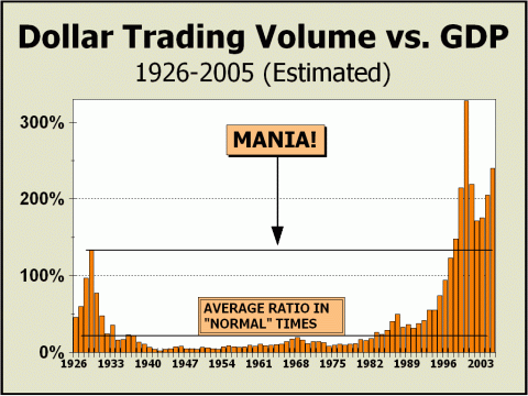
- TRADING SOARS AGAIN - If you check out our February mania update for comparison, you will see a huge jump in Dollar Trading Volume versus GDP over the last three months. We are now at levels only matched in the fateful year 2000 as participants overreached in the belief that anything was possible and that prices could go infinitely higher. How else might one explain the spike you see below, so far in excess of what occurred in 1929? What makes the comparison extremely interesting is that DTV for the Nasdaq market is still almost half of what it was in 2000! The difference is two-fold. First of all, DTV for the New York Stock Exchange is nearly 29% higher than in 2000 and secondly, the tremendous trading of Exchange Trading Funds on the American Stock Exchange has contributed to transactional velocity. Since data for the Amex is not published, we can only make crude estimates and we believe the Amex is now generating more than four times the DTV it generated in 2000. In 1929, DTV was 228% of total market capitalization. In 2000, DTV was 203% of total market cap. If one required proof of a mania, this one statistic (not pictured) was as germane as any. At the present rate of transactional velocity, the year 2005 will witness DTV at 199% of total market cap. Thus, we believe our posit
that a mania is still visible
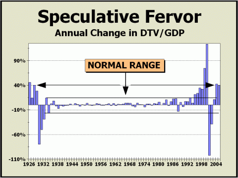
- SPECULATION IS ON A PAR WITH 1929 - PORTIONS OF THIS ARTICLE ARE REPRINTED FROM THE FEBRUARY 28th ISSUE OF CROSSCURRENTS The mania really came into full bloom as stocks recovered from the Long Term Capital Management mini-crash in the fall of 1998. As the market moved into high gear, we attempted to show every single perspective we could think of to highlight manic activity. We chose total Dollar Trading Volume versus Gross Domestic Product as an especially significant marker, since it was approaching levels only seen in The Roaring Twenties. And by the end of 1998, DTV had registered a brand new peak versus GDP, proof positive that nothing was more important than stocks. And despite the obvious shift of some assets into housing in recent years, all the indicators we present on our Pictures Of A Stock Market Mania report still point to a stock bubble very much in progress. The featured chart below shows a perspective we have not examined in at least a couple of years, wherein we plot the annual changes in Dollar Trading Volume divided by GDP. In this manner, we hope to portray how speculation rises and falls on a yearly basis with some clarity. Clearly, the normal range is an arbitrary choice, since we do not have definitive criteria, but given a consecutive span of 62 years from 1933 to 1994 and a range of -15% to +15%, we feel comfortable with our notion. Now that Speculative Fervor is once again surging and is at the exact level achieved in 1929, we feel it is time to trot out this perspective once more. In the January 24th issue of Crosscurrents, we showed how the one-year moving average of mutual fund cash levels had run to a new generational low. Versus the background of interest rate hikes, it is clear that fears of the downside are nil - allowing speculation to rear its ugly head. However, since 1950, a sixth rate hike has witnessed an average decline in the S&P 500 of 3%-4% after three months, 10% after six months and 15% one year later. As well, the Fed is on track to continue hiking, even if only in minimal increments. Why stocks still remain in such favor can only be attributed to the wide held belief that no permanent harm can befall those who participate on the long side. Certainly, those beliefs were widely held in 1929. Were not suggesting a repeat of the crash and burn that occurred in either 1929-1932 or 2000-2002, but with speculative fervor again so high, the odds should favor a return to the normal range and most likely soon. If so, the remainder of the year should be at best, pretty much a non-event for bulls and at worst, a fulfillment of our 2005 low target of Dow 8500. We still believe the secular
low will arrive in 2006.
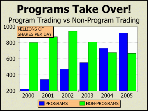
- JUST WHAT INVESTORS NEED, MORE PROGRAMS - The article below was presented
in the February 7th issue of Crosscurrents.
The New York Stock Exchange's announcement of plans to extend the trading day by two hours should come as no surprise. After all, it's all about money, right? And falling seat prices. It was just revealed that NYSE seat prices have fallen to their lowest level in almost ten years, clearly raising fears about the future for the venerable 212-year-old institution. A seat sold for $2.65 million in August 1999, less than seven months before the Crash of Nasdaq, and two weeks ago a seat traded hands for a mere million bucks. The Specialist system must now compete with electronic exchanges and members face a vast increase in competition from other products, such as Exchange Traded Funds, most of which trade on the American Stock Exchange. But the NYSE has run with their only advantage, encouraging program trading of every kind and description. As the chart below clearly illustrates, programs now account for the lion's share of activity on the most senior of U.S. stock exchanges. Program activity is still rapidly on the rise after accounting for more than half of all volume last year. Program volume has more than quadrupled in five years, even as non-program volume has declined. At the current rate, for every share of non-program activity transacted on the NYSE, there will be at least 1-1/3 shares of programs. But why is this expansion in program activity a bad thing? We're glad you asked. In the past, individual company prospects were the paramount metric. Prospects were determined by analysts and portfolio managers who actually visited the companies that they were interested in, to get the best perspective possible about the company's operations. The procedure is still in place on a more modest scale but has been largely supplanted in importance by the dramatic increase in indexing. It is easier for the average portfolio manager to compete with index or sector funds by more closely resembling an index or sector. For example, the top holding in the $145 million Fidelity Structured Mid Cap Value Fund is the iShares Russell Midcap Value ETF (IYR). Perhaps the managers can be trusted to have visited the number two holding of TXU Corp. to account for their confidence in TXU, but the iShares position says nothing about the individual companies in the group and is only a nod for an entire sector at the risk of participating in the declines of the very worst companies in the group. This is not a sane investment policy in our view. Not long ago, the NYSE made the comment that program activity actually represented a smaller share than tallied, since activity was double counted. That is, for every share on the buy side there was a share on the sell side. Ironically, the NYSE ignored the fact that the same situation is relevant for non-program activity as well. The tallies are an accurate representation of the mechanical effects ruling trading today. In the words of Doyne Farmer, a researcher with the Sante Fe Institute of New Mexico, "Our analysis ..[says] maybe a lot of price movement is more or less mechanical." Worse yet, as more money under management becomes indexed, there is an even greater possibility of arbitrage or other "strategic" opportunities, accentuating the vicious cycle. On January 31st, the IYR traded at a premium of 0.25% to the underlying constituents. You and I could not perform an arbitrage on the minimal discrepancy in pricing, but many trading firms can. Two firms alone accounted for more than a billion shares in programs the week of January 21st. The more shares are traded on the basis of "strategies," rather than for their investment potential, the greater the risk that the shares may become mispriced relative to their value. How can arbitrage possibly reverse mispricings of individual issues if the arbitrage takes place using most or all of the constituents of an index or sector?! We need look no further than the continuing chasm between historical valuations for the S&P 500, more than 80% of the U.S. stock market, and present valuations. Is this not ample proof that
indexing and program activity
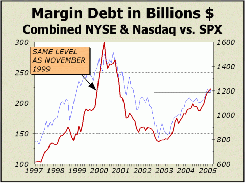
- MARGIN DEBT IS RISING - The article below was presented
in the February 7th & March 14th issues of Crosscurrents.
We haven't shown this particular perspective of sentiment in quite awhile, but the right time certainly appears to have arrived. Simply put, when folks are at their most bullish, they cannot resist going out on a limb. When the mania surged to its most lunatic levels in March 2000, speculators levered themselves like never before. Margin debt levels increased to a hair shy of $300 billion, equivalent to roughly 3.1% of Gross Domestic Product and 1.7% of total market capitalization. The former was the highest since the Roaring Twenties slammed head-on into a collision with reality. Total margin debt is now more than 1.8% of GDP and over 1.4% of total market cap, clearly not as high as in 2000, but considering how prices collapsed after March 2000, at very worrisome levels nevertheless. Margin loans have soared by 60% since September 2002 and the additional $81.5 billion in buying power provided by these loans has bought a 48.7% improvement in the S&P 500. We do not yet have data for January but the tally visible below through December, is on an exact par with November 1999, a scant four months from the peak. We're not sure how much more evidence is required to prove the mania only took a time out, but it is crystal clear from what we have shown in the last few issues that participants are not concerned about the possibility of a stiff price correction, let alone a resumption of the secular bear market. The time elapsed from the October 2002 bottom is now 2.3 years. In the twentieth century, a 15% price correction occurred on average, every 2.23 years. Maybe the twenty-first century will find markets unfolding in a more friendly manner, but we wouldnt make book on it. As stock prices fell 2.5% in January, total margin debt unexpectedly rose another $2.5 billion to $220.1 billion, nominally higher than the $218.3 billion registered in November 1999, only three months and ten days before the greatest stock market bubble of all time finally burst. Why unexpected? Margin debt has risen in only 16 of 57 prior months (28%) that stock prices have declined. It is not likely that the record level of nearly $300 billion in margin debt established in March 2000 will be seen for a very long time to come. The Fed had already recognized the possibility of a mania as early as December 1996 and was considering methods to deal with the bubble right up to the end. Although they sat and watched last time around, dealing with the fallout meant forcibly pulling short rates to negative, which only accentuated the publics desire to take on debt. Given that the current level of margin debt versus total stock market capitalization is actually higher than it was in November 1999, we believe the Fed is monitoring the situation far more closely now. If margin debt continues to rise as it did in the last few months before the bubble burst, the Fed will have a compelling reason to finally increase margin requirements. We would expect Wall St. to fight such a move tooth-and-nail, ...and fail.
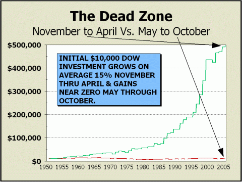
- THE DEAD ZONE ARRIVES
-
Buy-and-hold is utter nonsense.... Over the last 54 years and change, holding stocks from the beginning of May to the end of October in the average calendar year has been disastrous, a veritable dead zone. Virtually ALL of the stock market's gains have come from the first day in November until the last day of the following April. The proof is seen in our featured chart, wherein we have cut the calendar neatly in two to illustrate the effects of the two disparate seasons. If you had invested $10,000 in the Dow Industrials on May 1, 1950, sold your holdings every October 31st, and repurchased them every May 1st, you would now have a paltry $264.42 profit to show for the 27 years you were in stocks (54 years divided by two). To those who would criticize by citing that our computation is sans the benefit of dividends, we would counter that we are also computing without the penalty investors have suffered via the ravages of inflation. A meaningless comparison? Hardly. The 54-year average dividend yield of 2.99% pales next to the indisputable fact that the 1950 U.S. dollar is now worth only 12.3 cents, a rate of decay that far exceeds the impact from dividends! On the other hand, if you had invested $10,000 in the Dow on November 1, 1950, sold out on every April 30th and repurchased on every November 1st, your stake would have grown to $496,630! The odds of a discrepancy this huge between the two seasons being a statistical fluke are rather remote.
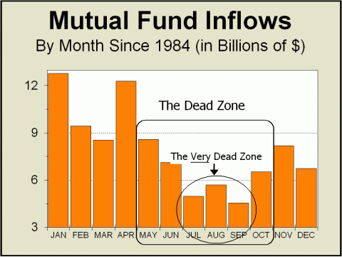
We have no reason to suspect the pattern will change this year. Thus, we expect inflows to again contract during the Dead Zone and provide little, if any, support for stock prices. Since March 2003, a period of over two years, stock prices have moved mostly upwards or sideways or have given ground very slowly. However, history implies a 10% or greater correction will occur every 1.44 years and a 15% or greater correction will occur every 2.23 years. The timing would seem to be propitious for
a correction of substance to occur
If measured from the Dow price of 10,192 as of the end of April, our targeted annual Dow low of 8500 is only 16.6% away. Perhaps our target is a bit low; as usual, we prefer to adjust targets as time passes to account for developments. However, it is clear from the pictures we show today that risks for investors are now quite substantial and we believe the odds favor those who are now out of stocks....at least until the end of October. Simply put, our target could also be too high.
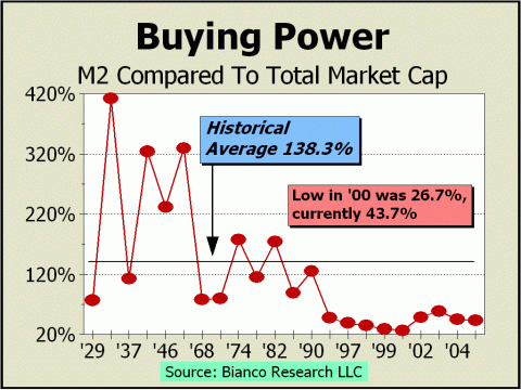
- BUYING POWER IS RUNNING LOW - Our fourth chart shows that a portion of the demand for stocks comes from the application of purchases made via margin loans, but margin loans are not possible unless cash has been committed in the first place. Thus, in the final analysis, cash represents potential buying power for the stock market. When the money supply expands rapidly as it did for the anticipated upheaval of "Y2K," the reservoir of buying power is potentially multiplied by two from margin loans. January 1, 2000 arrived and computers still worked, elevators still ran and nothing of note occurred except the mania was enabled to stage a stratospheric run. Check out our fourth chart again to see how margin exploded into the peak. With the benefit of hindsight, the Fed will certainly not allow a repeat performance. If we allow that a return to the historical average is at all possible, the size of the U.S. stock market could drop dramatically in the future - or money supply could expand dramatically - or a combination of the two factors will occur. However, without an
equal surge in margin loans,
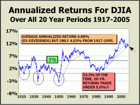
- WHERE IT ALL LEADS - Returns for stocks have been spectacularly high for years. Long term gains such as those registered since the mania commenced are in theory, impossible to maintain. If, on the other hand, gains such as these were possible, then one of two circumstances would have to be present. 1) Other asset investments would have to keep pace to compete or simply vanish. In this case, the only way bonds could possibly compete would be for interest rates to rise. Even when factoring in safety, bond yields would have to be far higher than now to compete with the 20-year annualized return of 10.84% from stocks, ex-dividends! Adding in the average 2.04% dividend yield over the last generation takes stocks (via the Dow) to a total return somewhere in the neighborhood of 12.88%. If long term bonds were fairly priced at a yield 3% below that of stocks, the equivalent yield of 9.88% would drop the prices of today's bonds by more than one half! Since the bond market is actually many times larger than that of stocks, the losses in wealth would be staggering. The resulting shock would decimate stocks, since stocks are purchased with wealth. Less wealth, less purchases. 2) An era of extremely high inflation would also allow stocks to maintain their support, but it would be only an illusion, since a dollar in another generation might be worth only a fraction of what it once was. This factor was at work at the prior peak for our chart on April 7, 1962. At the time, the Dow was 710. Although the 20-year return slackened dramatically, the Dow was 16.6% higher at 828 on the same date in 1982. Within seven months, the Dow was 47.6% higher. Trouble is, in terms of the April 1962 dollar, the April 1982 dollar was worth less than 32 cents. By November 1982, it was worth less than 31 cents. Thus, we can speculate that long term returns must eventually decline to more reasonable levels. Our most likely assumption is that 20-year returns of 5% will once again occur at some point in the future. As our chart clearly illustrates, returns below the 5% level have occurred more often than they have not. If we posit that the 5% level is reached in five years, the Dow would be trading under 7500, down 27.4% from now. If we posit instead that the 5% level is reached in ten years, the Dow would be trading at about 11,522, still more than two hundred points below its all time peak. If we rely on time alone to bring returns down to the 5% level with no damage at all to prices, that time will be achieved late in December 2014. Eventually, returns must normalize. Where does the mania lead? In our
view, lower or sideways prices....
From this writer's perspective, the anticipated "summer rally," could easily turn out to be the bull's last at bat for awhile. The arrival of the Dead Zone should afford very little in the way of support for higher stock prices. The May 9, 2005 issue of the Crosscurrents newsletter details more reasons to expect our low side targets to be achieved later in the year, most likely during September/October. Meanwhile, the stock market mania is still very much in our view.
High
Targets for 2005 - high odds that the tops are in:
Low
Targets for 2005 - even odds: most likely case is autumn bottom
Long
Term Targets for ultimate secular bear market low - now most likely to
occur in 2006
THE CONTENTS OF THE ENTIRE WEBSITE ARE COPYRIGHT 2005 ALAN M. NEWMAN I hope you have enjoyed your visit and please return again. If you know anyone who might be interested in seeing what we have to offer, we'd be happy to have them visit as well! Alan M. Newman, May 8, 2005
All information on this website is prepared from data obtained from sources believed reliable, but not guaranteed by us, and is not considered to be all inclusive. Any stocks, sectors or indexes mentioned on this page are not to be construed as buy, sell, hold or short recommendations. This report is for informational and entertainment purposes only. Samex Capital, Alan M. Newman and or a member of Mr. Newmans family may be long or short the securities or related options or other derivative securities mentioned in this report. Our perspectives are subject to change without notice. We assume no responsibility or liability for the information contained in this report. No investment or trading advice whatsoever is implied by our commentary, coverage or charts. |
|
|