|
THE GREATEST STOCK MARKET MANIA OF ALL TIME - DATED MARCH 27, 2011 A SPECIAL REPORT BY ALAN M. NEWMAN, EDITOR CROSSCURRENTS This feature is now published on roughly a quarterly basis. Our next update will likely be published in early July 2011 |
|
Our readership
is world-wide.
This report
is primarily a compilation of articles that have previously appeared in
the Crosscurrents newsletter.
Please check out the testimonials on our Kudos page. Printable
files of this report accompanied by our forecast are available only to
paid subscribers.
We admit our statistics for total Dollar Trading Volume (DTV) are not 100% accurate. We're not even sure that any entity would be able to tally exact numbers at this point. The BATs exchange purports to report it all (links for trading on Friday, March 18th) and our link shows data for 15 arenas, including Nasdaq and the New York Stock Exchange but is everything reported, including all transactions in so-called dark pools? We're by no means sure they are. Wikipedia's article (see http://en.wikipedia.org/wiki/Dark_liquidity) states that "the trade is usually visible after the fact in the market's public trade feed" for so-called "Iceberg Orders," but usually means not always. Furthermore, regarding dark pools, the Wiki states that ".... detailed information about the volumes and types of transactions is left to the crossing network to report to clients if they desire and are contractually obligated." This certainly sounds like information can be withheld. If information can be withheld, some information can be assumed to be withheld. [CLICK
FOR NYSE TRADING]
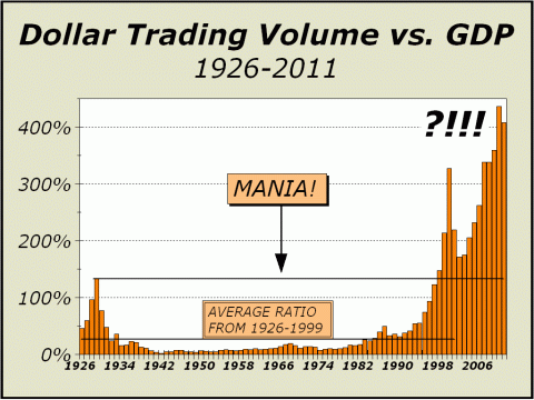
Thus, our tally is best treated as an estimate. In any event, we are confident that our estimates are within 1% to 2% of the actual totals. Given the size and scope of trading in today's markets, a rough estimate is all we need to infer a continuing environment that is distinctly unfriendly to investors, both individual and professional, an environment that favors high frequency traders and those who trade via programs and algorithms. At the pace of the last 12 months, the NYSE will alone account for $18.69 trillion in dollar trading volume. If we use the month-to-date average of NYSE trading as a percentage of overall trading (28.22%), we can estimate total DTV of $66.22 trillion for this year, slightly less than last year's estimated total of roughly $65 trillion. However, we have refined our estimate a bit further and as of today, believe DTV totals approximately $61.26 trillion, an amount equal to almost four times total market capitalization and easily more than four times the country's gross domestic product. Remember the tech mania of 1999 and 2000??? Trading has doubled since then.
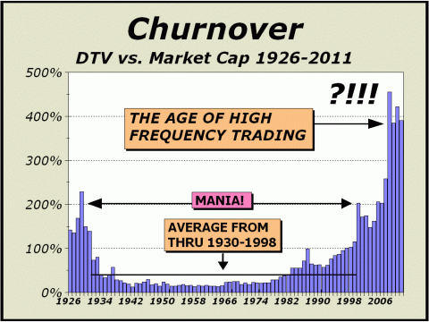
Turnover in the U.S. stock market is so rapid, we now term it "Churnover." It's all about the churning. Imagine, on a routine day, stocks are transacted at a rate four times all the transactions that take place throughout our economy. If the public represented the overwhelming majority of transactions, as they used to in decades past, commercial activity would grind to a complete halt as there would no longer be sufficient time to actually labor to produce goods or provide services. The SPDR S&P 500 ETF Trust (SPY) hit its peak on February 18, 2011. Volume in the rally had previously begun to contract - a bad sign - yet close to $16.9 trillion of SPY shares traded that day, equivalent to 41% of the day's GDP. But that was just an ordinary day. On May 6th of 2010 when the "flash crash" occurred, DTV for just the SPY alone totaled an astonishing $73.11 billion versus perhaps $41.15 billion generated by the economy. High frequency trading (HFT) probably accounts for as much as 70% of all trading nowadays. HFT requires that participants seek out quicker and quicker ways to transact, lest the competition jump ahead of them. Trading, which was once confined to orders placed in milliseconds from the time information arrived at computers, has been accelerated to microseconds and is well on its way to picoseconds (one-trillionth of a second). Although HFT proponents claim the market enjoys increased liquidity, it most certainly does not. Last May 6th, when the Dow dropped 1000 points in mere minutes was all the proof one needed to illustrate that HFT does not promise liquidity. Despite the propaganda, as long as bids can be pulled en masse by participants, all in reaction to one another, our markets will continue to suffer the threat of new flash crashes. It's not a matter of if, it is a matter of when.
Clearly, HFT transactors trade
ahead of the public
HFT transactors trade with the equivalent of inside information. Non-HFT trading now amounts
to roughly $18.4 trillion.
Is there any doubt that the public cannot possibly receive the best price? Our stock market no longer
serves the public.
The following article was the
lead article in our February 21, 2011 issue.
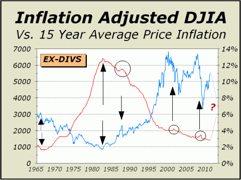
Lies, Damned Lies And Statistics. It seems like a hundred years ago now, but it was November 1996 when your Editor had his first article published in BARRONs. The subject was the relationship between inflation and stocks and specifically, we cited a long term 14-year average rate of inflation, which after further research, was tweaked to 15 years. We speculated that the common wisdom was all wrong. The widely held conventional view has always been that a rise in inflation is bad for stocks and a lower rate of inflation is good for stocks. The question we posed was suppose inflation has little impact upon stocks? Suppose, instead, the stock market has a major impact upon inflation? The theory is simple; its all about the allocation and reallocation of money. When stocks are out of favor, money tends to be reallocated into other assets including commodities, and as a result, inflation rises. When stocks are in favor, money drains from other assets including commodities and inflation moderates. Todays featured chart is a compelling view of our theory at work, beginning with a secular peak for stocks in 1966 and lasting 16+ years to the secular bear market low in 1982 and another 13+ years until the Dow regained its former inflation adjusted peak. Money flowed out of stocks and into other assets and commodities and then the flows reversed into stocks; stock prices rose and average CPI fell. As more and more money poured into stocks, there was relatively less available to flow into commodities and other asset classes, thus inflation continued to fall. When our lines crossed in 1995, the total assets of mutual funds were less than $1 trillion. From that time to the top in March 2000, another $1 trillion flowed into stock mutual funds, pushing the rate of inflation still lower. And then things began to get really interesting. Despite the obvious dichotomy, that stocks have remained out of favor and the long term CPI has continued to decline, we see three bumps where a crash in stocks was accompanied by a brief bump up in the long term CPI. Nevertheless, a recent dichotomy. Or is there?
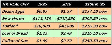
We cant think of very much that costs less than it did in 1995. Computers, sure. But we do not eat computers, nor do we wear them, nor do we live in them nor do we drive them to work. Despite the governments computations, everything important seems to be far more expensive for consumers than the CPI would have you believe. A recent visit to John Williams Shadow Stats website (see http://www.shadowstats.com/) was quite instructive. Take Mr. Willams inflation calculator, for instance. Plug in any dates you want (http://tinyurl.com/4vgcezp) and see how Williams SGS stats compare with the officially. stated CPI for the same period of time. For instance, from mid-1995 through the end of last year, the official CPI says it took $143.72 to buy what $100 used to buy, an annualized rate of 2.4%). ShadowStats claims it took more than $350, an annualized rate of 8.7%. See the table below; a small sampling of price increases since 1995 showing what it costs now for $100 worth of the same in 1995. While the average of this sampling does not approach the ShadowStats $350, we have left a lot out. Nevertheless, our average comes to $209.34, more than twice the CPIs stated rate. Bear in mind, we spend a lot more money on bread, gas and tuition than we spend on eggs. A real-life average based on likely spending habits and with a complete list of consumer needs, and the ShadowStats average is eminently believable. Thus, there really is no dichotomy at all. Clearly, inflows into stocks have not only abated, they have turned extremely negative in the last few years and as a result, money has found other places of favor, lifting prices substantially along the way. Prices for rice, grains, cotton, oil, copper and other commodities have been soaring. Prepare to be shocked by http://www.indexmundi.com/commodities/. We have no doubt whatsoever, that the CPI is woefully understated, a lie, a damned lie, a statistic utilized to calm fears and even mitigate the governments social security obligations, which in 2009, totaled $650 billion.
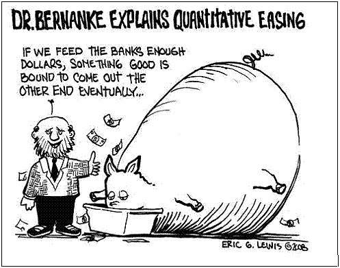
Worse yet, the stated policy of the Federal Reserve to lift stock prices, has to exacerbate the problem of rising prices. The amount of money we need to print to buy all the bonds required by QE1 and QE2 cannot help but result in higher inflation. If there is going to be a significant increase in the supply of money, everything whether nailed down or not must eventually cost more (including stocks). It is the law of supply and demand at work. Thus, now were in a very strange situation; negative inflows provide pressure while the increasing stock of money provides impetus. In the last year, M2 has risen by $332 billion. While that has had the desired effect upon stock prices, it is also having an undesirable effect upon other prices. In our view, we are facing an inevitable rapid rise in inflation, including the very visible CPI, not just the Shadowstat version. We have no doubts about QE2. It cannot work. Why the Fed Chairmans goal of lifting stock prices may be admirable for some, it cannot address the lost wealth from housing nor the continuing plight of those who are underemployed. If one wanted to make just plain folks feel more comfortable about spending money to lift the economy, a better target would be to lift housing prices. Instead, housing prices remain mired as interest rates rise, a direct result of the further debasement of our currency. Furthermore, as this insane policy continues to be implemented, we must expect interest rates to rise still more, exerting still more pressure on housing prices. The QE2 exercise is palpably insane.
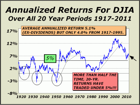
Although stock prices are rising, were not sure who is getting rich besides high frequency traders and the major brokers. When JPMorgan and other bankers announce they have been able to trade six months without even one losing day, can Mr. Bernanke really opine that John & Jane Doe are feeling that much better about their portfolio that they will spend enough to create 4 million jobs? While stock prices have risen, housing prices have gone nowhere. Herein lies the real dichotomy as housing has always been the best measure of wealth for Americans. On one hand, there remains a sullen, or more realistic outlook for housing while stock market bulls continue to proliferate based on the Feds stated goal of reflating stocks, apparently to prior bubble levels. Yet, as our featured chart clearly illustrates, stocks remain well below their inflation adjusted highs. History has been a great teacher. As we show below, stocks (ex-dividends) can be counted on to return roughly 5% per year over the long term. Sometimes more, sometimes less. Sometimes much more, sometimes much less. Annualized 20-year returns now stand at 7.3% (ex-dividends), far above the historic norm. We believe that long term returns are destined to eventually regress to the historic norm of 5%. If we are correct, Bernankes plans are for naught. If The Dow simply went nowhere, the 5% level would not be reached for another four years and three months, in May 2015. Even a return to a very generous 6% would take three years at Dow 12,000. And consider that long term returns have been above a 6% benchmark less than 44% of the time. Expectations for stocks are still way too high.
The S&P 500 recently achieved a CAPE (Cyclically Adjusted P/E) of 24. CAPE is based on ten-year earnings adjusted for inflation. A similar run occurred during the Roaring Twenties, peaking in 1928, again into the 1937 peak, again into the 1960s, just before the 66 secular peak, and again into the great tech mania. Todays overvaluations imply bare-bones returns for years to come (see John Hussmans views at http://tinyurl.com/48h36xz). When ten-year annualized returns rebounded after the 2000-2002 crash to more than 11% in November 2004, our outlook remained grim and not only did we predict a fall to the historic norm, we claimed very good odds that the ten-year annualized rate could fall to zero. Ten-year annualized returns
eventually fell to nearly minus 4%
We now expect 20-year returns to decline to more normal levels. Money is still coming out of stocks and is moving elsewhere. Inflation is rising and will accelerate in 2011 and quite likely beyond. For those who are interested,
a limited number of reprints of our original BARRONs article are available.
Below, our entire lead article reprinted from the January 3rd issue of Crosscurrents. Time To Punish The Risk Takers Again. In our November 19th interview with Financialsense's Jim Puplava (www.financialsense.com), we were asked about QE2. Our immediate response was to bring up the old saw about "buy on rumor, sell on news." Treasuries were solid for months as speculation centered on the Fed finalizing plans to buy bonds for the ease but when push came to shove and the plan was finally implemented, prices reversed and headed south. Strange? No, not really. Amazingly, despite the Fed's best intentions, interest rates are going up, not down. Incredibly, the Fed has turned out to be even dumber than most of us already knew. By telegraphing each and every purchase, the Fed has enabled the banks and brokers to buy beforehand and then sell to the Fed. And each time the Fed's demand ends, prices drop. Mortgage rates were supposed to decline to enable more affordable housing and easier financing, but only a month after the implementation of QE2, rates were up a full percentage point. QE2 has done nothing except enrich banks and brokers. No one in government understands what is going on. Worse yet, the Chairman of the Fed has now undermined
any remaining confidence that observers might have in Bernanke with his
new stance that the Fed is not printing money, an admission that he candidly
made a year ago. See Jon Stewart explain it all at http://tinyurl.com/38qyngu.
Unfortunately, this is really not comedy. It is tragedy. And
Congress and the Administration are powerless to prevent the creeping oligarchy
of such as those at the top of Goldman Sachs and other firms that purport
to believe they are doing God's work and not robbing our Treasury nor negatively
impacting the lives of most Americans. We believe differently.
The push to securitize literally everything in sight has had disastrous
consequences and continues to threaten our economy (see Mark J. Perrys
and Robert Dells interesting story at http://tinyurl.com/38saz8s).
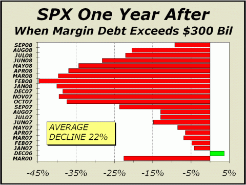
And through all of this, the beat goes on. Stock prices levitate as the Fed desperately and stupidly attempts to create yet another bubble and sentiment turns grossly optimistic. For a couple of months, we have seen a substantial pickup in optimism in several measures of sentiment, such as the Investors Intelligence tally of professional advisors and the American Association of Individual Investors (AAII). Traditionally, excessive optimism in these two indicators points to an imminent correction, often short to intermediate term in nature, a few weeks to perhaps a couple of months. However, our featured chart today indicates risk taking (read optimism) on a far greater scale, implying strong odds for considerably lower prices one year from today.
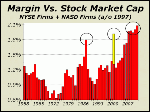
When FINRA released the total margin stats for October, it was only the 23rd occasion in which total margin debt exceeded $300 billion. A year after the very first instance, in December 2006, the S&P 500 was ahead by 3.5%. A year after each of the other occasions, a consecutive string of months from January 2007 to September 2008, stock prices were not only down but were down big, averaging a 22% decline. We have taken the liberty of adding the month of March 2000 to the bottom of our chart, despite the months tally of margin debt not quite getting to $300 billion (it was $299.93 billion). However, a year later, stocks were down 22.6%. Its not that we believe $300 billion in total margin debt represents a magical barrier for stocks but the more margin debt is accommodated by players, it is clear that there is more risk in holding stocks. Leverage was one of the principal factors that undid the great rise into the 2007 peaks for all the major averages, as individuals, banks, brokers and hedge funds resorted to extreme exposure, some in excess of 30-1. Historically, periods of extreme leverage have augured quite poorly for stocks. Just updated: FINRA reported total margin debt up another 2% in November to a total of $309.3 billion. From only six days before the March 2009 low, margin debt has expanded by 54.9%. In the same period of 21 months into the October 2007 peak, margin debt expanded by a lesser amount, 48.8%, Clearly, risks have grown to an extreme. At left below, the same chart we placed in our Chart Spotlight feature at www.cross-currents.net/monthly.htm recently, but updated to reflect data for November. The peak for margin debt in 1987 was accompanied by the greatest stock market crash in history. The black bar for 2000 represents where margin debt was at the March 10th highs (the year end reading is represented by the gray bar). Stocks were subsequently cut in half and Nasdaq was slaughtered, down 70%. And currently, we see the second highest level in history, second only to the utter madness that was described as the Roaring Twenties. We believe the comparison today offers a stark and threatening perspective. Margin debt as a percentage of gross domestic product (GDP) is the highest it has been in decades. The use of excessive leverage was one of the principal factors that catalyzed the collapse from the 2007 highs and only three years and change later, the same situation is at hand. Curiously, since the 2007 collapse, margin debt as a percentage of capitalization has continued to climb. Since 1987, GDP has tripled. Market capitalization is up six-fold. Margin debt is up seven-fold. Dollar trading volume is 27 times what it was. The only fair comparison would be an assumption that the present peak in margin will result in the same type of price collapse as suffered three times previously. Thus, as the year ahead opens for trading, as we have come to expect in the modern era of over leveraged and aggressive strategies, there is considerable risk ahead on the horizon.
The risk takers have returned and they have proliferated. After two halvings in the major
averages in only 9 years,
We expect the risk takers and gamblers to be punished yet again.
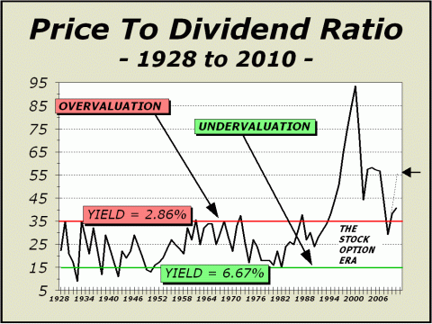
Below, reprinted from the January 31st issue of Crosscurrents. Dividends We urge readers to revisit our archives to see our comments on Edson Gould, written for the February 2004 edition of Pictures of a Stock Market Mania (see http://www.cross-currents.net/archives/feb04.htm). Gould was one of the all time greats and his Sentimeter was one of the most salient concepts ever shared with the public. As our chart above clearly illustrates, the boundaries Gould cited worked wonderfully from 1928 to 1994, a lifetime. And then something changed. We believe a good portion of the discrepancy between then and now is a result of the stock option era. And of course, this is an excellent reason why insiders want no part of their own companies, since dividends are no longer a significant part of the picture. As well, the lack of dividends is a good reason for the public to have lost interest as well. There once was a time when you could invest and afford to sit through a bear market as stocks earned 5%-6% or more while you waited for the tide to shift. No longer. Thus, a nation that grew up on savings accounts and dividends now has neither. A sad perspective on how vastly things have changed. At center, the price to dividend ratio is surging again well into overvalued territory. Although we show the ratio versus the Dow, the dashed line represents where the broad based S&P 500 trades today, significantly higher and much further into overvalued territory.
Yet another reason for the Feds goal to create a stock market bubble to fail.
Once more, the Federal Reserve is making a huge mistake.... Bubbles do not end well.
To see a free sample copy of the Crosscurrents newsletter, CLICK HERE
***THIS USED TO BE OUR FORECAST SECTION*** Some of our readers may be aware of a purported "study" of stock market forecasters, published by an internet blogger. In our case, the blog reported accuracy ratings that we can only describe as devised and so far from accurate as to be laughable. Needless to say, our forecasts were interpreted incorrectly and denigrated. We have no desire to direct any traffic to this blog and if you are interested in seeing the "study," you will have to search for it. The blog admits "The Crosscurrents forecasts/targets frequently include qualifications/embellishments that makes testing difficult," yet the ratings were undertaken as if gospel. The blog further admits that "a few very bad forecasts make the average absolute error high." Ironically, and most disturbingly, those very same forecasts begin and end with our initial forecast of a secular bear market bottom at Dow 6400, originally published on our website as far back as 2003 and published in our Washington, DC speech before the International Federation of Technical Analysts in November of 2003. However, as our initially cited time target was pushed out with each new forecast, the aforementioned study considered the entire forecast before it to be utterly wrong and in some cases, awarded us a rating of minus 80% accuracy. That is a stunning misapplication of statistical science, in that the actual bear market low to date was Dow 6469 print basis on March 6, 2009. On a number of occasions, we also specified an SPX low of 680, about as close as one can get to the actual 683 closing low. We not only forecasted the
actual price bottom with pinpoint accuracy,
Moreover and most importantly, we have usually cited the upside parameter as "potential" and the downside parameter as "risk," in order to highlight both the best and worst possible cases. The study incorrectly interprets each of these parameters as actual forecasts, which must, by definition, make one or the other of our parameters hopelessly wrong. The market cannot move in both directions at once. If an actual forecast has been issued in the past, it is typically not accompanied by a disclaimer, such as upside "potential" or downside "risk." It has always been accepted wisdom in our business that one does not forecast both price and time together. If a time is specified, never specify a price. If a price is specified, never specify a time. It is sufficiently difficult to forecast one of the two aspects alone. Most forecasters follow this golden rule. When we issue a forecast, we typically do not follow the golden rule. However, the denigration of our forecast results by this faulted study has cast a serious pall on our desire to continue publishing price and time forecasts for the benefit of the public on the free portion of this website. The Crosscurrents website has had more than three-and-a-half million visitors since it was established in 1999 and we are quite proud to display just a few of the many kudos accorded us by readers at http://www.cross-currents.net/kudos.htm. We did not earn these kudos by publishing wrong forecasts time after time. Despite our desire to continue serving the public, we will no longer expose our analysis to faulty studies and inadequate math on the free portion of our website. Therefore, our policy has changed. While we will continue to publish the very popular Pictures of a Stock Market Mania feature, we will no longer provide any price and time forecasts or parameters for the public as have accompanied this feature in the past. The subscriber portion of our website will have the same article accompanied by price and time forecasts and other parameters as we deem significant, as it always has. If you wish to see these forecasts and or parameters, we suggest you subscribe or purchase a copy of the full article for only $15 [CLICK HERE]. If you later subscribe, we will be happy to apply the $20 towards your subscription. THE CONTENTS OF THE ENTIRE WEBSITE ARE COPYRIGHT 2011 CROSSCURRENTS PUBLICATIONS, LLC I hope you have enjoyed your visit. Please return again and feel free to invite your friends to visit as well. Alan M. Newman, March 27, 2011
The entire Crosscurrents website has logged over three-and-a-half million visits. All information on this website is prepared from data obtained from sources believed reliable, but not guaranteed by us, and is not considered to be all inclusive. Any stocks, sectors or indexes mentioned on this page are not to be construed as buy, sell, hold or short recommendations. This report is for informational and entertainment purposes only. Persons affiliated with Crosscurrents Publications, LLC may be long or short the securities or related options or other derivative securities mentioned in this report. Our perspectives are subject to change without notice. We assume no responsibility or liability for the information contained in this report. No investment or trading advice whatsoever is implied by our commentary, coverage or charts. |