|
- THE GREATEST STOCK MARKET MANIA OF ALL TIME - DATED JUNE 2, 2012 A SPECIAL REPORT BY ALAN M. NEWMAN, EDITOR CROSSCURRENTS This feature is now published on roughly a quarterly basis. Our next update will likely be published in late September or early October 2012 |
|
Our readership
is world-wide.
This report
is primarily a compilation of articles that have previously appeared in
the Crosscurrents newsletter.
Please check out the testimonials on our Kudos page. Printable
files of this report accompanied by our forecast are available only to
paid subscribers.
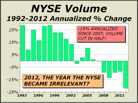
There is no question about it, the age of paper is on the way out. The mania peaked long ago and what we are witnessing at this juncture is the dying throes of the capital markets. Despite bouncebacks after the 2002 lows and the 2008-2009 lows, we expect the current downturn will wind up as having a far more significant long term impact. The market was given a second chance and thrid chance by investors but the financial industry and the federal government completely blew it, proving to be enemies of the public. It's not a secret any longer. Self interest rules... Despite brand new cycle highs for all major indexes, Dollar Trading Volume (DTV) fell in 2011 and is on target to fall again this year. Although we cannot completely vouch for our 2010 tally, we believe it is accurate enough for a fair comparison. Our 2011 tally should be very close to whatever the actual number was and we believe we are spot on with our 2012 estimate, which equates to more than a 12% fall from the 2010 peak in DTV. If new index highs has been insufficient to catalyze greater transactional volume, we have likely arrived at a major inflection point for stocks specifically and for the capital markets as a whole. High Frequency Trading (HFT) is apparently contracting as well. From previous estimates that pegged HFT responsible for as much as 70% of all trading, we now see estimates as low as 53%. Our own calculations (admittedly back-of-envelope) place HFT at somewhere between 55%-62% of all trading, levels that can only harm the investment markets since long term valuation judgments are missing entirely. The result is grossly inefficient pricing of the constituent issues. As we pointed out in our last issue, exchanges offer rebates for HFTs, supposedly to provide liquidity. They flood the system with bids and offers that are almost always canceled within microseconds, thus the bids and offers serve essentially no purpose at all. The liquidity provided is not real and is an illusion. We hasten to remind readers of one of the most important comments about trading made in the last several years; "Oversized rebates have distorted
the price discovery process....HFT's can essentially make a profit by buying
and selling a stock at the same price due to these rebates."
The U.S. stock market is no longer a market for investors. HFT's now operate on the exact same level as highly placed insiders who can trade ahead of the public. The capital market is for all intents and purposes, now utterly useless for the public because value is no longer an issue or consideration.
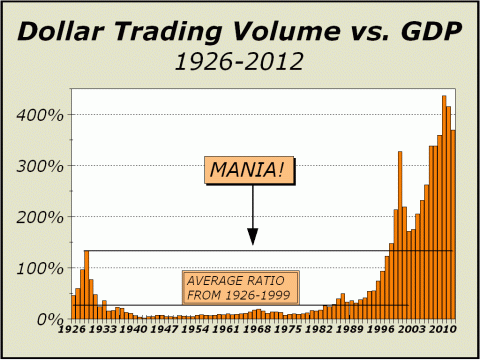
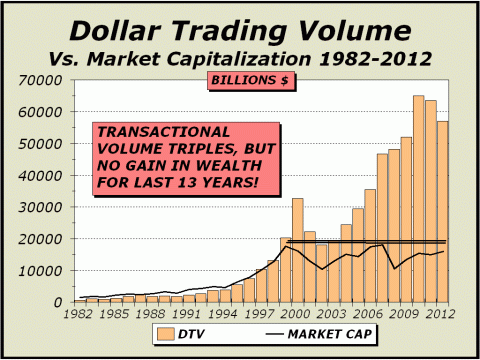
For the first five months of the year, DTV is running at a pace that equates to $57.15 trillion in transactional volume, 3.7 times the country's gross domestic product (GDP) and 3.6 times the entire market capitalization of stocks. DTV has grown by an annualized rate of 16.5% over the last 20 years and more than 12% annually over the last 15 years, despite two huge market collapses. The only other trend that can match this incredible pace is the growth in notional values of derivatives, where growth is an astounding 18.8% for the last 20 years. All that matters is the industry of finance and stocks. While this process did indeed enhance valuations for awhile, in the same 20 years, GDP has grown by only 4.7% annually. Stock market wealth rose 4.5-fold from 1991 to the 2000 manic peak and then doubled from the 2002 lows to the 2007 peak. One would be excused for thinking GDP might have shown a more robust long term trend, but then one would have to factor in that stock prices and wealth were halved twice from 2002-2002 and again in 2008-2009. If the cost of 4.7% GDP is
an occasional mania
The Roaring Twenties (at left on our chart) were the epitome of the short term view. Buy. Buy on margin. Buy more. Forget the long dated future. If stocks were higher tomorrow, you could be a wealthy man. Thus, the focus was on the short term and a mania was born. And then died.... Wall Street's theme had to change and it did - buy for the long term. Eventually, a long term investor would be proved right... and quite probably rich. It took many years for the theme to take hold but finally, it brought the American public back to the fold and stock investing once again became big business. The magic of the longest secular bull market in history from 1982-2000 allowed a complete change in character for investors, back to the attractive impetus of riches built over the short term. Why wait for gains? Thus trading once again took precedence and average holding periods contracted to under six months. And then along came HFT and overall holding periods contracted to less than three months, skewed greatly by high frequency traders holding positions for microseconds. In an environment where it became unnecessary to hold onto stocks for any substantial length of time, participants were led to believe that leverage was reasonable. And then, they believed that more leverage was more reasonable. Finally, they believed that still more leverage was the only sane way to go. The combination of increased leverage and increased trading had dramatic effects.
As we see above, there is a finite limit for all effects. Too much of a supposed good
thing
For all the false demand created
by leverage,
These are death throes....
The following article was the lead article in our April 9, 2012 issue. Dichotomy.
Peter Oppenheimer of Goldman Sachs went on record recently that the present time was the Best Time in a Generation to Buy Stocks, Sell Bonds (see http://yhoo.it/H6U65g). Really? While the statement is qualified by the distinction between bonds and stocks as Mr. Oppenheimer is comparing what he perceives as relative valuations between the two asset groups, this is clearly a bull call for stocks. As usual, the media grasps at every straw and everywhere we looked, the straws were touting this bull market call. Why push for the bulls prospects at this juncture, after stocks have doubled over the last three years? Hey, a bull market is always good for business. A bear market? Never. We see things much differently. Stocks are already up 21% from the October lows and have had an incredible bull run. It has taken three huge rounds of Federal Reserve manipulations via Q1, Q2 and Operation Twist to stave off an economic collapse and to generate even a modest recovery of sorts. Operation Twist is slated to end in June and given past history wherein the end of Q1 and Q2 presaged downside for stocks, we believe the downside will be anticipated and acted on sooner than later. Wed far rather heed the words of John Hussman or Walter J. Zimmerman, featured in a BARRONs article by Randall Forsyth (see The Worst of Times to Buy Stocks? http://on.barrons.com/GQA1yc). Frankly, we continue to present the bear case in each issue because we feel any mention at all of a bull case is at best, misleading and at worst, downright dangerous.
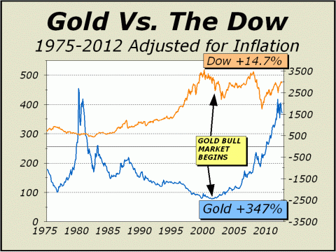
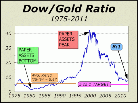
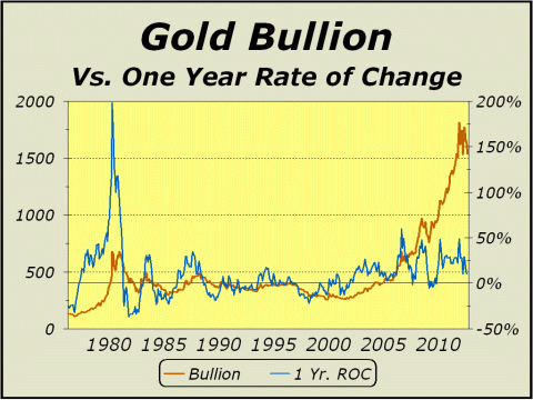
If there is a dichotomy that is meaningful, it is the relative distinction between stocks and gold. Given the Feds commitment to the printing press, there will be an ever increasing supply of money, which must eventually cheapen every dollar invested in stocks and especially bonds. While soft assets like stocks, will offer some protection against inflation, hard assets like real estate or gold, will offer far more protection against the debasement of currency. The last three years of upside for stocks still illustrate bullion in a far superior position. Why do we adjust for inflation? Why wouldnt we? If the CPI indicates the cost of living is 28.2% higher than in September 2001 when we made our super bull market call for gold, then you would need that much more just to stay even with where you were before. Stocks, as measured by the Dow (ex-dividends), are 14.7% higher. Gold bullion is 347% higher. Thats some dichotomy. Even when measured from their last major lows, stocks are up 71% from March 2009 and gold is up 98% from November 2008.
While the dichotomy has lessened in the big rally from August 2011 and the Dow/Gold ratio has climbed from a low of 6.4:1 to currently 8:1, we believe the ratio is poised to reverse again almost immediately. Lest we forget, bullion had a tremendous rally, rocketing over 60% higher in just over a year and likely getting quite a ways ahead of the fundamentals. Gold still receives virtually no sponsorship in the media and the focus, if any, is on how far down bullion is from last years highs. This is very curious, since there is virtually no mention that the major stock averages remain well below their all time peaks. Nevertheless, the precious metal is still up 18% over the last year and given super bull market status, the correction, albeit scary, was a necessary element for another bull leg. In our view, this has been a very constructive consolidation. We strongly believe the Dow/Gold ratio is eventually headed for 5:1 and will likely remain at roughly the same level until paper assets can once again prove their worth. That circumstance will take a great unwinding of the debt cycle, which is likely going to take many years to unfold. Thus, gold is now greatly undervalued vis-à-vis stocks. A decline in the Dow/Gold ratio from 8.1 to 5:1 could be accomplished with many iterations, three of which we offer below: Dow 15,000 = Gold $3000
No matter how we compute it, every iteration must favor gold. It would appear that the bull case for stocks strongly hinges upon on the Feds continuing creation of money to assist the economy, but that will only favor bullion that much more. Clearly, the economy is not gaining the kind of traction that indicates an all-clear. Consumer confidence recently came in at 70.2 for March, down from 71.6 in February, but more importantly, far from the 90 reading that indicates a healthy economy. As well, on March 26th, it was reported that the Case-Shiller index for home prices dropped for the fifth straight month in January, reaching the lowest point since the end of 2002. Thus, investors are now advised to buy stocks for all the wrong reasons. After generations of being prodded to buy because things were getting better, one should now buy because the Fed will print more of the stuff with which you can buy more stocks. This might only make sense in Oz, but we would not pay particular attention to the bearded man behind the curtain. While printing more of the green will indeed lend support to stocks over the very long term, it will also eventually kindle a far higher rate of inflation and far more interest in gold. So, now that weve established the dichotomy that favors gold over stocks, what about gold stocks? They have suffered for months as the rest of the equity market has rallied and with the XAU Gold/Silver Index trading no higher than it was last October and lower than in the summer of 2010, one wonders if there is indeed, a bull case ahead. We emphatically believe there is. The caveat is that since we see the stock market headed for a significant correction, the timing to accumulate gold shares is not quite right. We would be far more inclined to be buyers after the major stock indexes correct, but not before. For now, we would stress patience. Below right, the one year rate of change is still positive and since we believe gold is likely headed for new highs later this year, may remain positive throughout the summer. For all intents and purposes, this has been an ideal consolidation. Fear has knocked weak hands out and doubt pervades; and all the while the fundamentals argue strongly that each dollar printed ensures an increase in value for each ounce of gold.
In a Special Update to Crosscurrents
readers on May 19th,
Year over year, bullion has
outperformed stocks consistently,
Can gold break its 2011 record high in 2012? We expect it will.
The following article was published
in the March 12, 2012 issue.
A One Stock Market On The Verge Of Correction. Since late 2003, when we first posed our belief that the stock market was metamorphosing into a form that threatened the capital formation system, we have attempted to buttress our theory with commentary and charts. Over the last couple of years, we have accelerated the publication of our perspectives, cognizant that we are likely witnessing the death of a vital aspect of our economic system. Capitalism is all about the raising of capital to invest in new ideas, new production and new technology. However, in very recent years, the theme of investment has changed significantly. In effect, the companies that employ our worker population have become far less important than the markets and exchanges in which they trade and the people that drive the economy have become less important than the companies that drive trading. As a result, Wall Street has become so self-regulated that we can no longer argue potential for abuse because abuse is inevitable. Simply put, if you allow the foxes to regulate their own behavior, there will eventually be no hens left. And those who are alleged to remain at the top of regulatory chain, such as the SEC, have gone derelict in their duty. Bear in mind the SECs mission statement; The mission of the U.S. Securities and Exchange Commission is to protect investors, maintain fair, orderly, and efficient markets, and facilitate capital formation. Its bad enough over the last decade to see the many scandals in which the SEC was asleep at the switch or elected to punish wrong doers with a slap on the hand, but the massive implementation of high frequency trading has wrought an unbelievable transformation of our capital markets. Despite the present lack of volatility on the way up from the late November 2011 lows, the threat of disorderly markets continues. For reasons we will outline a bit later on, the markets remain highly inefficient. The withdrawal of the public from the markets, as clearly shown by todays featured chart, confirms that investors no longer trust the protection offered by the SEC. Lastly, as we pointed out last week, despite the recent headlines for Facebook and Yelp, the market for IPOs is shrinking at a rapid pace, not the kind of situation one wants when employment is still at intolerably high levels. [ED NOTE: PROPHETIC! LOOK WHAT HAPPENED TO FACEBOOK TWO MONTHS AFTER THIS WAS WRITTEN!!!]
Above, the last bar on our chart represents the current year through last Friday. Although much of the year remains, this is the most inauspicious start this writer can remember in 48 years of observation. If no one is going to attend, the party will be a resounding failure and everyone is going to go home unhappy. If anything, the picture confirms our view that stocks remain in a strong downwards secular trend. Secular trends can be extraordinarily long lived, as evidenced by Japans Nikkei Index, still down 75% from its 1989 bubble high.
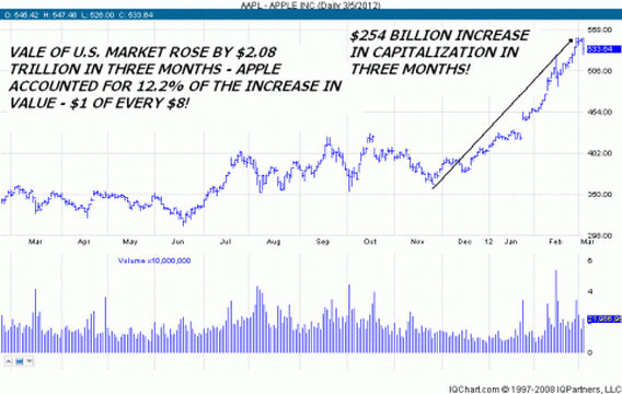
Last month, Apple (AAPL) traded 330 million shares, better than three of every eight shares traded in the Nasdaq 100 Trust (QQQ). The last time AAPL traded as significantly compared to the Qubes was in April 2006. Within three months, APPL was crushed by a correction of over 30%. It was no mere coincidence that the bottom for APPLs volume vis-à-vis the Qubes came only a few weeks after the shares bottomed in early 2009. From that point on, AAPL has been in the sights of almost every player, especially hedge funds. Recent stats from Goldman Sachs show that 20% of long/short hedge funds count APPL amongst their ten largest positions and at least one share can be found in the portfolios of approximately 30% of the hedge funds. Apple has become way too popular. While we believe Apple is a terrific company, the current thesis is that the shares must be owned or the trading entity risks under performance. This tactic becomes self fulfilling as all pile aboard. Think momentum. In the meantime, as the shares go from grossly over owned to absolutely essential in every portfolio, AAPLs capitalization grows so large that it can distort entire indexes, such as the Nasdaq 100 Trust, the Nasdaq Composite and even the S&P 500 (see http://bit.ly/xxBMgR). In the last decade and change, indexing has been touted as the cure all for investors of every stripe but if one stock can sway a major index, then what is the point of owning the index? Of course, it doesnt and cant possibly work all the time, as evidenced by the near 80% collapse of Netflix (NFLX) in only four-and-a-half months last year. While the same risk is not in store anytime soon for AAPL, corrections are inevitable and the risk of a pullback of 15% or more would not disturb the long term trend but would clearly impact the major indexes. Since the risk of a correction is likely quite large now for Apple, the risk is correspondingly large for the major indexes. We have noted for quite some time how the total of issues traded lines up fairly well with the S&P 500 when lagged by approximately one year. The theory is that if there is an increase in issues traded daily, investors are seeking out stocks as investments, a necessary ingredient of rising prices. Clearly, the opposite is true as well. A decline in issues traded daily, investor discontent is fomenting, a precursor of falling prices. While the lagged nature of this indicator means it can never be precise, it is clearly pointing to difficult times ahead. Less volume overall, more volume concentrated in fewer issues. In only three months,
This was surely the greatest
short term ramp
....death throes of the mania
for stocks.
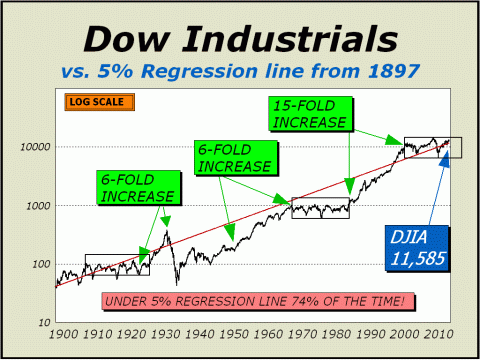
We May Still Be Far From A Bottom Over the course of history, stocks have not been up as much on an annualized basis as many investors believe. The trouble is, the greatest bull market of all time has convinced many that super bull markets are the rule, instead of the exception. Below, you see the truth. Going back 115 years, stocks are expect to gain roughly 5% per year, ex-dividends. Our regression line grows at exactly 5% per year and ironically shows the Dow Industrials under the line 74% of the time. In fact, the Dow remained under the line from October 1930 through January 1996, a period of more than 65 years. So, does the Dow belong above the line or below? As well, consider that it took many years for the Dow to finally break out in the 1920s (see highlighted box). The same occurred from 1966-1982 (second highlighted box). Perhaps the same will occur now (third highlighted box). If so, we have quite a ways to go before the right edge of the box is reached.
The regression line stands at Dow 11,585. The regression line will not reach the Friday, June 1st close of 12,118.57 until April 2013. The regression line will not reach the 2012 May 1st high of 13,338.66 until April 2015. The regression line will not reach the October 2007 record close of 14,198.02 until June 2016. Over the last 50 years, which
includes all the mania years,
There are likely more death throes to come....
To see a free sample copy of the Crosscurrents newsletter, CLICK HERE
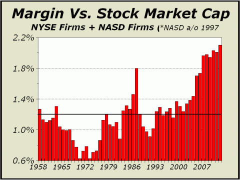
The good news is the bear market bottom of Dow 6400 that we first forecast back in 2003-2004 and occurred in 2009, is now quite likely to wind up as the bottom for the secular bear market that began at the March 2000 highs. Our projected worst case low for 2012 has been raised to Dow 10,404 and would likely be sufficient for us to turn bullish for at least the intermediate term, provided the mutual fund cash-to-assets ratio expands significantly from current record low levels and if margin debt is cut significantly from today's levels. If mutual fund cash remains near record low levels and margin debt remains high, the secular bear market will continue. Projected Best Case
Highs for 2012
Projected Worst
Case Lows for 2012
Reward/Risk Ratio: Very Poor - Favors Bears We still expect a dramatic expansion in volatility. THE CONTENTS OF THE ENTIRE WEBSITE ARE COPYRIGHT 2012 CROSSCURRENTS PUBLICATIONS, LLC I hope you have enjoyed your visit. Please return again and feel free to invite your friends to visit as well. Alan M. Newman, June 2, 2012 The entire Crosscurrents website has logged over three-and-a-half million visits. All information on this website is prepared from data obtained from sources believed reliable, but not guaranteed by us, and is not considered to be all inclusive. Any stocks, sectors or indexes mentioned on this page are not to be construed as buy, sell, hold or short recommendations. This report is for informational and entertainment purposes only. Persons affiliated with Crosscurrents Publications, LLC may be long or short the securities or related options or other derivative securities mentioned in this report. Our perspectives are subject to change without notice. We assume no responsibility or liability for the information contained in this report. No investment or trading advice whatsoever is implied by our commentary, coverage or charts. |
|
|