HOME | SUBSCRIBER SECTION | CHART OF THE MONTH | TECH OUTLOOK | COMMENTARY | LINKS | CONTACT US | ARCHIVES
|
- THE GREATEST STOCK MARKET MANIA OF ALL TIME - DATED JULY 15, 2015 A SPECIAL REPORT BY ALAN M. NEWMAN, EDITOR CROSSCURRENTS This free feature is now updated only three or four times each year. Our next update will probably be published in early November 2015 |
|
since we first published this website on January 15, 1999. Our readership spans 185 countries.
Our paid
subscription stock market newsletter has only two rationales for its existence;
Please check out the testimonials on our Kudos page. Printable
files of this report accompanied by our forecast are available only to
paid subscribers.
and are chosen for their timeliness and relevance. Every Reason To Expect A Worst
Case Scenario
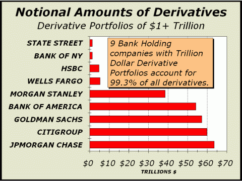
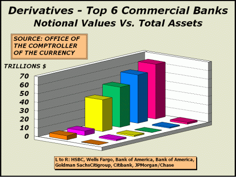
Every few months, we open the latest report (see http://1.usa.gov/1GsVmj4) on derivatives published by the Office of the Comptroller of the Currency (OCC), hoping to find some reason to allay our fears that another major derivative nuclear blowup and fallout lies just around the next corner. The OCCs data only goes back to 1991, so we are dealing with a very short history of 24 years. However, in a span of 28 years, we have seen three major derivative events, the impact of the second far exceeding the impact of the first and the impact of the third far exceeding the impact of the second. Each of these events pushed the financial world to the brink of collapse and should be a frightening and constant reminder of the fragility of our financial markets. At the end of the fourth quarter of 2014, the total notional value of derivatives was $220.4 trillion, down 7.9% from the third quarter total of $239.3 trillion. This sum still represents 12.6 times the countrys GDP and nine times total stock market capitalization. Notional values are so vast that the potential for disaster is always present. Each of the three major derivative events were catalyzed by an entirely different category of derivatives and each proved that reliance on derivatives and the assumption of correct pricing models to justify those derivatives simply invites disaster. By May 1987, stocks had become grossly overvalued accompanied by margin debt running to over 2% of total market capitalization in the late summer, the first time such lofty levels had been achieved since the Roaring Twenties. However, portfolio managers were convinced their holdings were protected by a brand new strategy known as portfolio insurance. This scheme was made possible by stock index futures, a derivative product developed only a few years earlier. The theory was if prices declined by 3%, you could sell stock index futures to protect your portfolio against further decline. However, when everyone began using the strategy, stocks would sell off 3%, triggering more sales of stock index futures, which triggered still more sales until a cascade was in effect. The selling of stock futures became a self fulfilling prophesy and the crash was enabled. Around 12:30 pm on October 20, 1987, the Dow Industrials traded briefly below the crash low of October 19th. After opening 200 points higher, the Dow had quickly faded and was dropping like a stone. One could easily make the case that we were no more than minutes away from a total financial collapse. It didnt take long to recover. By early December, the Dow had a huge three-day breakout. The bad times were behind and a brave new world was once again possible. One decade later, derivatives were far more widely utilized for trading and offered huge potential for gains. Notional values had grown to 2.6 times total U.S. stock market cap and 3.7 times GDP. Long Term Capital Management (LTCM) seemed to be the savviest player of all, utilizing extreme leverage to return over 21% after fees in its first year, 43% in the second year and 41% in the third year. The Board of Directors included Myron S. Scholes and Robert C. Merton, who shared the 1997 Nobel Memorial Prize in Economic Sciences for a "new method to determine the value of derivatives". What could possibly go wrong?
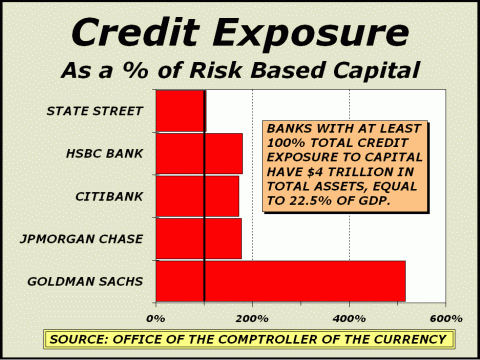
With leverage and derivatives, everything can go wrong. In 1998, LTCM lost $4.6 billion in less than four months following the 1997 Asian financial crisis and 1998 Russian financial crisis. At one point, it was posited that the LTCM derivatives portfolio which included very risky options on the S&P 500 index, threatened a daisy chain of $2 trillion in risk, placing the stability of seversl of our largest financial institutions in doubt. Not only was the Federal Reserve forced to intervene, the Fed had to coerce banks and brokers to cooperate in the liquidation and dissolution of the mess LTCM left behind. At the worst point, we might only have been hours from a financial collapse. Somehow, in less than an additional decade, banks and brokers created a bubble in housing prices via incredibly aggressive lending policies which enabled another derivative fiasco. Zero down mortgages were offered to impossibly risky borrowers and the low quality loans were repackaged and touted as higher quality. It was all an illusion and as it became apparent that too many low quality borrowers had become overextended, it all rapidly fell apart. By the time Lehman Bros. was forced to close its doors, we were once again perhaps only hours from a collapse. Our featured charts tells you all you need to know. Virtually all notional values are tied up by nine large banks, and 95% of the total belongs to just the five largest. It is no wonder that banks were bailed out when the housing bubble burst. There was literally zero room for error and the best policy at the time was to ensure stability by any means possible. The ensuing recession was the worst in decades but at least a collapse was avoided and the economy was enable to recover, albeit weakly.
Unfortunately, nothing much has changed. The banks that were too big to fail in the last blowup remain too big to fail. If a replay occurs, there will be no choice for the Federal Reserve. Any major players poised on the brink of extinction will be bailed out. We have created a perfect scenario for bad players, who not only may take on undue risk, why would they not take on undue risk? There is no price to pay for foolishness. Goldman Sachs CEO Lloyd C. Blankfein owns 1.9 million shares of GS worth more than $400 million. Mr. Blankfein need not worry one whit at whatever course his company takes, however foolish or even illegal. As the previous bubble fallout clearly showed, there is an elite class of individuals in this country immune to the problems and pitfalls suffered by the other 99%. Credit default swaps account for 96.1% of all notional values in credit derivatives, for a total of more than $9 trillion. See http://bit.ly/11zlIjW for a primer, which tells us A buyer of a CDS might be speculating on the possibility that the third party will indeed default. Therein lies the rub. Buyers may have a vested interest in a default and could conceivably act with precisely that objective in mind and actually contribute to circumstances that lead to the default. Given the impossibility the housing bubble could play out without disaster, we believe there were considerable and concerted efforts to accelerate and worsen the outcome. There were billions of dollars to be made. The same situation prevails today.
There are billions of dollars to be made via defaults. As the charts above imply,
Couple these pictures with
those illustrating record leverage in stocks
Were still looking for Dow 14,719 on the downside.
"Fascinating, Insane or Telling?" REPRINTED FROM THE MARCH 30th
ISSUE OF CROSSCURRENTS
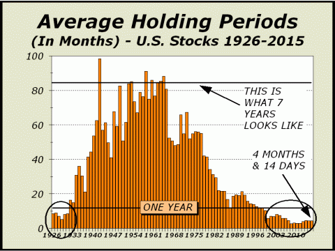
CNBC recently proved for the umpteenth time why the station has lost so many viewers over recent years and why they are relegated to lose a lot more when the next bear market finally arrives. The question is not how many more viewers will watch the soaps instead, but may be whether the financial channel can even survive. Given the staying power of a six year bull market in which stock prices have tripled, the circumstance of Neilsen ratings plunging to 21-year lows last year strongly suggests the product CNBC sells is one consumers can do very well without. Our rant has always been CNBCs style over the years, consistently the cheerleader and all smiles in the quest to keep viewers interested at all times. Unfortunately, bear markets are a fact of life and they necessarily result in a contraction of viewers as investors move to the sidelines and wait. This is a completely normal situation but is not acceptable when advertisers pay your bills. Viewers must be retained, even if it means that fantastic and unsustainable bubbles such as the tech mania in 2000 or the housing mania in 2007 receive less recognition as manias than they deserve. Thus, the tack has been to remain positive as often as possible and of course, the game played out with ratings slipping anyway as viewers fled to self preservation mode, uninterested in any best case scenarios offered on air. We have seen our fair share of bull over the years but this particular segment (see http://cnb.cx/1G1Ju5F) in which the WSJs Jonathan Clements and Premier Financial Advisors Mark Martiak trumpet the advantages of effectively taking the proceeds of a seven year car loan to buy stocks, pretty much takes the grand prize. Last we looked, autos were a rapidly wasting asset. In the same four years an auto depreciates by half, one could also be risking a hefty loss on the amount invested in stocks. Whether or not the car is held for seven years is irrelevant. Using an auto loan as leverage to buy stocks is far worse than buying stocks on margin. This sure sounds like imprudent advice to us. To her credit, reporter Erin Burnett questioned the safety of such actions but this is the most highly leveraged society in history and without exception, levering up in any way, shape or form is typically accepted with open arms. Ms. Burnett was a bit nonplussed, admitting she didnt know if the idea was fascinating, insane or telling. Well go with insane. The U.S. equity market has morphed into a Frankenstein monster driven by high frequency trading; millions of trades, many of which unwind in mere seconds. For the most part, time horizons have shortened so significantly that there is no long term to buy for anymore and as our featured chart clearly illustrates, seven year holding periods for stocks went out of fashion over 50 years ago. As a consequence of the modern era and high frequency trading, traditional valuation measures have become relatively meaningless and mutual funds now hold as little cash as possible in reserve. They are near fully invested and will lose more in a market decline and be less able to take advantage of lower prices when a bear market eventually provides compelling values, as typically occurs. Shocking as it may seem, current average holding periods are shorter than they were in 1929. Dollar trading volume (DTV) versus gross domestic product (GDP) is at its fourth highest annual level ever, while the last nine years represent all of the nine highest ever. Interestingly, the tenth highest was in 2000, when the tech mania peaked. There are so many measures that scream bubble and mania that any suggestion for investors to increase leverage must be treated as sheer lunacy.
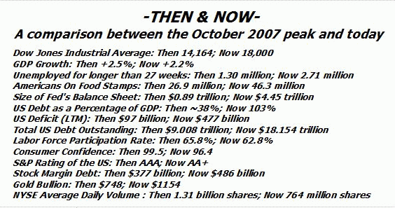
At center, we featured a similar table from Zero Hedge in the March 2013 issue but have altered it somewhat to better represent what we view as striking comparisons to the October 2007 peak, from which stocks collapsed by 50%. While we do not expect another halving in prices, the comparisons are quite unfavorable and strongly imply things are far worse, not better than in 2007. Consider that the Feds policy has indeed pulled off its primary objective; to inflate asset values. More than $5.8 trillion in stock wealth has been created from the October 2007 peak and as we know in retrospect, even that peak was unsustainably inflated. The additional wealth works out to over $18,000 for every U.S. citizen, yet GDP growth is lower, we have twice as many unemployed for longer than 27 weeks and still have a near record number of people receiving food stamps. What is wrong with this picture?!
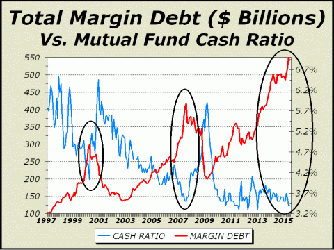
At bottom left, combined margin debt as measured by the NYSE plus NASD, now totals $485 billion. An expansion in margin debt is actually bullish to a point, since it signifies a growing interest in stocks. However, not only do we now have a situation of excessive leverage, margin debt is no longer growing and this strongly suggests prices are too high. For all intents and purposes, total combined margin debt topped more than a year ago in February 2014. The draw down of leverage in both the 2000-2002 and 2007-2009 bear markets was over 50%. A similar unwind today would equate to more than $250 billion of excess supply, easily enough for prices to suffer a 20% downside this year. While forecasting the bursting of a bubble is precarious work, we have no choice when viewing so many charts at seemingly pivotal extremes.
Clearly, the gap between margin
and mutual fund cash ratios
Fascinating, yes. Telling, yes. However, insane wins hands down.
The Case For A 25% Decline
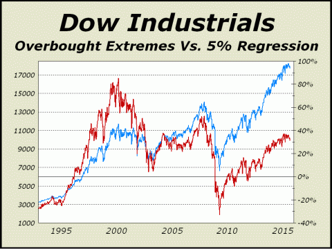
At least twice a year, we show a chart of the Dow Industrials dating back over a century accompanied by a 5% regression line. Our chart data goes back to 1890 and since then, the Dow has averaged annual gains of roughly 5% ex-dividends, thus we believe the line is a fair representation of normal expectations. Surprisingly, the Dow has been below the line 74% of the time. This seemingly weird circumstance simply mirrors what we know about markets. Bear markets tend to greatly overdo the downside and this factor tends to keep the Dow under the regression line longer than one might expect. Below left, we illustrate just how overbought stocks were in 2000 and 2007 by their percentage above the regression line. There have been only four occasions in which the Dow has greatly exceeded the regression line on the upside. The first was during the Roaring Twenties, arguably the biggest mania of all time. As stocks peaked in 1929, our indicator soared to 86% above the line. The 1929 high was not exceeded until 1955 and the super bull market did not begin until August 1982, thus the Dow remained below the line for decades, finally rising above in 1996 as the tech mania approached. How amazing was the tech mania? Our indicator ran to almost exactly the same level as in 1929. The third peak arrived in July 2007, when both housing and stocks were in manic mode. And now, the present overbought condition has taken us almost 37% above the line. Bear in mind, this is only the fourth time we have seen this circumstance and each of the prior circumstances resulted in a horrific bear market. The dénouement need not be an exact replay of any of the cited prior bear markets. The Roaring Twenties resulted in an 89% decline in the Dow. Stock prices fell 50% from the tech mania peak and 50% again following the busted housing bubble. Although our present downside bear target is Dow 14,719, we would caution that a scenario in which prices briefly dip to the zero percent line on our chart at lower left would take us to under Dow 13,500, down roughly 25% from today.
History shows us that a 25% decline occurs on average every 5.8 years. A bear market of this magnitude would actually be quite ordinary.
Standard Deviations
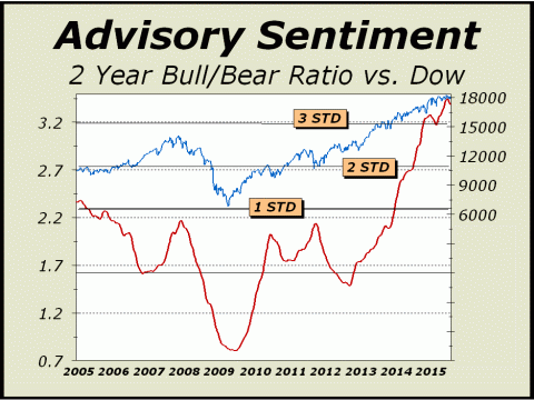
After a brief timeout, Investment Advisors are again flowing into the bull camp. In our quest to show the persistence and permanence of the bullish camp. the chart below right is a 104-week moving average of the ratio of advisory bulls to bears (per Investors Intelligence). Using a baseline of December 2002 through December 2013, we can see that the average two-year ratio has climbed well above three standard deviations from the norm (average 1.76, median 1.86).
Statistically speaking, two standard deviations cover 95.45% of all values. Three standard deviations cover 99.72% of all values. The odds of us witnessing this
kind of one-sided sentiment is clear off the charts,
OUR EVENTUAL
TARGET REMAINS DOW 14,719
WE STILL
HAVE AN OPEN BEAR MARKET TARGET OF DOW 12,471
We also believe the March 2009 low of Dow 6469 will likely never be seen again.
THE CONTENTS OF THE ENTIRE WEBSITE ARE COPYRIGHT 2015 CROSSCURRENTS PUBLICATIONS, LLC I hope you have enjoyed your visit. Please return again and feel free to invite your friends to visit as well. Alan M. Newman, July 15, 2015 The entire Crosscurrents website has logged nearly 4 million visits. All information on this website is prepared from data obtained from sources believed reliable, but not guaranteed by us, and is not considered to be all inclusive. Any stocks, sectors or indexes mentioned on this page are not to be construed as buy, sell, hold or short recommendations. This report is for informational and entertainment purposes only. Persons affiliated with Crosscurrents Publications, LLC may be long or short the securities or related options or other derivative securities mentioned in this report. Our perspectives are subject to change without notice. We assume no responsibility or liability for the information contained in this report. No investment or trading advice whatsoever is implied by our commentary, coverage or charts. |
|
|