HOME | SUBSCRIBER SECTION | CHART OF THE MONTH | TECH OUTLOOK | COMMENTARY | LINKS | CONTACT US | ARCHIVES
|
- THE GREATEST STOCK MARKET MANIA OF ALL TIME - DATED JULY 7, 2013 A SPECIAL REPORT BY ALAN M. NEWMAN, EDITOR CROSSCURRENTS This free feature is now updated only three or four times each year. Our next update will probably not be published until late October or early November 2013 |
|
Our readership
is world-wide.
This report
is foremost a compilation of articles that have previously appeared in
the Crosscurrents newsletter.
Please check out the testimonials on our Kudos page. Printable
files of this report accompanied by our forecast are available only to
paid subscribers.
DON'T
FEEL LIKE COMMITTING TO A LONGER TERM? SPECIAL 4-ISSUE (apx. 3 months)
SUBSCRIPTION OFFER:
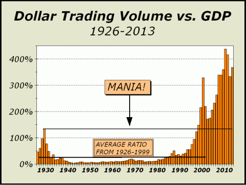
The Federal Reserve induced rally in stocks has endured for far longer than we believed it could. However, the quest to create and build wealth, which was the Fed's goal, has not been achieved. Economic growth is very slow and now, with the Fed pondering its next step and the possibility of "tapering" bond purchases, even more doubt exists than before. Why then, have prices continued to climb until the recent highs? And can prices continue to rise? Read on..... After topping in 2010, Dollar Trading Volume (DTV) began to subside and by last year, had fallen 19% from its peak. Our mutual fund inflow analysis had clearly shown that the public was no longer interested in stocks but nevertheless, DTV levels were consistent with the theme of an ongoing mania for stocks. Even at the low point in 2012, DTV was two-and-a-half times as much as in 1999, when the mania captured the imagination and assets of investors and turned them into worshippers of anything "tech." Nasdaq was only months away from a 250 P/E multiple and the most bizarre circumstances were taking place daily, like when 3COM spun off its subsidiary PALM in September 1999 and the subsidiary wound up worth more than the parent company. One would be excused for thinking that this generational peak in insanity would be relegated to lower DTV stats for years to come. Not so..... Thus far in 2013, DTV is expanding at a 12.5% rate thanks to a huge increase in the month of June. DTV in June was 40% higher than the average of the first five months of the year. In fact, if the torrid pace
of June 2013 is maintained,
What in heaven's name is going on?!
Perhaps our most germane explanation
is the analysis we offered
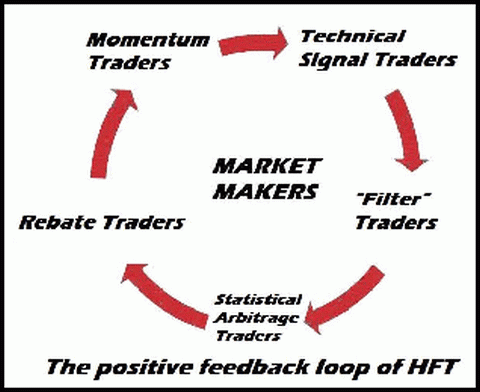
The Positive Feedback Loop A few weeks ago we came across a very interesting piece by Brandon Rowley of T3Live.com (see http://bit.ly/11Php0P), detailing the six primary strategies of high frequency trading, which we highlight in parentheses. No matter how often we write about HFT and its completely outsized effect on the stock market, its never enough. Simply put, we believe HFT is the greatest threat in history to the long term viability of our capital markets since strategies are confined to only short term results. Momentum (1) plays far too large a role and even becomes a self fulfilling formulation for profit as trades are then triggered on extremely short term technical signals (2). This induces trades based on filters (3) and since indexes must lag by even microseconds, this tiny unit of time is sufficient to catalyze statistical arbitrage (4) opportunities. Thus, #1 triggers #2, which in turn triggers #3, which in turn triggers #4. Is it any wonder that we now suffer an environment where 50%-70% of all transactions are based on extremely short term methodologies? The long term is no longer
a consideration,
Perhaps the most bizarre part of the HFT process belongs to rebate (5) trading, whereby an exchange or ECN entices liquidity in the form of additional bids and offers. Even if trades are entered and exited at a loss, the rebates should result in minimal gains. Over the course of time, when repeated thousands of times, large profits are ensured. The riskless basis of HFT is evidenced by the trading arms of the major banks and brokers who consistently report quarters with as few as zero days of losses to perhaps only a handful. Make no mistake, the public is at the rear end of the line and receives no benefits whatsoever from these manipulations.
Although we are told that HFT has improved liquidity, too many market makers (6) have already shown that to be a lie. However, every one of the six primary strategies is expressly designed to place the public at a disadvantage. In times of stress, market makers are not going to stand in the way and will desert their posts in order to survive the kinds of episodes they are supposed to prevent. The Flash Crash of May 2010 has been repeated hundreds of times on a much smaller scale with individual stocks, rather than the entire stock market, but like the gigantic derivatives exposure we suffer, a systemic accident is certain to happen. Again, its not a case of if, only when.
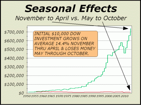
The following was the lead article in our April 29, 2013 issue. Welcome To The Dead Zone. Despite the historical record of the last 63 years, the cries of sell in May and go away have diminished significantly in recent years. A brave new world catalyzed by five years of Quantitative Ease has implied a permanent incline for the major indexes, regardless of how the economy plays out. We must admit a similar supposition by many observers that the economy will be permanently inclined despite the statistics showing otherwise. But then again, it appears that there has been no end of ignorance since 1999, when Nasdaq began to take off in a rocketship ascent. Astonishingly, while there have been two punctuations from 2000-2002 and 2008-2009, one mania has followed another and we are now firmly ensconced in a third consecutive mania. The difference is the Fed just sat idly by during the first two manias, but is actively pursuing sponsorship of the current desire to push all asset prices higher as much as possible and as rapidly as possible. Even so, seasonality has its place and is perhaps the most amazing phenomenon attributed to the stock market. The fact remains that over a period of 63 years, you were virtually guaranteed to make money at the most awesome pace if you only bought stocks at the close on October 31st and sold them on the close of April 30th each year. In the same span of time, you were guaranteed to lose money if you instead bought stocks on close of April 30th and sold them on the close on October 31st. The track record evinced by our featured chart is indisputable. If the pattern were visible for only a decade or two, perhaps our assumption might be questioned as statistically valid. However, after a period of 63 years, it is not only statistically valid but there is solid logic behind seasonality.
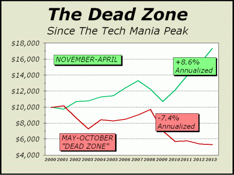
Inflows are typically strongest in January and April and weakest when summer drags on. Pension contributions, bonus payments invested in the market and the IRA season, which ends on April 15th, play very strongly into this effect. Also, volume slows as vacation times unfold and interest in stocks is low. While we cannot offer any assurances that these patterns must continue, we see absolutely no reasons for any to change. Even so, we see no end of criticism of seasonality, or perhaps it is simply blind ignorance. Most professional observers are at best, quite reluctant to admit any possibility that the pattern exists or can continue because an admission would imply investors would be better off if Wall Street simply shut down from May 1st through October 31st. Ironically, seasonality not only exists, but the patterns have become stronger over the years. Since 1950, $10,000 invested in stocks solely from November through April, has grown to $739,614, an annualized rate of gain of 14.4%. Nothing we know of matches this performance over time and thus it is easy to see the allure of investing in stocks. However, the same $10,000 invested solely from May through October is now worth only $8948, thus we now see the true reason for the old adage of buy and hold. Wall Street will not cannot shut down for six months of the year, so the policy of buy-and-hold is promulgated to ensure business 12 months of every year. Below, the record since the 2000 tech mania highs is distressing worse than the entire 63 year record. While the good six months offer gains, they come at a far lower pace of 8.6% annualized, and the poor six months are really, really poor, illustrating a 7.4% annualized rate of loss. Thus, if there has been a change in seasonality, it has been for the worse. The evidence is startlingly emphatic on that score.
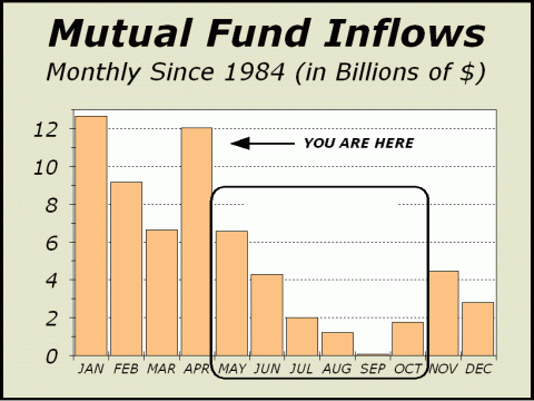
First, consider the pattern for mutual fund inflows from 1984 as shown below. As stated previously, January and April are typically the best months and together, they bolster the favorable action in stocks for the good six months. Years ago, we coined the phrase The Dead Zone for the months from May through October and clearly, judging by the statistics for the last 29 years, inflows are not sufficient to support prices. Before we go any further in this discussion, please allow us to reveal that these seasonal patterns were first written about extensively by Norman Fosback and Yale Hirsch decades ago. The observations were later augmented by an investing system devised by Sy Harding that has proved remarkably valuable over the years by simply adding one well known technical indicator to the mix.
When we begin to compare more recent periods to the past, we not only see how the pattern has deteriorated, we see a shocking development. It appears The Dead Zone has expanded and continues to expand over time. Given the Feds accommodation and desire to inflate assets, this is not very difficult to understand. The Feds stated objective has been to increase wealth through higher prices for stocks and housing. The process of buying $85 billion in bonds each month is supposed to furnish the financial system with so much money that an effective overflow creates demand where demand would otherwise not exist. However, demand is supposed to be created by the realization of value, whereas the demand fostered by the Federal Reserve is tantamount to manipulation. In short, it does not work and cannot ever work for more than a limited period of time.
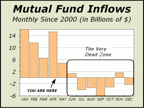
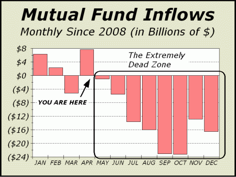
Above, we see the pattern for mutual fund inflows monthly since 2000, when the tech mania peaked, and below, we see the pattern since 2008, when the housing mania peaked. There is an obvious dichotomy, more startling than that revealed by the 29 year record of our traditional Dead Zone chart from 1984.
The six month Dead Zone accounts for only 25% of all mutual fund inflows. Since 2000, the dichotomous Dead Zone has expanded to seven months and there are negative inflows. Since 2008, the Dead Zone has expanded to eight months and not only are inflows negative during the markets poor season, they are strongly negative. Weekly inflows for domestic mutual funds are already beginning to deteriorate from the early year surge. In fact, looking back over the last seven weeks reported by the Investment Company Institute, there has not been a single dollar of net inflows to domestic funds. That ghastly sound you are about to hear is likely the dying breath of the bull.
The following articles are all reprinted from our May 27, 2013 issue. Third Mania Ending The first of the manias we have referred to was
clearly the public at its most rabid, eager to dive into Nasdaq at a 250
P/E and daily prognostications of higher prices. The second was built
on perceptions of a permanent wealth effect, that permanently higher housing
values would mean more money for stocks resulting in a virtuous cycle.
Given that investors stock wealth was cut in half twice and the public
has pulled $600 billion from portfolios, the current phase appears to be
primarily limited to one of the most prolific episodes of Groupthink practiced
by Wall Street professionals, including hedge funds.
We also see clear evidence of euphoria in the Rydex Ratio charts (courtesy of Carl Swenlins Decisionpoint, see www.decisionpoint.com). As of last Fridays close, there were $13.70 in Rydex bull and sector funds for every $1 in bear index funds. The Rydex Ratio, which divides bear and money market assets by bull assets fell to 26%. Both of these measurements are the most lunatic we have seen since the tech mania and they are so far in excess of the norm of recent months that we can only conclude that a major top is upon us. While we have had difficulty timing the expected reversal, last weeks action should be sufficient to end the lunacy.
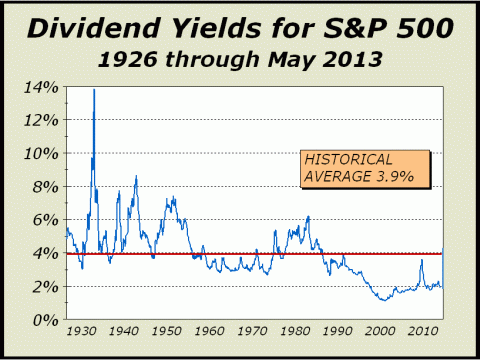
Investors Cannot Win Recently, we featured a chart of cyclically adjusted price earnings multiples (CAPE) and commented on Tobins Q Ratio, two important measures showing a hugely overvalued stock market. Below, dividend yields for the S&P 500 point to the very same circumstance, a hugely overvalued stock market. Until 2000, dividends yields averaged a generous 4.27%, thus stocks were typically a great investment. Decent gains on an annualized basis plus dividends and even the prospect of dividend growth gave investors the best of all possible worlds. However, the modern era of manias has afforded no such generosity. S&P dividend yields since the 2000 mania top have averaged a paltry 1.85%, less than half the historic average. Of course, we live in an era of insider sales and insiders dont want dividends paid to stockholders. Investors cannot win.
Long Term Returns The greatest bull market in history, culminating with the tech mania, had an incredible effect on twenty-year annualized returns. Despite two of the most memorable collapses in stock market history, when stocks were cut in half from 2000-2003 and then cut in half again from 2007-2009, twenty-year annualized returns for the Dow Industrials remain quite robust, at 7.6%, ex-dividends. The historical record clearly places these returns at the very top end of a scale showing a far lower 5.17% annualized average for 96 years dating back to 1917. Clearly, the most recent period is head and shoulders above the past. In fact, during the 78 years from 1917-1995, twentyyear annualized returns averaged only 4%. Can returns remain at the elevated levels seen since 1995? Not a chance. The simplest reason is that asset classes must compete or perish. The principal differentiating factor is risk. Thus, bonds will typically grow at a far lower rate than stocks, because the return is relatively assured. However, if stocks could be counted on to return 7.6% over all twenty-year periods, there would be almost no incentive for bonds to even exist. It is also important to understand that the huge secular bull run from the 1982 lows came only after stocks suffered through an extremely long period of underperformance from the mid-1960s, when the Dow first hit the 1000 mark. After 16 years, the Dow was at 776. Thus, we are strongly inclined to believe that twenty-year annualized returns must decline to historically valid levels as time passes. While a correction or bear market might achieve those levels sooner, all of the scenarios we extrapolate today seem lousy. If we are correct, the future for stocks is not at all attractive. If the Dow falls to 10,000, the historical average of 5% annualized gains over twenty-year periods would not be achieved until February 2015. At Dow 12,000, it would require an additional ten weeks out to May 2015. Even at Dow 15,000, meaning a relatively sideways jaunt for prices, the journey would take us out to March 2016 before our implied norm would occur. Add into the mix the expectation from any of these points would realistically still be gains of only 5% per year and the current level of excitement and euphoria is unmistakeable; a third phase of mania, following the tech madness that ended in 2000 and the housing and stock boom that ended in 2007.
To see a free sample copy of the Crosscurrents newsletter, CLICK HERE
We attribute a large portion of the bull phase to mechanical forces, rather than the centuries old tradition of investing for value. The mode of this bull market has been unlike any before. It has endured for more than four years despite a massive withdrawal from the stock market by individuals. After two collapses ending in 2003 and 2009, the public knows it can no longer trust Wall Street. There is ample proof in the outflows recorded by mutual funds in the last few years and if one needed further evidence, visit http://www.valuewalk.com/2013/07/cnbc-quarterly-ratings-fall/ for the final nail in the coffin. We strongly believe the present bull market has been powered by positive feedback loops, as outlined in our top article in this issue of Pictures of a Stock Market Mania. The offset that no one expects, are the negative feedback loops that will inevitably ensue at some point, when stocks re-enter the long secular bear market phase. The tech mania bust saw prices collapse by one-half. The housing bust saw prices collapse by one-half. Both of these declines were well out of the normal range for bear markets and were likely aided by the same mechanical forces; but this time, by negative feedback loops. We are now certain that the bottom of Dow 6469 in March 2009 was quite signficant, like the bottom in 1982 before the great secular bull market began, like the 1987 crash bottom and like the tech mania crash bottom in 2002. We forecasted this price bottom back in 2003-2004 and still see no reason to alter our views. We see no reason for the March 2009 bottom to ever be exceeded on the downside. However, this does not make us bullish in the slightest. If inflation picks up over the years to come (as we expect it will), the relevance of Dow 6469 will become more remote and meaningless. We remain heavily tilted towards the bear case. Projected Highs
for 2013 (already seen)
Worst Case Scenario
Lows
Current "Correction" Target is just above Dow 14,000 Reward to Risk Ratio: Extremely Poor THE CONTENTS OF THE ENTIRE WEBSITE ARE COPYRIGHT 2013 CROSSCURRENTS PUBLICATIONS, LLC I hope you have enjoyed your visit. Please return again and feel free to invite your friends to visit as well. Alan M. Newman, July 7, 2013 The entire Crosscurrents website has logged over three-and-a-half million visits. All information on this website is prepared from data obtained from sources believed reliable, but not guaranteed by us, and is not considered to be all inclusive. Any stocks, sectors or indexes mentioned on this page are not to be construed as buy, sell, hold or short recommendations. This report is for informational and entertainment purposes only. Persons affiliated with Crosscurrents Publications, LLC may be long or short the securities or related options or other derivative securities mentioned in this report. Our perspectives are subject to change without notice. We assume no responsibility or liability for the information contained in this report. No investment or trading advice whatsoever is implied by our commentary, coverage or charts. |
|
|