|
CHART DATA THROUGH JULY 1, 2001 A SPECIAL REPORT BY ALAN M. NEWMAN, EDITOR LONGBOAT GLOBAL ADVISORS CROSSCURRENTS |
| Our new article focuses
on the turn of the cycles. Like the wheel of time, one cycle ends
and another begins. The secular bull market, capped by the greatest
stock market mania of all time, concludes. A secular bear market
commences. How can we be so sure?
The evidence from history precedes our own analysis and illustrates how the folly of a great imagination belies those who would be visionaries to an impossible future. Simply put, optimism has its place. The internet, even if it was going to re-shape our lives in the 21st century, was bound to displace segments of the economy and result in a few years of reaction to the sea changes in progress. It has happened before as the advent of the age of radio and autos can attest. In fact, it has happened again. Despite the phenomenal advances in technology in the last decade, the advance that stands without peer is the progression of the "science" of financial engineering. The impact of ESOPs (read tax benefits to Cisco Systems), the growth accorded by non-operating earnings (read Intel's investment portfolio) and the benefits provided by derivative manipulations (read Microsoft's Put selling program) have all conspired to show the corporate world not as it truly is, but as it would like you to believe it is. As Wall Street's analysts
begin to suffer the recognition they rightly deserve,
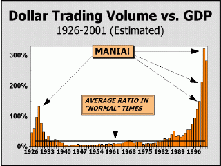
We always begin our presentation with a view of Dollar Trading Volume, the most important indicator we can show and perfect proof of the stock market mania that has pervaded the environment since 1995. Despite falling nominally since our last update, DTV is still 283% of total gross domestic product. Wall Street has maintained its sway over investors, who continue to trade $2.83 of stock for every $1 spent on the purchase of goods or services. This perspective has been our focus for longer than the two-and-a-half years our web site has been in existence. The charts have been shown in our newsletter for close to four years. Why this indicator has received so little attention beyond our coverage is beyond our ability to discern. The charts have appeared with our permission on only one other website and in only one other financial publication despite our constant reminder that we are willing to grant permission as long as attribution is granted. You can't have a mania unless the public is involved to such an extent that the economy itself winds up playing a secondary role to the upwards march of stock prices. As the current mania progressed from its early stages, the velocity of funds thrown at stocks increased rapidly. Then, as the internet craze became full blown, velocity increased geometrically. What you see on the chart is partially explained by the old adage that "in a bull market, everyone is a genius." But in a mania, participants presume perfection, both for circumstances and their ability to predict what is yet to come. At one point in late 1999, it really did not matter what internet or technology stock one might have chosen. Almost all were equally regarded as having near limitless potential and had to trade higher, whatever the current price. Aided by the price projections of investment bankers who had a vested interest in maintaining the illusions of a perfect future, participants bought Amazon, Priceline and Qualcomm at their highs, truly believing the shares would double or triple in short order. As we see below, Nasdaq's share of the pie grew from nominal at the beginning of the secular bull market in 1982, to overwhelming in 2000. What we see in this picture is the public's growing acceptance of risk as a legitimate cost for making money in the bull market. Of course, as prices rose, the attendant risks rose, so the chart is also implying the acceptance of HIGHER risks as time progressed! With both charts finally turning down, the implication is that the cycle is at an end.
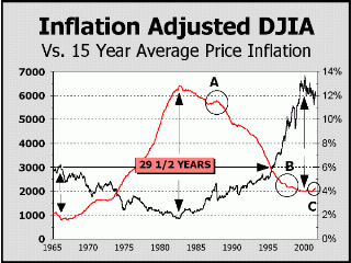
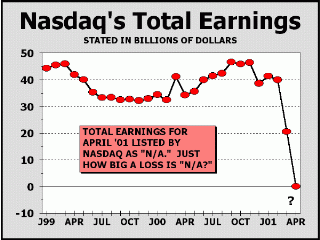
We are presenting a portion of our article in the May 21st issue of Crosscurrents, dealing with inflation and tying stock returns directly to rising or falling long term rates of inflation. This is another view of a cycle at an end and a cycle just beginning. Question: is inflation a factor in the performance of stocks or is it the other way around? We wrote a somewhat controversial article for BARRON'S in November of 1996, claiming the latter. Our theory posits that inflation is always present somewhere in the economy. When stocks are in a long term phase of accumulation, a sufficient amount of money is diverted from the purchase of goods and services and inflation occurs in the price of stocks. When stocks are in a long term phase of distribution, money flows back into the purchase of goods and services, driving up the rate of inflation. As proof, we matched the inflation adjusted Dow Industrial averages up against the 15-year rate of inflation. Why the 15-year rate and not another period? The 15-year rate showed precisely what we intended to illustrate. As it turned out a slighter more rapid rate also worked and approximated a one-quarter cycle of the long term 56+ year Kondratiev wave. Since the Kondratiev cycle is predicated on four seasons, a one-quarter length period to measure inflation seemed appropos. Judging by how well the theory works in our picture, this is an explanation that is too elegant to ignore. An eye opener. The cycles dating back to the inflation adjusted Dow highs of 1966 match almost exactly, certainly precise enough to assume there is a mutual force at work. As our chart clearly illustrates, the 1966 and 1999 inflation adjusted highs in stocks are neatly matched by a long term low in the rate of inflation and the 1982 inflation adjusted low in stocks is very closely matched by a long term high in the rate of inflation. As further proof, the circled areas show shorter term divergences in stocks that are also neatly matched by divergences in the rate of inflation. The big news here is that the cycle once again appears to be reversing as the inflation adjusted Dow is now in decline and the long term rate of inflation is beginning to rise. Given that the inflation numbers being dropped are the very friendly numbers of 1986. the long term rate of inflation appears poised for a solid advance. For the sake of comparison. the annual rate of inflation averaged only 1.5% from April 1986 through January 1987. How bad can it get? The prior down cycle for stocks lasted from 1966 to 1982. a period in which losses were far greater than those perceived. The inflation adjusted Dow traded at 3092.80 in January of 1966 and at 829.33 in July of 1982. a loss of 73%! This is an excellent picture of the damage a secular bear market is capable of. Of course, as we imply with our first chart, inflation on one hand is offset by deflation on the other hand. The cycle that has now appeared for Nasdaq is one in which earnings have entirely disppeared. The prior expansion witnessed only modest growth of 1.6% in the best period of earnings from March 1999 to September 2000. Despite the public's willingness to buy Nasdaq stocks at 150 times the index net earnings in September 2000, the type of growth that might have justified such a stance was never visible. This picture is additional evidence that the cycle for stocks has concluded. Cycles exist. All bull markets end. Manias end very poorly.
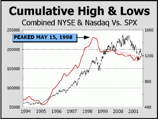
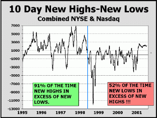
The first step in the concluding act of a mania requires that participants simply not comprehend the end process. Thus, despite a collapse in Nasdaq prices, down 70% in one year - and a fair sized bear market for the S&P 500, down 28% - the public and professionals have retained their bullish stances. The public still believes returns in excess of 10% per year will continue and Wall Street strategists have raised their allocations to stocks to all time highs. Even we are somewhat chastened by the appearance of the recent rising peaks and rising valleys of our cumulative high/low chart. Until, of course, we dig a bit deeper into our interpretation of the chart. First off, cumulative high/lows are still only a measure of what has transpired over the course of precisely one year. This chart is actually a compilation of one-year rolling periods, measured day by day. Given the enormous draw down by stocks suffered in the last year, a bottom of some significance had to occur. At one point, the U.S. stock market had surrendered close to 40% of its entire capitalization. If history has shown us any lesson, we have been taught that all declines are followed by rallies, regardless of the strength of the dominant trend. In this case, we believe the recent divergences have been brought about by the humongously oversold nature of the initial Nasdaq collapse. Judging by our second chart, there is still no reason to believe that a bullish sea change is at hand. In the earlier phase, 91% of the time, 10-day new highs predominated over new lows. In the latter phase, despite the recent day-to-day appearance of very positive numbers, new lows STILL predominate over new highs 52% of the time. Should we be paying more attention to the modestly positive readings for all of the last several weeks? We tend towards the view that the current rally has peaked so far from the peaks sustained in earlier years of the mania, that the second and weaker phase is still quite evident. The extent of the bullish dynamics prevalent during the mania are no longer visible.
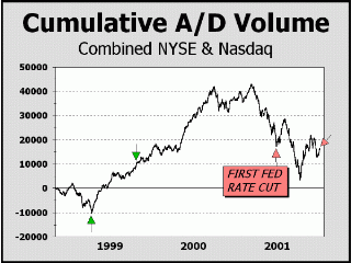
Could the time since the late March bottom actually be a nascent bull market as so many now believe? Could it be the worst is finally behind us? Perhaps if what had preceded the top was a typical bull market, the answer would be yes and even we would be bullish. But never before in history has a mania ended without fear and panic taking hold and an ensuing phase where investors just gave up hope and talk of the stock market was accompanied almost universally by despair. In the case of the current mania, there are many, many signs that the principal presumption is "business as usual." Wall St. strategists maintain a near 70% allocation to equities, the highest in history. Mutual funds maintain 5% allocations to cash, near the lowest in history. Not once in the year where Nasdaq fell 70% and the S&P 500 fell 30% did bearish Newsletter writers outnumber their bullish counterparts! Most polls show investors now expect lower returns, but still expect returns two to three times the historical average. The list is endless. Meanwhile, although the Federal Reserve has done everything in their power to catalyze a wide ranging breakout they have merely stabilized the markets and prevented a collapse. Judging by Cumulative Net Advancing/Declining Volume for the two major markets, the Fed's influence is waning and the time may rapidly be approaching when even efforts to stabilize prices will have no effect. The time between the two green arrows spans the same time frame as the time between the two red arrows. The first green arrow points to the Fed induced bottom in response to the LTCM fiasco in 1998. The first red arrow points to the first of the six discount rate cuts by the FRB. The difference in how each market reacted is astounding. In the recent period, the six cuts have resulted in no net gains for our indicator. The only assumption to be made is that massive distribution is still taking place. When might this distribution turn into a more rapid decline in price as particpants accelerate their exit from stocks, perhaps even trigger a full-fledged panic? Given the two-year average price of the broad based S&P 500 (about 80%-85% of total stock market capitalization), our guess is several months at best. Note how the two year average price has twice before acted as support and that support has now failed miserably. The turn to the downside of the two-year line is a perfect corollary to investor patience. The lower the line, the less patience and the greater chance investors will accelerate their exit from the stock market. The odds are rising that investor patience is close to an end.
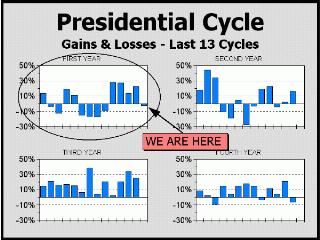
Over the very long term, stocks invariably go up in value. The longer the period, the more certain the outcome. But shorter periods are not so certain. On a daily basis, stocks are up only a bit more than half the time. On a monthly basis, a bit more. On an annual basis, going back to 1832, stocks are up 62.2% of the time. But even within the framework of these annual gains, we see cycles at work. Vis-a-vis the Presidential cycle, stocks are at their best in the year before the election and are at their worst the year after the election. Although we are only showing the results back to 1950, results back to 1832 bear us out. Our view shows pre-election years up every time and they have been up 74% of the time going back in time. As well, our view shows the current cycle down seven of 14 years, whereas it has been positive only 46% of the time back to 1832. Thus, another influence is at work against stocks for 2001. The two secular bear markets of the 20th
Century began in 1929 and 1973.
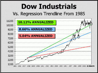
At this point in our updates, we always attempt to answer the question,"How far can stocks fall?" Sometimes we offer a worst case scenario, sometimes a best case scenario. Sometimes a bit of both. Below, we see three regression lines stemming from the August 1987 TOP, which was also a mania, driven primarily by institutions but insignificant compared to the current era. The green line extends to last week's Dow close and represents annualized gains of 10.1% (all stated percentages are ex-dividends). The blue line connects two important bottoms in the fall of 1997 and 1998 and represents annualized gains of 8.6%. The red line connects the 1987 top to the 1994 top, shortly before the bull market began to morph into a full fledged stock mania. This line represents annualized gains of just over 5%, consistent with average gains recorded for more than a century. The green line grows at better than twice the historical average and cannot be sustained. If, for the sake of argument, we could prove that these huge gains could be sustained, then we must also assume that interest rates have to increase accordingly to compete with the permanent superior gains that would be afforded by stocks. If rates rose to compete, their relative riskless attraction would eventually lure investors away from stocks, lowering returns from stocks! The new era supposition for the permanence of higher returns for stocks is impossible. All three lines are measured from a blowoff top, the most conservative/friendly/bullish view we can present. Measured instead from the 1987 crash bottom, the green line would represent 13.75%, the blue line 12.25% and the red line 8.51%. The historical average for the Dow Industrials (ex-dividend) going back to 1897 is only 5.02%. The green line is where we now stand. The blue line is where we are likely to stand within two years. The red line is a probable support for the very long term, i.e., for the duration of the secular bear market. Despite the call for higher prices, lower
prices are likely,
We invite you to stay tuned for our next report, in which we intend to precisely illustrate the truth about the long term. We hope to entomb the common wisdom, the mantra repeated by all of Wall Street's so-called professionals, i.e.,"buy-and-hold." In the long term, the only consequence that is guaranteed is the passage of time. Our shorter term indicators point to an increasing likelihood of a test or break of the March lows for the stocks. Given the current prevalent attitude instead expects a rally to new Dow highs, we expect this disappointing decline will add to the consternation of investors and will probably cause money managers to hasten the process of "distribution." Since stocks are always 100% owned, this may simply mean that assets are rotated into those issues that are considered safest in a worst case scenario. We expect whatever sponsorship remains will attempt to rotate assets into the Dow stocks. Indeed there is a remote chance that the Dow may yet run again to one more new high before the cycle of the mania runs to its completion. In the last few months of 2001, the 30 Dow
stocks
Our downside targets for
the remainder of 2001 are:
Our "best case" upside
target potentials for the remainder of 2001 are as follows:
Alan M. Newman, July 3, 2001
All information on this website is prepared from data obtained from sources believed reliable, but not guaranteed by us, and is not considered to be all inclusive. Any stocks, sectors or indexes mentioned on this page are not to be construed as buy, sell, hold or short recommendations. This report is for informational and entertainment purposes only. Longboat Global Advisors, Alan M. Newman and or a member of Mr. Newmans family may be long or short the securities or related options or other derivative securities mentioned in this report. Our perspectives are subject to change without notice. We assume no responsibility or liability for the information contained in this report. No investment or trading advice whatsoever is implied by our commentary, coverage or charts. |