|
In The Wrong Direction - THE GREATEST STOCK MARKET MANIA OF ALL TIME - DATED JANUARY 26, 2010 A SPECIAL REPORT BY ALAN M. NEWMAN, EDITOR CROSSCURRENTS This feature is now published on roughly a quarterly basis. Our next update will likely be published in mid-May 2010. |
|
Our readership
continues to grow.
This report
is primarily a compilation of articles that have previously appeared in
the Crosscurrents newsletter.
Please check out the testimonials on our Kudos page. Printable
files of this report accompanied by our forecast are available only to
paid subscribers.
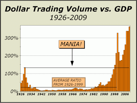
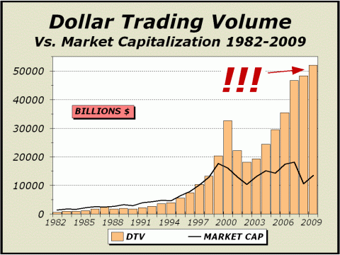
Disclaimer: in the last few issues of this report, we have stated that the data for our lead charts on Dollar Trading Volume were becoming increasingly difficult to find and verify. Even the source we thought we found for our last report has turned out to be questionable. Simply put, there is likely now so much trading that takes place away from public scrutiny that no one can publish an accurate total of transactional volume. In June 2009, we believed we had underestimated DTV and we now believe we significantly OVER estimated DTV in our October 2009 issue. We also no longer believe we are within 2% of whatever might be the actual tally, which is now likely unknowable. This issue's tally is our best guess.
Dark pools. Sounds a bit ominous, no? Well, check out the Wiki's definition and you'll see part of the problem with tallying total transactional dollar volume. And it used to be so easy! We would simply check the NYSE, Nasdaq and Amex sites for the actual numbers, total them and present the chart based on the data. No problem! When the Amex ceased their tallies, we found an easy way to estimate, based on the most active issues. However, in the last few years, a number of new exchanges have sprung up and data is not just hard, it is actually impossible to come by. For example, one of the independent dark pools listed by Wiki is Liquidnet. Check out this description from Liquidnet of their trading approaches (see http://www.liquidnet.com/products/supernatural.html). There are now too many "external" markets and simply put, the statistics are not available. Truth be told, even if we had the statistics, we would not have any clue to what might be double counted and what might be not. The only truth we can rely on is that the NYSE now handles a fraction of NYSE composite volume across all exchanges. As we cited in our last issue, back in early 2006, NYSE volume was approximately 75% of NYSE composite volume across all exchanges. By mid-2007, it was only 50%. By the spring of 2008, it was only 30%. In 2009, it has only been as high as 40%, as low as 15% and averaged roughly 25%. When we try and put whatever information we have together, sometimes we come up with tallies that seem way out of whack. For instance, BATs notional volume summary for the day of this writing (Tuesday, January 26th 11:50 am), shows a 5-day running AVERAGE of $243,5 billion per day, an annual rate of $61.4 TRILLION, way in excess of anything we have ever measured before. Yet, according to SIFMA stats (see http://www.sifma.org/research/research.aspx?ID=10806), average daily dollar trading volume is considerably less. We cannot get a handle on everything that is traded anymore. Given that NYSE only volume is now apparently only one-quarter of NYSE composite volume across all exchanges, we can make some rough estimates but stress that the charts you see below are based upon our guess and should not be relied on as totally accurate. As you can readily see, we have cut our estimate substantially from the October issue, just in case our former estimate was overstated. Even so, the chart is both stunning and quite alarming.
Although we have reduced our estimate significantly
from our last issue,
It's all about trading. Investing per se, no longer matters.
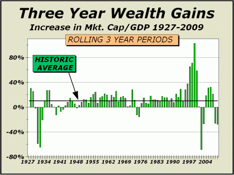
Vis-a-vis total stock market capitalization, trading has soared to extremes never before see. Total turnover of market capitalization peaked in the 1929 mania at 2.28, meaning that stocks were held an average of less than 23 weeks. Last year, turnover peaked at 4.55, meaning that on average, stocks were held for only 11 weeks and 3 days before they disposed of. Since 1926, turnover has averaged only 0.7 (average holding period a year-and-a-half) and if we factor out the two manias, turnover is roughly half, or an average holding period pushing the three year mark. [Note: turnover in 2009 was the equivalent of an average of 13.5 week holding periods] Obviously, Wall Street earns more when stocks are traded, so the push in this generation has been to find every way possible to increase volume. And now that the public has been fully exploited via the two manias, is used, thoroughly abused and unlikely to play, the most logical way for exchanges to increase business is to exploit every methodology, including massive transactions on the scale of seconds to take advantage of miniscule pricing discrepancies. Ironically, it is easy to make the case that each discrepancy addressed leads to another and another, so that the expansion in trading becomes self fulfilling. Like a snowball rolling downhill, it simply gathers more snow and increases in size. However, as trading increases, investment decreases. As investment decreases, the
need for participants to VALUE stocks
Thus, valuations become irrelevant. When valuations become irrelevant, the stock market suffers and wealth vanishes. The proof is visible below.
The following article was the
lead article in our November 9, 2009 issue.
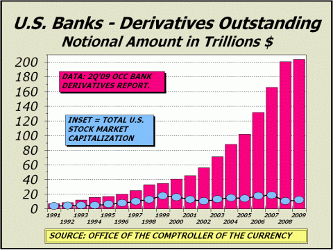
Capital Is Still Moving Into Derivatives, Not Concrete Every few months we focus on the rapid growth of derivative products, their effects and the implications for the future. We began this journey in January 1999 when we created the Pictures of a Stock Market Mania website. Our commentaries and charts obviously hit a nerve as our readership expanded and we now have an audience comprised of viewers from 177 countries around the globe. Our stance has always been that the largely unregulated and unfettered growth of derivatives placed undue strains on the financial system and was bound to catalyze dramatic failures on a somewhat regular, if infrequent basis. Clearly, the stock market Crash of 1987 was a derivatives failure. Stock futures trading had exploded as institutions foolishly believed they found a way to insure their portfolios against losses. If only the world was that simple! Then in 1998, Long Term Capital Management foolishly believed it had found a way to pile on leverage without increasing risks to the breaking point. Although they would only extract a tiny percentage of profit from each of their derivative contracts, the extent of their leverage meant huge profits .as long as the models worked. The models failed, LTCM failed and the entire financial system nearly came crashing down. The hiatus was only nine years. Another nine years elapsed before we suffered the worst financial crisis since the 1929 stock market crash decimated Americas wealth and placed the population in a relative dark age for another decade to come. The 2007 episode was also predicated on models that might function in a perfect derivative world, but the past is a stern teacher and it is painfully obvious that we will never live in a perfect world, derivative or otherwise. Amazingly, notional values of derivatives have continued to grow, and reached $203.5 TRILLION by the end of the second quarter of 2009. While the ratio of notional values versus total stock market capitalization has contracted nominally from 18.9 to 16.6, the ratio of notional values versus gross domestic product has risen from 14.1 to 14.5. Only a decade ago, those respective ratios were only 2.0 and 3.6. Were not talking just growth here, we are looking at a runaway train. Is there anyone in the world who believes this pace can continue? Extrapolating at the rate of the last five years alone, in another five years, notional values of derivative products would total $560 trillion. If GDP grows at 5% per year, the ratio of notional values to GDP would reach a staggering 30.8. Ian McAvity (see http://www.topline-charts.com/Deliberations.htm) has pointed out many times how economic growth has been fueled by the rapid expansion of debt in America, positing that every dollar increase in GDP requires at least $3.50 in new debt [NOTE: McAvity computes that recently, every dollar of growth has required as much as $7 in new debt]. If that pace can be sustained, then surely pigs can fly. But we digress .
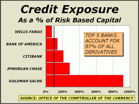
Below, a chart we shown at least a dozen times over the last few years. The top five banks account for 97% of all derivatives and their total credit exposure is a combined average of 324% of their total risk based capital. And incredibly, that ratio is down from our last report through the fourth quarter of 2008, when it reached 489%. When Goldman Sachs was granted bank status by the Federal Reserve, the company overnight became the most phenomenal public entity ever featured in the OCCs quarterly reports on derivatives (see http://www.occ.treas.gov/deriv/deriv.htm). Goldmans credit exposure is now more than nine times its risk based capital. The company has a market cap of $91.5 billion but controls $40.48 trillion in notional values of derivatives. Goldmans assets total a mere $120 billion. And if that is scary, consider that since our last report, Goldmans assets have dwindled from $162 billion and derivatives have expanded from $30.28 trillion. The situation can grown to such bizarre extremes that parody has entered the picture, as witness this fantasy cooked up by the Borowitz Report (see http://borowitzreport.com/article.aspx?ID=7047). Clearly, there is now ample speculation that Goldman has way too big a role than comfort dictates. An outsized number of government bigwigs are Goldman alumni, such as former Treasury Secretary Henry Paulson. A decade ago, Robert Rubin, another former Goldman Alum, was also Treasury Secretary. Factor in stories such as Kurt Nimmos October 15th piece (see http://tinyurl.com/ygrnool) and whatever confidence might be left in the system quickly fades.
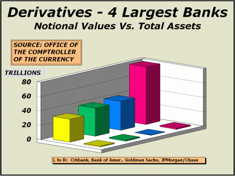
Again below, we have culled our usual perspective of the seven largest banks down to four. Just the four banks pictured below represent 94% of all derivative products peddled with élan by their proprietors, confident that mathematics will carry the days, weeks, months and years without cause for regulation and without significant odds for eventual failure. We hasten to point out the smaller line of bars, barely visible, represent the total assets of the banks in view. As we have stated before on many occasions, the utilization of these contracts and models have allowed banks to take on extraordinary risks and leverage. Just as entropy cannot be removed from a closed universe, risk can never be removed from a closed financial system. The more the players rely on hedges and mathematical models, the less reliability for forecasted human response and eventually, a corrupted model.
The OCC publishes metrics in every report, including detailing how gross negative fair values are countered by gross positive fair values, resulting in a netting benefit for banks. In the Q207 report, netting benefits granted a net current credit exposure of $199 billion, but also specified a potential future exposure metric that curiously, is no longer published. That metric was $1.659 trillion, which coincidentally, is almost precisely the amounts lost by financial companies to date in the wake of this fiasco. As of Q209, netting benefits run $166 billion but gross negative fair values are close to $4.5 trillion. Heaven forfend losses ever reach those levels. Those who know us from many years ago, know our
former propensity for optimism and bullishness. As the market for
derivative products has expanded, our former bullish tendencies contracted
and were replaced by realism. As the Chairman of the NYSE once observed,
the future is built upon concrete, technology and the workforce, not financial
contrivance. Amen.
"....our financial system is gasping for capital because of...excess leverage and speculation...you need capital to alight somewhere and to build concrete things, rather than buying things and selling things." Below, reprinted from the December
21, 2009 issue of Crosscurrents.
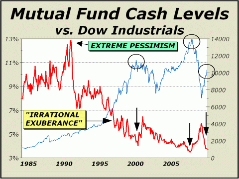
Insufficient Funds We have written about the end of an era quite often in the last few years, pointing to an inevitable secular shift away from paper assets towards more tangible investments, or so-called hard assets, such as gold and oil. Anyone who wishes to argue the point should consider that since July 2007, when all was going swimmingly well with the world, nearly $250 billion has exited equity mutual funds. In the past, a mass exodus would typically be accompanied by portfolio managers raising cash to provide a sizable cushion and a significant stake to invest when the investment environment improved. However, the business of managing OPM (other peoples money) is no longer about fiduciary responsibility, it is about competing and surviving. The stock market, as defined by the Dow Industrials, has risen in 58 or the last 86 years, precisely two of every three years. Betting against being fully invested would appear to be a disastrous wager since the longer term has invariably bailed out shareholders and money managers in the past. Over three year time frames, the market gains ground 76% of the time. Over all five year periods from 1944 to 2003, the Dow was higher 88% of the time. Who can argue with the long term? As a result, paper assets, especially stocks, gained favor to the point of fanaticism, accentuated by the mania that culminated in 2000 with a Nasdaq crash and a bubble echo into the October 2007 price peak. Nevertheless, in the last half-century, there have been many bear markets and most have been accompanied by cash-to-assets ratios rising to 8%, 10%, 12% and even higher as fund managers desperately attempted to avoid the downside. In October 1990, the ratio reached 12.9%. But after the worst crash in Nasdaq history (cut in half in only eight months), the cash-to-assets ratio did not even climb as high as 6.5%. And 19 months later, despite a continuing secular bear market and prices far below the highs, the cash ratio dipped below 5% by June 2002, one of the greatest displays of optimism and complacency ever seen. After the price peak of October 2007, the cash ratio expanded but this time only made it to 5.9%. Incredibly, although the broad based S&P 500 is still off 30% from the price high, the cash ratio has plunged to as low as 3.8% and is threatening to take out the all time lows of 3.5% recorded in the summer of 2007. This display of optimism and complacency surpasses anything we have ever seen before. Although the SPX is 30% below the all-time highs, the math is not quite what it appears, since the major index must climb another 41% to get back to the highs. Given the index is already up 65% from the lows, one would be excused for believing such an event would require a rather complete turn in the fundamentals, such as far lower unemployment stats combined with huge gains in job growth. Neither of these factors appear to be on the horizon.
Instead, we can make the case that stocks are facing the end of an era. We have made this case before with several charts and you can add the picture at bottom left, showing that the trend for mutual funds is clearly no longer on the rise. However, fund assets have now run to 37.4% of total stock market capitalization, the highest in history [the chart is shown in the December 21st issue]. Given that fund assets represent such a huge share of the overall pie and cash ratios are so low, what does this say about the stock markets ability to continue making gains? In our view, not much. Indeed, we are quite disheartened to see the cash-to-assets ratio of mutual funds remain at historically low levels. In March 2000, the buying was completely exhausted as the ratio fell to 4%. In October 2007, the buying was completely exhausted when the ratio was 3.9%, after first having fallen to as low as 3.5%. And now, in December 2009, we can make a logical assumption that buying may be completely exhausted with the ratio at 3.8%. If we are wrong, we are likely not wrong by much. If we are again headed to 3.5%, perhaps it will take several months and perhaps the major indexes will trade somewhat higher. But as in 2000 and 2007, this new peak in complacency and excess would very likely not be followed by a mere correction or even a significant correction in price, but instead, be followed by a third act of pain and despair.
Two Long Term Perspectives REPRINTED FROM THE SPECIAL YEAR
AHEAD ISSUE OF JANUARY 4, 2010
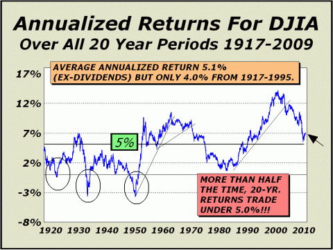
The last decade has come as a shock to the many investors who have been raised on the common wisdom that stocks are always the right place to be. Still, participants are not easily dissuaded and despite the zero percent total return for the last decade, the overwhelming belief is that patience will be rewarded, stocks will earn 8%-10% per year and all will be well. Perhaps. Perhaps not. In recent years, we showed our 10-year annualized return chart many times and boldly claimed average returns would again fall to zero as they last did in 1982. Annualized returns for all ten-year periods actually collapsed to nearly minus 4%. And now we shift our focus to our chart of 20-year annualized returns, which currently stand over 7%. The average for all rolling 20-year periods over the last 93 years is only 5.1% and more often than not, our line resides UNDER 5%, not above it. We suspect the line is headed for the 5% level again. Even if the Dow trades sideways and does not correct, our target will not be achieved until February 2015 (although it will come very close at the end of 2013). However, a correction to roughly the 8000 level would satisfy our 5% target this year.
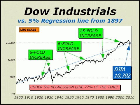
Our 5% Regression chart is similar in that it displays a propensity for the Dow to always and eventually revert to a 5% growth path. After the enormous 15-fold increase achieved by the super bull market and twin manias, we should expect to see this indicator suffer tremendous resistance at the line, currently Dow 10,302. One year from now, the line
will make it up to 10,817,
The next bull market will be characterized by slower gains over a much longer time time. If gains average 5.1% for the
next decade and inflation remains modest,
For far too long, capital has
moved in the wrong direction.
The last secular bull market
was extraordinary.
To see a free sample copy of the Crosscurrents newsletter, CLICK HERE
*THIS USED TO BE OUR FORECAST SECTION Some of our readers may be aware of a recent "study" of stock market forecasters, published by an internet blogger. In our case, this blog reported accuracy ratings that we can only describe as devised and so far from accurate as to be laughable. Needless to say, our forecasts were interpreted incorrectly and denigrated. We have no desire to direct any traffic to this blog and if you are interested in seeing the "study," you will have to search for it. The blog admits "The Crosscurrents forecasts/targets frequently include qualifications/embellishments that makes testing difficult," yet the ratings were undertaken as if gospel. The blog further admits that "a few very bad forecasts make the average absolute error high." Ironically, and most disturbingly, those very same forecasts begin and end with our initial forecast of a secular bear market bottom at Dow 6400, originally published on our website as far back as 2003 and published in our Washington, DC speech before the International Federation of Technical Analysts in November of 2003. However, as our initially cited time target was pushed out with each new forecast, the aforementioned study considered the entire forecast before it to be utterly wrong and in some cases, awarded us a rating of minus 80% accuracy. That is a stunning misapplication of statistical science, in that the actual bear market low to date was Dow 6469 print basis on March 6, 2009. On a number of occasions, we also specified an SPX low of 680, about as close as one can get to the actual 683 closing low. We not only forecasted the actual price bottom with pinpoint accuracy, we did so six years before the fact. Moreover and most importantly, we have usually cited the upside parameter as "potential" and the downside parameter as "risk," in order to highlight both the best and worst possible cases. The study incorrectly interprets each of these parameters as actual forecasts, which must, by definition, make one or the other of our parameters hopelessly wrong. The market cannot move in both directions at once. If an actual forecast has been issued in the past, it is typically not accompanied by a disclaimer, such as upside "potential" or downside "risk." It has always been accepted wisdom in our business that one does not forecast both price and time together. If a time is specified, never specify a price. If a price is specified, never specify a time. It is sufficiently difficult to forecast one of the two aspects alone. Most forecasters follow this golden rule. When we issue a forecast, we typically do not follow the golden rule. However, the denigration of our forecast results by this faulted study has cast a serious pall on our desire to continue publishing price and time forecasts for the benefit of the public on the free portion of this website. The Crosscurrents website has had more than three-and-a-half million visitors since it was established in 1999 and we are quite proud to display just a few of the many kudos accorded us by readers at http://www.cross-currents.net/kudos.htm. We did not earn these kudos by publishing wrong forecasts time after time. Despite our desire to continue serving the public, we will no longer expose our analysis to faulty studies and inadequate math on the free portion of our website. Therefore, our policy is now changed. While we will continue to publish the very popular Pictures of a Stock Market Mania feature, we will no longer provide any price and time forecasts or parameters as have accompanied this feature in the past. The subscriber portion of our website will have the same article accompanied by price and time forecasts and other parameters as we deem significant, as it always has. If you wish to see these forecasts and or parameters, we suggest you subscribe or purchase a copy of the full article for $20 [CLICK HERE]. If this policy change does not meet with your approval, we certainly understand and nevertheless, invite you to continue reading the free articles we post for the benefit of the public. THE CONTENTS OF THE ENTIRE WEBSITE ARE COPYRIGHT 2010 CROSSCURRENTS PUBLICATIONS, LLC I hope you have enjoyed your visit. Please return again and feel free to invite your friends to visit as well. Alan M. Newman, January 26, 2010 
CLICK ICON TO GO BACK TO ARCHIVE MENU All information on this website is prepared from data obtained from sources believed reliable, but not guaranteed by us, and is not considered to be all inclusive. Any stocks, sectors or indexes mentioned on this page are not to be construed as buy, sell, hold or short recommendations. This report is for informational and entertainment purposes only. Persons affiliated with Crosscurrents Publications, LLC may be long or short the securities or related options or other derivative securities mentioned in this report. Our perspectives are subject to change without notice. We assume no responsibility or liability for the information contained in this report. No investment or trading advice whatsoever is implied by our commentary, coverage or charts. |