| Other than
the rare token three-minute appearances of Robert Prechter and David Tice
on CNBC, the coverage of the secular bear market and potential for further
dis-investment by the American public just doesn't seem to rate much attention
by the nation's most visible purveyor of financial news. As if it
just wasn't that important for folks to know.
Of course,
we all know that ratings are the key to advertising revenue and in a bear
market, interest in stocks must wane... and with interest, ratings....
and with ratings, advertising revenues. So the trick becomes one
of focusing on the good, rather than the bad. Or stressing the possibilities
offered by the future without considering any of the lessons taught by
the past. By continuing the policy of pushing hope for investors,
CNBC attempts to survive. Not that we can fault the need for survival
- we cannot - but unless we have just plain lost our editorial mind, we
see anything less than unbiased and full coverage of the bear market as
deceitful. The public needs to be reminded every day that even now,
valuation measures are far from what history has shown is sustainable.
Although we
certainly cannot claim infallibility nor are we blessed with an innate
ability to forecast with precision, we are nevertheless pleased to offer
you a few perspectives that you will not find elsewhere in the financial
media. The pictures tell a continuing story. The bear market
is intact. Incredibly, the mania is intact as well.
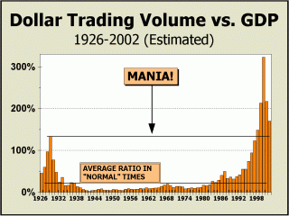
The final figures will not
be available for at least another month or two, but our preliminary estimate
for all of 2002 places total Dollar Trading Volume at 170% of Gross Domestic
Product. Before the mania for stocks began to take hold as early
as 1995, this measure had exceeded GDP only once before, in 1929 at 133%.
The measure has now exceeded GDP for six consecutive years, topping 2.4-fold
higher than it did in the Roaring Twenties and in fact, it has averaged
over 170% of GDP since 1995. This period of eight years represents
by far, the most incredible stock market mania of all time. Incredibly,
despite the collapse by Nasdaq and the obvious shredding of the notion
of a "new era," DTV remains robust and is only down 45% in absolute dollar
terms in the two years since the peak. At a similar point after the
Roaring Twenties concluded in a crash, DTV had fallen by 76% and was off
by 89% after three years. It may be somewhat instructive to consider
that the implosion of the Roaring Twenties did not end until 1942, with
DTV crushed by 96.8% in absolute dollar terms. Can it happen again?
We're betting it will not, but to believe the worst is already over would,
ironically, require that the notion of a new era be correct.
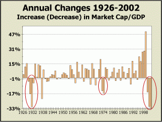
How a "new era" could be
in force when so much money has been lost in stocks is beyond our ability
to comprehend. As our next chart clearly illustrates, losses have
run to levels worse than they were from 1930-1932, relative to GDP.
The total absolute losses since the end of 1999 are now approximately $8.1
trillion. Given that much of the economic expansion from 1982 was
built upon expanding debt, how can recovery from an implosion in stock
values come with debt still at record extremes? As revealed by Morgan
Stanley's Stephen Roach recently, over the 25 years from 1957 to 1982,
total government, business and household debt increased by $5 trillion
dollars while national income increased by $3 trillion dollars. But over
the past 20 years from 1982 to 2002, total debt has increased by more than
four times as much - $22 trillion dollars - while national income has increased
by only the same $3 trillion. The percentage of income now devoted
to interest payments has risen 20% since 1996 and is at a record high 14.4%
of annual income. Thus, interest payments as a percentage of total
income are at record highs while interest rates are at record lows.
Debt service now soaks up a sufficient portion of the marginal demand for
stocks and likely ensures a very long period of retrenchment, for both
borrowers and shareholders.
After '73-'74,
it took another eight years for the bull to return.
After '29, it took
26 years for the bull to return.
Expecting that the
bull has already returned simply staggers the imagination.
Since the October bottom, we have been besieged
by repeated commentaries and analyses about the brand new baby bull market.
It's not as if we're wishing for the opposite. Truth be told, we're
definitely not fans of trouble, nor disaster, not even of bear markets.
But
it is what it is as far as we are concerned. No use beating
around the bush. No use wishing a new bull into existence when past
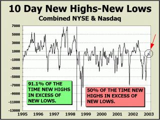
excesses have obviously much room to unwind. As further proof of
our own theory, we offer a chart we have shown many times before, of New
Highs minus New Lows registered on the New York Stock Exchange over all
10-day rolling periods. It is clear from this picture just when the
bear market commenced - in late May of 1998. It is also quite evident
how the dynamics of both bull and bear differ. Given recent action
from the October low and how this action stacks up against prior rallies,
how can the notion of a brand new bull market be supported? Seems
to us that if anything, the current rally is weaker than it should be if
this were a bull market. In the same span of 63 trading sessions
from the orthodox lows in September of 2001, this indicator gained 8164
units to a positive 1100. And this time? The gain is 6912 units
to a positive 965. Although it will certainly gain ground for another
couple of weeks, we are hard pressed to see this rally as dynamic of a
bull market; far more likely, it is the dynamic of a downside consolidation
.
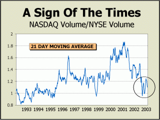
In the November 18th issue of Crosscurrents, we
presented the chart at left entitled "Dead Can Dance," commenting on the
probability that the next bounce would not venture far into territory seen
during the latter part of the mania. Ironically, the recent pullback
is additional evidence that Nasdaq's reign as the stock market for the
21st century is dead in the water as the century begins its third year.
After the bursting of the biggest stock market bubble in history, how much
can one like about an index that has at best, microscopic (if any) earnings
and near zero dividends? Especially now that the administration is
focused on rewarding those who hold dividend producing stocks, why would
Nasdaq hold any interest for investors? Additionally, stocks need
earnings to pay dividends. Nasdaq has neither in any substantial
quantity and for the foreseeable future, it appears interest in Nasdaq
vis-a-vis their more conservative brethren on the NYSE will remain quite
subdued.
Without the usual excitement generated by
Nasdaq, can there be a new bull market?
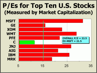
We showed the two charts below in our June report,
which will be posted again in our Archives when the Archive renovation
is complete sometime in February. P/E multiples have contracted sharply
from our earlier perspective, but our earlier view was shown when the top
ten stocks included Coca Cola and Intel, which sported multiples of 39
and 56 respectively. Coke & Intel have been replaced by IBM and
Merck, at 22 and 23 multiples. However, the overall multiple of our
high cap group is still 22.5, far higher than history is shown can be sustained.
Even without the highest multiple for Microsoft included, the average for
the other nine stocks is still 21.5, about 50% higher than the historical
average for the S&P. We have arbitrarily placed a line at a 15
P/E to illustrate that only one of the ten issues trades at a valuation
that is quite reasonable from a historical perspective.
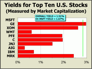
As opposed to the contraction in P/E multiples,
the replacements in the top ten offered almost no help to investors with
regard to dividend yields. In June, yields for the top ten stocks
were a stingy 1.38%. Today they are a stingy 1.51%. Even without
the zero percent dividend of Microsoft, yields for the other nine companies
are only 1.67%. Before the current stock market mania took control
of the masses, history had shown that bear markets typically begin when
yields drop to under 2.86%.
Yields have remained under that overvalued
boundary for nine years!
Typically in the past, bull market began when yields
surged to 6.67%. Given that "new era" thinking is still in vogue,
it will likely be years before yields that robust will occur again.
Dividends have averaged 4.15% back to 1928. Perhaps yields will eventually
attain the historical average before the bear ends? Still too much
to expect? Even if we were only to expect yields to return to the
traditional overvalued level of 2.86% (as indicated by our vertical green
line), this can only occur if prices fall, dividends rise or a combination
of the two results in our target. If dividends for the top ten rise
by a generous 25% in the next five years, the 2.86% boundary can only be
achieved if the average price of our top ten falls by 34%!
Can these be pictures of the beginning of
a bull market in stocks?!
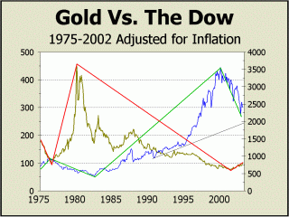
When "911" took place, we could no longer ignore
the inevitability that gold would eventually trade in a new bull market.
Gold had peaked in January of 1980 at over $800 per ounce and had only
sporadic failing rallies since. But 21 years is a long time and with
the likelihood that paper assets had seen a once-in-a-lifetime high, money
would necessarily and eventually gravitate to other assets, like gold.
At left, the cycles that set stocks and gold in opposite directions seems
quite apparent. One up and the other down. Although the cycles
do not turn with complete precision, when they have turned, they have turned
emphatically
we expect they are turning emphatically now. We have adjusted both
gold and the Dow for the effects of inflation to afford a true perspective
in constant dollars.
At right, our particular technical discipline illustrates
the breakout in September 2001 with clarity, overcoming a downtrend in
place since January of 1983. Remember, these charts are adjusted
for inflation. We would always prefer to use the actual price high
to draw our lines but spikes in a mania, such as the one for gold in 1979-1980,
do not efficiently portray "trends." We do not believe there is serious
resistance for gold until the point where our other two drawn lines converge
at approximately $418 per ounce. If the notion that gold is in a
new bull market is correct, much higher levels are achievable. If
you compare the inflation adjusted heights reached by both gold and stocks
in their respective bull markets, there is every reason to believe that
levels approaching those old highs are possible - even if they are not
probable. We can come up with additional targets at 780 per oz. and
$951 per oz. by matching gold's prior lower peaks with the possibility
of a new bull market.
Note how the manic top in gold in 1980 was
resolved.
A protracted bear market and far lower prices.
Note how the bear market in stocks has proceeded
thus far.
With what certainty can we assume a new
bull market in stocks has commenced?
None....
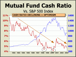
We showed the chart at left six months ago and
despite the prognostications of a new bull market coming from Wall St.
professionals and the media, not much has changed at all in our perspective.
Optimism still reigns. The trend in place for the cash ratio from
the early 90s to the 2000 top in price is quite obvious. After all,
how else would such a phenomenal increase in price take place unless cash
was spent down, down more and down still further? Note how brief
price corrections in 1997 and 1998 were accompanied by equally brief upturns
in relative cash levels.
Incredibly, since late in 2000, cash levels
have not risen further - they have instead fallen.
When cash levels peaked at 6.47% at the end of
November 2000, the Dow was at 10414, the SPX at 1315 and Nasdaq was at
2597. In all of the visible history we have of mutual fund cash levels,
there could only be one conclusion derived from a 15% decline in the Dow,
a 30% decline in the SPX and a 45% decline in Nasdaq; pessimism would surface
and cash levels would have to rise. Not this time! What better
proof can there be of ebullience, of continuing enthusiasm for stocks?
However, as history has shown, low cash levels also provide little support
for prices. Only a move back to levels that have typically ended
bear markets in the past will end this bear market.
Is this the picture of a brand new baby bull
market?
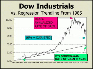
Every few months we show the 5% regression line
for the Dow in order to illustrate how the mania for stocks generated returns
that could not possibly be sustained. Why 5%? Going back more
than a century, stocks have returned somewhere around the 4.5-5% level
ex-dividends. Yet, from the start of our chart in September of 1985,
stocks attained an average annualized gain of 16.6% in 1999. This
rate of return is sufficient to turn $10,000 into one million in 30 years.
If everyone could achieve results like that, no one would work and all
would simply invest... but in what? If no one was working, there
would be no industry to invest in! Even if annualized returns fell
to 10%, more than double the historical average, the Dow would still need
to decline to 6750, about 23.3% lower than today.
For returns to regress to a 5% mean,
the Dow would need to decline to about 4926,
down 44% from today.
A recent issue of BusinessWeek polled the "Fearless
Forecasts" of 67 "of the smartest players on Wall Street." It always
seems to be the "smart" ones that get it wrong, like the majority of Wall
Street strategists who have been so woefully wrong on the direction of
stock prices for so long. The consensus view is that the Dow will
end the year at 9871, up 18.3%. It is the view of the group of 67
that the S&P 500 will rise 19.3% to 1049 and that Nasdaq will surge
27.6% to end the year at 1703. Although we must admit that we believe
prices could conceivably end the year modestly higher, we believe the odds
of an up year are not great and gains will likely be limited to 5%.
The group of 67 experts also placed average allocations
of 68% in stocks and 7% in cash, almost precisely where their brethren
of 15 top strategists placed their allocations. It is very difficult
for the mainstream to deviate from the norm. Dare we say "Monkey
see, monkey do?"
Elliottwave's Steve Hochberg recently cited the
Sindlinger & Co. weekly survey, showing the percentage of U.S. households
in stocks is at 56.7%, "exactly where it was at the Dow's all-time peak
on Jan. 14, 2000. At a bear market bottom, Hochberg feels this percentage
"will be 20 percent or lower." That would certainly fit in with the
way past manias have played out.
From the peak in March of 2000, what has
changed?
Allocations by the experts always favored
stocks by a substantial margin.
The consensus always looked for higher prices.
And all the while,
a bear market was in progress.
More likely, when the next
bull market arrives, almost no one will believe it.
Our initial forecast
for 2003 places the highs for the year at:
Dow 9600 - SPX 999
- Nasdaq Composite 1550 (low odds)
Our initial forecast
for 2003 places the lows for the year at:
Dow 6400 - SPX 680
- Nasdaq 1000 (high odds)
THE CONTENTS
OF THE ENTIRE WEBSITE ARE COPYRIGHT 2003 ALAN M. NEWMAN
Alan M. Newman, January 11, 2003

CLICK ICON TO GO BACK TO ARCHIVE
MENU
All
information on this website is prepared from data obtained from sources
believed reliable, but not guaranteed by us, and is not considered to be
all inclusive. Any stocks, sectors or indexes mentioned on this page
are not to be construed as buy, sell, hold or short recommendations.
This report is for informational and entertainment purposes only.
Longboat Global Advisors, Alan M. Newman and or a member of Mr. Newmans
family may be long or short the securities or related options or
other derivative securities mentioned in this report. Our perspectives
are subject to change without notice. We assume no responsibility
or liability for the information contained in this report. No investment
or trading advice whatsoever is implied by our commentary, coverage or
charts. |