|
- THE GREATEST STOCK MARKET MANIA OF ALL TIME - DATED FEBRUARY 10, 2013 A SPECIAL REPORT BY ALAN M. NEWMAN, EDITOR CROSSCURRENTS This free feature is now updated only three or four times each year. Our next update will likely be published in late June 2013 |
|
Our readership
is world-wide.
This report
is primarily a compilation of articles that have previously appeared in
the Crosscurrents newsletter.
Please check out the testimonials on our Kudos page. Printable
files of this report accompanied by our forecast are available only to
paid subscribers.
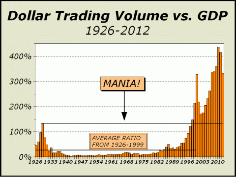
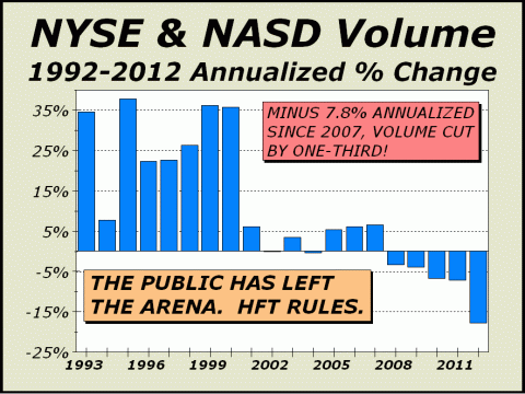
Several months ago, we attempted to show how the stock market has evolved from a public arena to a proving ground for the algorithms that currently control bids, offers and prices. High frequency trading has completely usurped the theme of investment and replaced it with a market that places traditional investors at a severe disadvantage. There is no point competing because fair valuations are no longer possible. Last year, total dollar trading volume (DTV) fell a resounding 17.1% as investors continued to move out of stocks at an extraordinary pace. The two-year decline of $12.3 trillion in DTV is clear evidence that the secular bear market has taken another bizarre twist and confirms our theory that Americans no longer believe the U.S. stock market can be fair. The huge bars for the last half dozen years in our next two charts are comprised mostly of high frequency and other programmed trading. We spoke of a burgeoning metamorphosis of the stock market as far back as November 2003 (see http://www.cross-currents.net/archives/dec03.htm) and clearly, we hit the nail directly on the head. The U.S. market is now ruled by mechanical forces. Program trading has tripled from the first few years of the 21st century and now averages over 30% of all NYSE trading. In fact during the week ended September 28, 2012, programs accounted for 48.6% of all volume. We do not have an exact count of DTV accomplished through programs but if we placed an average value of $50 for each share traded in this manner, we would still only come up with a sum of $1.2 trillion. Total DTV is now $52.7 trillion. So, where is other $51.5 trillion?
Given the huge outflows from domestic mutual funds last year, we cannot attribute much of DTV to the public, who certainly did not appear to be in a mood to trade. Close to $160 billion came out of domestic mutual funds. How then, were $57 trillion
in stocks traded?
The first two peaks on our next chart are ridiculously easy to tag as veritable full fledged manias, even if only from what we now know, that both bubbles collapsed. However, the evidence was certainly there; in the Roaring Twenties, leverage and sentiment went to extremes and the same occurred in 1999-2000 as margin debt soared to new record heights and no price was deemed too high to pay for Nasdaq's growth market, which eventually traded at 250 times earnings. While we see a modest pullback in trading as Nasdaq crumbled and the S&P 500 and Dow Industrials were both cut in half, trading came roaring back. From the end of 2003 through 2007, DTV increased 144% and mutual fund inflows were $568.5 billion. But then over the next five years, from the end of 2007 through 2012, DTV continued to ramp up even as investors pulled out $524.8 billion from mutual funds. If investors were so intent upon removing more tan a half-trillion dollars from funds, how could DTV advance another 39% and still remain more than $6 trillion higher than before?
The answer of course, is HFT. HFT is the most abusive force ever devised to take advantage of the public. Not only can HFT purveyors get lower prices on the buy side, they receive higher prices on the sell side. Part of the discrepancy is due to speed, which is now measured in milliseconds. Machines simply move faster. Their only limitation is speed of light. Every aspect of HFT, every strategy, every angle is designed to step ahead of the public on both the buy and sell sides. Huge profits are not necessary. Trade for minuscule gains and trade often, as often as possible and rack up profits with many tiny profits. HFT trades need not even make a profit in order to profit! How so? HFT is also about rebates garnered from exchanges for giving them transaction volume and business. I trade a zillion shares with you, you give me back $x per share as a reward for giving you all this business. The result is that it is possible for HFT to get out of a losing trade with a profit. Thus, the price paid per share is almost irrelevant, the primary reason why our stock market can no longer be fairly valued. You simply cannot trust prices anymore. If HFT could not accomplish the advantages it practices, there is every reason to believe the minuscule profits from each trade would cease to be and end the dominance of these strategies. HFT purveyors might simply evaporate just as the public has disappeared from the action. Clearly, the public has exited at a startling pace over the last few years. Although the stats show inflows for stocks in the opening weeks of 2013, we believe most of this represents tax planning as bonuses or some pension benefits that otherwise would have been paid in 2013 were paid out near the end of 2012 and immediately invested. We expect these inflows to
slow,
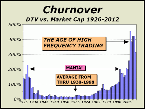
The trend towards lower volume clearly corresponds with the advent of new mechanical forces in the market. While it is still possible to cherry pick and establish good trading opportunities and long term investments, this is not your Father's stock market anymore.
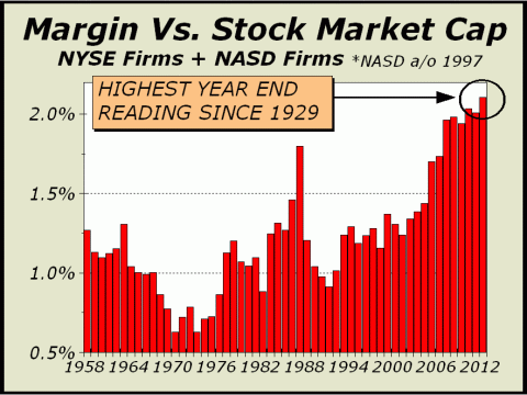
Volume stats, such as the chart above, are proof that the traditional stock market simply does not exist anymore. Increasingly, transactional volume stems from forces unfriendly to investors since valuations no longer play the pivotal role they once played. Worse yet, since it is now problematic to determine fair values, participants are ramping up their utilization of margin leverage to take advantage of the momentum established over the period since the March 2009 lows.
Thus, the combined margin stats for the NYSE and NASD are now the highest they have been since 1929 versus total stock market capitalization. We have been at lofty extremes for six years. On September 5, 1929. leading economist Irving Fisher said "Stock prices have reached what looks like a permanently high plateau." What you see above is not a
permanently high plateau.
The great secular unwind is destined to continue.
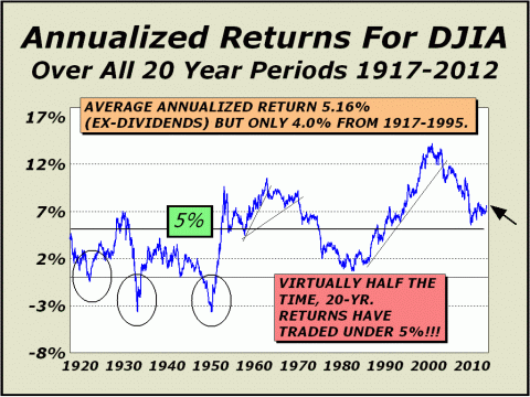
The following was the lead article in our December 31, 2012 issue. Getting Older...But Not Better. A demographic nightmare is brewing. Proof is seen in Japan's dwindling birth rate, which will be unable to support any notion of a secular bull market for generations to come. Japan's Nikkei Index is still down roughly 75% from the highs of December 1989. While the U.S. is still comparatively young, the aging of developed populations will have an impact on the margin for the worldwide economy and demand for stocks. It is now ten days past the Mayan apocalypse and the world has not ended. It is, however, changing rapidly in directions that will have an enormous impact for the generation ahead, transformations that could conceivably extend the secular bear market as far as the eye can see. We have covered with ever increasing depth how the financial markets have metamorphosed in the last dozen years. We gave a speech on this matter at the International Federation of Technical Analysts in November 2003, laying out in forty-five minutes just how this was going to play out and even offering a secular bear market target low six years ahead of time that missed by only 69 Dow points (see http://www.cross-currents.net/archives/dec03.htm). Our worst fears have been in view for every bit of the last dozen years and unfortunately, as much as would love to finally be as bullish as we were in July 1982, December 1987, January 1990 and even March 2009, there is no way to ignore that growth in industrialized nations has been predicated to an increasing degree on borrowed money and changing demographics will not be friendly as time passes. Returns from stocks have been far too generous for far too long, enhanced by easy money, the use of leverage and a complicit Federal Reserve, eager to see wealth built by any means. But history has shown reversion to the mean is real, not theoretical. As defined by the Wikipedia, ...the concept is the assumption that .high and low prices are temporary and .will tend to move to the average price over time. Twenty-year returns will eventually revert to the norm of roughly 5%. This may take years to occur but it must, because if it were to never revert, there would never be risk nor reason to invest in any other asset group. With the Dow merely trading sideways from here, it would take almost three years for the 20-year rolling return to revert to the mean. Even more distressing, note there have been three phases in which 20-year returns were under zero. At Dow 10,000, this circumstance would require well over six years.
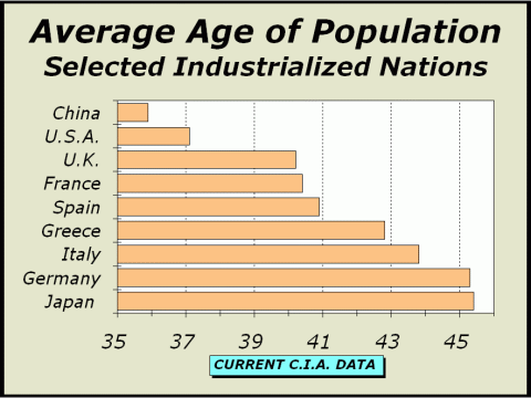
Fundamentals in the form of demographics argue for a reversion to the mean. The average age in the U.S. is now 37.1, which is not particularly old for major industrialized nations but the birth rate growth is now dropping so fast that the average age will be impacted. There are a number of reasons why birth rate growth is declining but clearly, one of the most important is that Baby Boomers are no longer reproducing. All those in this demographic group were born between 1946-1955, thus the oldest are now 67 and either retired or about to retire. The youngest are now 56, likely no longer even dreaming about having children and likely more focused on spending less and saving more for retirement just around the corner. Now it is a bit easier to see another reason why our economy has been under some pressure for quite awhile. Unfortunately, this will worsen over time. The Population Reference Bureau has taken note of our slower growth, citing lower immigration, declining fertility rates and an aging population (see http://bit.ly/12w4qim). The statistics show a marked decline; The United States added just 2.3 million people from 2010 to 2011, compared with 2.9 million from 2005 to 2006, just five years earlier. The article further states that the U.S. still has a relatively young age structure but the trends in place imply the age structure could start to resemble Europe. Europes population is not only older but is aging more rapidly, and the demographics of the Eurozone will be far more negative than ours in the remaining years of the decade. Of the 17 countries in the group, the four largest economies account for 57% of the total GDP and each of those countries are experiencing aging populations. Below, we illustrate average age of the population for those four countries plus several selected countries and the U.S. for reference. Germany is the worlds fourth largest single country economy and their population is also the second oldest amongst large industrialized nations.
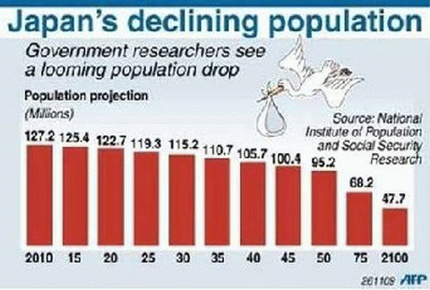
The U.S. is the largest single country economy, followed by China and Japan. However, the entire Eurozone comprises the largest economic zone in the world, roughly $17.6 trillion versus U.S. GDP of little more than $15.6 trillion. The United Kingdoms GDP is the seventh largest in the world. In Japan, the secular bear market has lingered on for 24 years and stocks today trade for only 25% of their value at the peak in December 1989. This is one of the most protracted bear markets in financial history and may be an indication of what is in store as other industrialized nations mature and begin to age. The CIAs World Fact book lists average age for populations (see http://1.usa.gov/U7DVOn) and Japans population is the oldest amongst large industrialized nations at 45.4 years. The aging of Japans population has already had a pronounced impact as the country literally cannot now pull itself back up to what used to pass for full economic growth. As the population ages, spending decreases and Japans economic boom, once the envy of the planet, is now a shadow of its former self. Above, Japans population appears to be headed into a death spiral. At last count, the birth growth rate was negative 7.7%. Government debt now stands at 1.086 quadrillion Yen, equal to $12.89 trillion.
Above, the former wunderkind
of economic growth
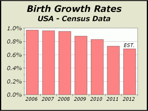
We note that much of Greeces problems stem from unfunded pension liabilities that were so unrealistic that both salaries benefits have been cut sharply resulting in a poorer population no longer capable of sustaining economic growth. Greeces population growth has now fallen to 0.006%, placing even their drastically cut benefits in some doubt for the years to come. Birth growth rates are also declining or have declined sharply in China, barely positive at 0.0016%, and Germany, which has now turned negative at minus 0.002%. China is the worlds second largest single country economy. Germany is the worlds 4th largest single country economy and has been the glue holding the Eurozone together, but for how long? Negative birth growth rates are going to have a huge impact as economic growth remains muted and both private and government liabilities turn into nooses. Below right, there has been a startling decline in our domestic birth growth rate in recent years. In 1950, there were 15 workers supporting each Social Security check. By the end of 2010, the number had fallen to 3.3 workers supporting each check. The government now assumes there will be only two per retiree by 2025. If you factor in unfunded liabilities for Social Security, Medicare and Medicaid, the tally for these liabilities actually rises from $16 trillion to $87 trillion. And if thats not enough, according to Boston University, the tally soars to $202 trillion in 20 years. It seems clear we are headed
into a protracted period of at very best,
....and a reversion to the
mean for those holding stocks
In the December 19th issue of Deliberations (see http://bit.ly/12zjKgP), the always spot on Ian McAvity reminds us of several salient facts that cannot help but impact the years ahead; From 1975 to 2000, private sector payroll employment increased at double the rate of population growth (2.13% vs. 1.08%). Since 2000, it has flattened out to 1/5 of population growth rates, while "Not in the Labor Force" shows a compound annual growth rate of 1.98% p.a. vs. 0.9% for population since 2000. Thus, we have exactly the opposite situation as before. While the feds might cheer that private payrolls are up 3.1 million in the last dozen years, the Not in Labor Force category is up by 19.7 million. Going forward into the new year, its not going to be about job creation, its going to be about the Not in Labor Force category. The more this category grows, the less capable our economy will be to generate the kind of growth necessary to create jobs and to supply the government with the tax revenues it needs to operate. It is not our job to offer solutions, just to posit what comes next and what we see is not pretty. The worst case scenarios seem to be reserved for the EuroZone, especially Greece and Spain, where it seems increasingly unlikely that either country will recover soon from current unemployment rates of 25%. Despite the common wisdom that Japan is now poised to move to the upside, we would not be surprised to see the Nikkei take out the January 2009 lows under 9000, down 20%. While the U.S. may muddle through 2013 without
disaster,
There are far worse places to be invested, such as Europe or Japan. Probably the best way to view the prospects
for next year and beyond
For the long haul, we see only
two areas
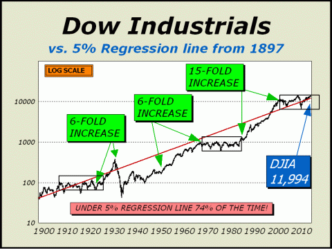
Regression To The Mean. We've had this regression chart in our files for as long as any other we've maintained. We keep and use what works. It's not a short term nor timing indicator but if there's a lesson to be learned, it is that always and eventually, markets revert to the mean. In the case of stocks, prices rise roughly 5% per year and the logic behind this statement is solid. for instance if we were all to assume stocks could permanently rise by substantially more than 5%, all competing investments would lose any attraction. As well, since this would mean less risk in holding stocks longer term, there would be virtually no reason to ever own bonds. But without a bond market, there would never be a stock market. Companies cannot raise all the money they need just from selling common stock. We used the chart below to forecast the huge 50% plunge in 2008-2009 years ahead of time and while we cannot point to the same downside potential here, we note with apprehension that a regression to the mean would take the Dow Jones Industrials down by quite a lot.
The regression line stands at 11,994. The Dow is at 14,000, 16.7% above the regression line. 16.7% below the regression line is Dow 9991. We could easily see the Dow Industrials trade below 10,000 once again. The great secular unwind continues.
To see a free sample copy of the Crosscurrents newsletter, CLICK HERE
THE CONTENTS OF THE ENTIRE WEBSITE ARE COPYRIGHT 2013 CROSSCURRENTS PUBLICATIONS, LLC I hope you have enjoyed your visit. Please return again and feel free to invite your friends to visit as well. Alan M. Newman, February 10, 2013 The entire Crosscurrents website has logged over three-and-a-half million visits. All information on this website is prepared from data obtained from sources believed reliable, but not guaranteed by us, and is not considered to be all inclusive. Any stocks, sectors or indexes mentioned on this page are not to be construed as buy, sell, hold or short recommendations. This report is for informational and entertainment purposes only. Persons affiliated with Crosscurrents Publications, LLC may be long or short the securities or related options or other derivative securities mentioned in this report. Our perspectives are subject to change without notice. We assume no responsibility or liability for the information contained in this report. No investment or trading advice whatsoever is implied by our commentary, coverage or charts. |
|
|