|
THE GREATEST STOCK MARKET MANIA OF ALL TIME - DATED DECEMBER 19, 2010 A SPECIAL REPORT BY ALAN M. NEWMAN, EDITOR CROSSCURRENTS This feature is now published on roughly a quarterly basis. Our next update will likely be published in late March 2011 |
|
Our readership
is world-wide.
This report
is primarily a compilation of articles that have previously appeared in
the Crosscurrents newsletter.
Please check out the testimonials on our Kudos page. Printable
files of this report accompanied by our forecast are available only to
paid subscribers.
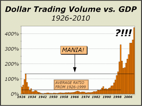
The problem of securing accurate data for total Dollar Trading Volume (DTV) remains. There are now so many sources that report transactions that it is far beyond our ability to track them all on a daily basis. The BATs exchange (links for trading on Monday, December 13th) shows data for 13 exchanges, including Nasdaq and the New York Stock Exchange. Collating all the data is impossible with our limited time, thus all we can do is estimate. There is also the possibility that a growing number of transactions are not even reported. The existence of black box transactions and dark pools has the potential to place our estimate on the low side of what actually occurs. In addition, today's estimate is purposely made on the conservative side to avoid the sensational. And yet, it is sensational. As we said in our last report, "there may now be no way to accurately quantify transactional volume" and what we offer in our lead chart is our best guess. And again, what we see is staggering and utterly depressing. In previous reports, our charts assumed trading on the New York Stock Exchange accounted for as little as 25% and as much as 30% of all transactional volume. For the basis of today's report, we are increasing the denominator to 27%, which we believe is a fair accounting. We are also estimating a total of 44% including transactional volume from Nasdaq. DTV for the New York Stock Exchange is reported monthly and below are links to view the most recent data for the NYSE, Nasdaq and BATs. At the current pace, NYSE DTV will total about $18.11 trillion for the year. Nasdaq data is available in spreadsheet form. At the current pace, just over $13 trillion will be transacted. Although a 44% denominator would take our total to close to $71 trillion, we are electing to use a 48% denominator in the interest of presenting a conservative estimate. [CLICK
FOR NYSE TRADING]
Our new estimate places total DTV at roughly $65 trillion for the year. Given GDP of $14.7 trillion, DTV is more than 4.4 times GDP, again, the highest ever. DTV is also 4.45 times total market cap, only a shade below the all time high of 4.55 times market cap in 2008. We will break all records with room to spare.
THE CHART BELOW IS PRESENTED
ALONG WITH A PORTION OF THE LEAD ARTICLE IN THE DECEMBER 6th ISSUE OF CROSSCURRENTS.
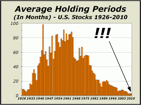
Thursday, June 3, 2010 was just an average day. The major U.S. indexes barely budged, the globe continued to spin and business continued to be transacted both on and off the stock exchanges. Roughly $40.4 billion in transactions wended their way through the economy, as consumers shopped for groceries, car dealers ordered parts for their shops and a few flat screen TVs moved off the shelves. Nothing out of the ordinary. However, on the stock exchanges, the SPY Spyder Trust traded like there would be no tomorrow as $26.1 billion exchanged hands. Another $7.1 billion traded hands in Apple Computer (AAPL), $4.8 billion in the iShares Russell 2000 and $4.3 billion in the Powershares QQQ Nasdaq 100 Trust. Amongst only those four securities, more money had exchanged hands than wended their way through the entire U.S. economy, the world's largest economy by far. By the time one moved down the list to only the 13th security with the greatest dollar volume in trading, $62.5 billion had changed hands that day, equal to more than 25% of all domestic trading and more than 1.5 times the GDP seen on that day. Of the approximate 18,500 securities trading on U.S. markets, it only took 99 to generate 50% of all trading volume. If June 3rd was typical, clearly, the economy took a back seat to trading as total dollar trading volume came in at an estimated $249.4 billion, more than six times the amount of business transacted off the exchanges. It has been calculated that high frequency trading (HFT) now accounts for as much as 70% of all trading, allowing holding periods to contract as far as ever in history. Although it is clear that heavily traded issues certainly have shorter holding periods than more lightly traded issues, the overall average holding period is now less than 2.8 months, slightly more than the record 2.6 months established in 2008. The theory that buy-and-hold was the superior way to ensure gains over the long term, has been ditched completely in favor of technology. HFT promises gains are best provided by holding periods measuring as few as micro-seconds, possibly a few minutes, or at worst, a few hours. Almost no high frequency traders hold positions at the end of the day. Too risky. Anything could happen overnight, when for all intents and purposes, trading ceases. As our featured chart clearly illustrates, the average holding period for U.S. securities has been cut to the quick. By the time World War II came into view, the average holding period for stocks was over five years and buy-and-hold theme for investors was Wall Streets sure bet. And it sure worked well for a very long time. However, the short term panics of 1987 and 1998 clearly provided interest for a new mindset and the drubbing investors received when stocks were cut in half from 2000-2002 and again from 2007-2009, was sufficient to march many small investors away from Wall Street, perhaps forever. In desperation to retrieve lost business and foster revenues, banks and brokers created a new environment that no longer accommodates investors, only traders with a mentality and rationales that do not justify any traditional requirement for fair valuations of equity.
As holding times contract,
investors have less sway, traders have more sway.
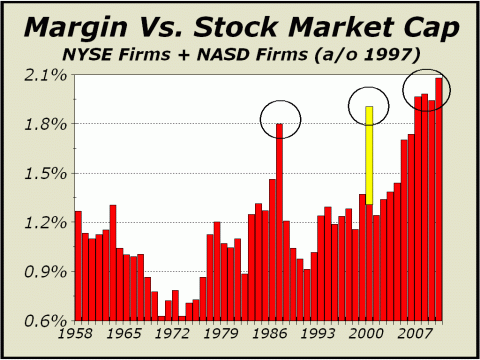
The average holding period is now well under three months. One excellent method to measure speculation, and thereby rampant optimism, is the utilization of margin debt. Comparing the chart below to the one above, it is clear that increasing use of margin debt goes hand-in-hand with contracting holding times. Clearly, there is no point in holding a stock for several years and paying or the privilege, since you will need higher prices just to pay interest. The yellow portion of the bar for the year 2000 shows exactly where margin debt stood as a percentage of total stock market capitalization at the peak on March 10th. The red portion is simply where margin debt ended the year. Measuring margin versus total capitalization seems like the most effective perspective for measuring speculation and optimism. Although we do not show the data beyond 1958, we can state without reservation that 1929 was the only occasion in which speculation exceeded what we have seen in the last decade. However, the upwards move in margin debt this year to over 2% of stock market cap is nevertheless, one of the highest readings ever and should serve as the strongest possible warning that the market is as dicey as it has ever been.
Avoidance of leverage is disappearing. Increasing use of leverage
equates to increased systemic risk.
What do you suppose will happen
now?
The following article was the
lead article in our October 25, 2010 issue.
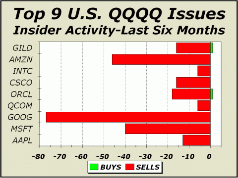
Insiders See Great Value.... In Cash. Every once in a while we take a look at insider activity in an attempt to gauge the confidence corporate execs have for the future of their own companies. Typically, in the past, we have examined the top ten companies in the Nasdaq 100 in one issue, then a couple of months later, we look at the retail stocks and then another couple of months later, we examine what insiders are doing in the Semi sector. On rare occasion, we have even tallied insider activity for all 30 Dow stocks. Of course, sellers are always more prevalent than buyers because compensation is based partially on options granted, vested and then later sold. As well, dividends have pretty much gone by the wayside, so any impetus to hold onto shares has been dramatically reduced. The fact is, as more options have been granted over the years, insiders have had the ability to retain their original holdings or even increase them, all while diluting the holdings of all other shareholders, mutual funds and individuals alike by selling portions of their holding. A very strange game. We were pondering the subject for our lead article in this issue when we realized we hadnt covered insider activity in quite awhile. Thus, our first step was to tally how insiders felt about the top Nasdaq companies. We show only nine of the top ten here simply because one of the ten largest, Teva Pharmaceutical (TEVA), is not an American company and has no insider transactions listed in our database. Of the nine remaining, the chart directly above represents the worst showing we have seen since we began doing this exercise at least ten years ago in the midst of the tech mania. Yahoos stats show 238 sellers and only 2 buyers over the last six months, a ratio of 119 sellers for every buyer. Moreover, share purchases totaled a mere 16,500 against a stunning total sold of 88.9 MILLION, a ratio of 5386 shares sold for every share purchased. Despite the apparent revulsion insiders have for their own shares, Wall Streets analysts are quite complacent and only a bit more than 5% of all recommendations for these stocks are on the sell side. If the future is so bright, why are insiders selling so heavily? We always prefer to check the data as thoroughly as possible, thus we also visited Bloombergs weekly tally online to ensure that insiders were still exiting their shares recently as well as over the entire six month timeframe of Yahoos stats. The list at http://tinyurl.com/36s8j3b proved enlightening and instructive. While the ratios were not quite as awesomely frightening as the three sectors we illustrate today, this broad representation of frantic dumping is nevertheless indicative of where the true value lies for corporate insiderscashing out their own shares. There were only four buys versus 72 sales. Less than 28,000 shares were purchased for $509,000 but 8.47 million shares were sold for a grand total of $332.1 million. For every dollar spent on buying shares, $652.46 was realized as a result of a sale. It would be a heck of a stretch to believe any of the proceeds were headed back into stocks. Clearly, with $76 billion exiting mutual funds since the end of April, it is clear insiders are not interested in U.S. stocks. Frankly, given the background of the economy and high frequency trading (HFT), we can certainly understand why.
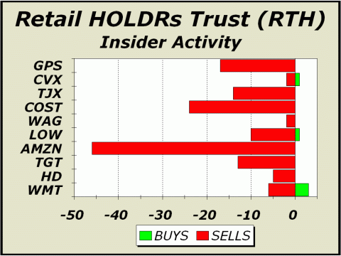
Below, we illustrate insider activity for the top ten retail sector stocks, comprising 82.1% of the assets of the Retail HOLDRs Trust (RTH). There were 139 sales versus only 5 buys, a sell/buy ratio of 28:1. Close to 23 million shares were dumped versus 27 thousand bought, a sell/buy ratio of 944:1. By comparison, one month before the major high in October 2007, the ratios were respectively 23.7:1 and 470:1. Todays tally of insider activity in the retail sector is the worst we have seen. Ironically, we also tallied how analysts perceive the sector and found (as usual) that Wall Street is barely capable of issuing sell recommendations. Of the 268 opinions rendered only 7 were of the sell or strong sell variety, a mere 2.6% of the total. How is it that insiders are frantically dumping shares if hardly anyone considers the stock a sell?
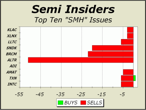
Below, we pose the exact same analysis for the very popular Semiconductor HOLDRs Trust (SMH). The count here is horrific as well. We see 122 sales and only one lone buy (for Texas Instruments). That lone buy was for a paltry 1000 shares while insiders were busy loading up their money bags with the proceeds from the sale of 5.7 million shares. Analysts are clearly not as sanguine about the semi sector, where 7.4% of recommendations are on the sell side.
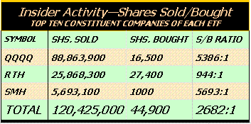
Below, the table represents the grand share totals for the three sectors, as awful as we have ever seen since we began doing this exercise years ago. Clearly, insider are seeing great value only in cash. Their actions speak volumes for the veracity of the current rally.
Insiders are frantically shedding
their own shares.
What are they telling us?
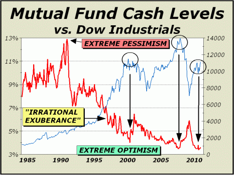
Below, a portion of the lead article reprinted from the October 4th issue of Crosscurrents. A Stunning View Of Complacency. Stock market performance is determined from two very different approaches; trading and investment. Our combined focus on high frequency trading and mutual fund assets represents both disciplines. HFT is thought to comprise perhaps as much as 70% of all stock market volume (see http://tinyurl.com/2bvnab6) and clearly, our charts of total dollar trading volume illustrate there has been a monumental change in the way stocks are bought and sold (see www.cross-currents.net/charts.htm). Our investment market has metamorphosed not only into a traders market, but a market influenced to a large degree by automated processes having nothing to do with human decision making. However, while the investment approach does not have anywhere the same moment-to-moment clout as trading, equity mutual funds nevertheless represent a huge fraction of the overall total, roughly 28% of stock market assets. Even in this segment, we are experiencing a monumental metamorphosis, one that cannot possibly bode well. If we measure back to 1984 (equating to most of the modern era), the median for the cash-to-assets ratio for mutual funds is 6%. In recent years, the ratio has consistently remained extremely low as those who manage the $5 trillion in U.S. fund assets justify as little cash as possible to take advantage of any rise in prices. This willingness to expose shareholders to additional risk has reduced the median sharply. By comparison, the average cash-to-assets ratio dating back to 1984 is considerably higher at 6.8%. However, today, the cash-to-assets ratio is only 3.5%, a tick above the lowest it has ever been in history, only half the average of the last 26 years and a sign of excessive risk taking. At best, this is evidence of huge complacency. At worst, it is extreme optimism. Below, we see arguably the best possible picture of extreme pessimism and optimism. The 1990 peak in the cash-to-assets ratio occurred in October 1990 at 12.9%, coinciding precisely with a bear market low. The mood was beyond ugly. Analysts, sages and gurus purveyed gloom exclusively. On the other hand, this same picture persuaded your Editor to turn extremely bullish and then on national TV as prices retested the lows just before Desert Storm, we claimed extraordinary pent up demand and 20% upside potential. Then in 2000, as the cash-to-assets ratio plunged to only 4% and the tech mania reached its zenith, the same picture persuaded your Editor to predict not only a bear market but a crash for Nasdaq. As prices peaked and the cash-to-assets ratio contracted to a new record low in the summer of 2007, we again forecast a bear market. Look again at our featured chart. Are we near a bottom or a top? We believe the answer is obvious.
Pessimism has completely disappeared. The level of complacency amongst fund portfolio managers is insane.
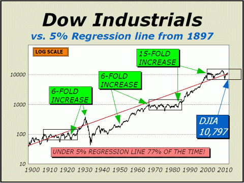
An Important Long Term Perspective In our last issue of Pictures of a Stock Market Mania, we presented "An Important Short Term Perspective." Today, we focus once again on the long term. Below, we have placed a red line across our chart representing a steady annualized 5% advance for the Dow Industrials going all the way back to 1897. As you can plainly see, stocks have not always been the powerhouse they were from 1982 through 2000. Stocks will most likely return approximately 5% ex-dividends year after year. The proof is stated by the 113 year span of our chart. As of Friday, December 16, 2010, the regression line was at Dow 10,797. We believe the line represents a form of "fair value," albeit certainly not guaranteed. The plunge below the red line in 2008-2009 doesn't look like much, but prices were cut in half. The plunge from the 2000 highs looks even less scary as it stopped right on our line, yet it also represented prices cut in half. As well, consider the sideways range before the mania in the Roaring Twenties. And then consider the sideways range from 1966 to 1982. If we duplicate the sideways ranges of yesteryear, it will be a long time before we put the old highs behind us for good. By the end of next year, the regression line will be at Dow 11,358, more than a full percent below where it is now!
We do not expect journeys far
north of the regression line for years to come.
And perhaps again after that.
Every factor we view points
to a market
To see a free sample copy of the Crosscurrents newsletter, CLICK HERE
***THIS USED TO BE OUR FORECAST SECTION*** Some of our readers may be aware of a purported "study" of stock market forecasters, published by an internet blogger. In our case, the blog reported accuracy ratings that we can only describe as devised and so far from accurate as to be laughable. Needless to say, our forecasts were interpreted incorrectly and denigrated. We have no desire to direct any traffic to this blog and if you are interested in seeing the "study," you will have to search for it. The blog admits "The Crosscurrents forecasts/targets frequently include qualifications/embellishments that makes testing difficult," yet the ratings were undertaken as if gospel. The blog further admits that "a few very bad forecasts make the average absolute error high." Ironically, and most disturbingly, those very same forecasts begin and end with our initial forecast of a secular bear market bottom at Dow 6400, originally published on our website as far back as 2003 and published in our Washington, DC speech before the International Federation of Technical Analysts in November of 2003. However, as our initially cited time target was pushed out with each new forecast, the aforementioned study considered the entire forecast before it to be utterly wrong and in some cases, awarded us a rating of minus 80% accuracy. That is a stunning misapplication of statistical science, in that the actual bear market low to date was Dow 6469 print basis on March 6, 2009. On a number of occasions, we also specified an SPX low of 680, about as close as one can get to the actual 683 closing low. We not only forecasted the actual price bottom with pinpoint accuracy, we did so six years before the fact. Moreover and most importantly, we have usually cited the upside parameter as "potential" and the downside parameter as "risk," in order to highlight both the best and worst possible cases. The study incorrectly interprets each of these parameters as actual forecasts, which must, by definition, make one or the other of our parameters hopelessly wrong. The market cannot move in both directions at once. If an actual forecast has been issued in the past, it is typically not accompanied by a disclaimer, such as upside "potential" or downside "risk." It has always been accepted wisdom in our business that one does not forecast both price and time together. If a time is specified, never specify a price. If a price is specified, never specify a time. It is sufficiently difficult to forecast one of the two aspects alone. Most forecasters follow this golden rule. When we issue a forecast, we typically do not follow the golden rule. However, the denigration of our forecast results by this faulted study has cast a serious pall on our desire to continue publishing price and time forecasts for the benefit of the public on the free portion of this website. The Crosscurrents website has had more than three-and-a-half million visitors since it was established in 1999 and we are quite proud to display just a few of the many kudos accorded us by readers at http://www.cross-currents.net/kudos.htm. We did not earn these kudos by publishing wrong forecasts time after time. Despite our desire to continue serving the public, we will no longer expose our analysis to faulty studies and inadequate math on the free portion of our website. Therefore, our policy has changed. While we will continue to publish the very popular Pictures of a Stock Market Mania feature, we will no longer provide any price and time forecasts or parameters for the public as have accompanied this feature in the past. The subscriber portion of our website will have the same article accompanied by price and time forecasts and other parameters as we deem significant, as it always has. If you wish to see these forecasts and or parameters, we suggest you subscribe or purchase a copy of the full article for $20 [CLICK HERE]. If you later subscribe, we will be happy to apply the $20 towards your subscription. THE CONTENTS OF THE ENTIRE WEBSITE ARE COPYRIGHT 2010 CROSSCURRENTS PUBLICATIONS, LLC I hope you have enjoyed your visit. Please return again and feel free to invite your friends to visit as well. Alan M. Newman, December 19, 2010 
CLICK ICON TO GO BACK TO ARCHIVE MENU All information on this website is prepared from data obtained from sources believed reliable, but not guaranteed by us, and is not considered to be all inclusive. Any stocks, sectors or indexes mentioned on this page are not to be construed as buy, sell, hold or short recommendations. This report is for informational and entertainment purposes only. Persons affiliated with Crosscurrents Publications, LLC may be long or short the securities or related options or other derivative securities mentioned in this report. Our perspectives are subject to change without notice. We assume no responsibility or liability for the information contained in this report. No investment or trading advice whatsoever is implied by our commentary, coverage or charts. |