|
- THE GREATEST STOCK MARKET MANIA OF ALL TIME - DATED DECEMBER 3, 2006 A SPECIAL REPORT BY ALAN M. NEWMAN, EDITOR CROSSCURRENTS This feature is now published on roughly a quarterly basis. Our next update will likely be published the first or second week of March 2007. |
| This is our
55th report on the ongoing mania since we first published this website
on January 15, 1999. Well over three million visitors have read our
free features and close to 1.2 million visitors have visited this particular
page.
A world map of readers from 137 countries can be viewed HERE. Run your mouse over each country! This report is now mostly a compilation of articles that have previously appeared in the Crosscurrents newsletter. Our paid subscription stock market newsletter has only two rationales for its existence; powerful commentary and unique perspectives that cannot be found anywhere else. Please check out the testimonials on our Kudos page.
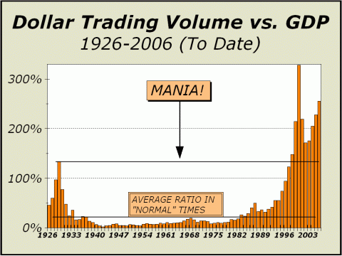
The pace of Dollar Trading Volume dropped slightly in the last three months, but still rages on at a level that even exceeds the phenomenon in 2000. A total of $32.6 trillion was traded in 2000 and this year's trading is currently running at a pace of $34.2 trillion. It seems we learned nothing from the collapse following the earlier stages of the mania. Or at least, it appears that investors are comfortable with the ownership of equities regardless of valuations. Cheap doesn't mean much anymore. Expensive will do just fine. That's what you get in an environment where folks have been brain washed into accepting that only equities can give them the kind of retirement they want. But the youngest Baby Boomers are now into their seventh decade of life and after retirement, will soon be living off their assets. Many will eventually sell stock
In the meantime, stocks are pretty much the only game in town. Although there was a slight slip in the velocity of trading, we can atrribute the dip solely to a lower rate of program trading. Over the last 13 weeks (three months), programs averaged 59.4% of New York Stock Exchange volume, or 29.7% if you accept the "new methodology" promulgated by the NYSE. In the preceding 13 weeks, programs averaged 65.9% of volume (or 33% via the "new methodology"). The new methodology assumes that NYSE volume is twice what it actually is. SInce programs are counted both on the buy and sell sides, the NYSE believes it is fair to report programs as a percentage of doubled volume, since each share bought also represents a share sold. We have gone into the matter at length in the Crosscurrents newsletter and will do so again, but not today. Suffice it to say, at the very least, the impact of programs are huge. The nominal decrease in program activity alone in the last three months has likely accounted for a decline in total dollar trading volume of over $250 billion. We do not see any trend towards lower program activity, just a hiatus before higher levels are again breached.
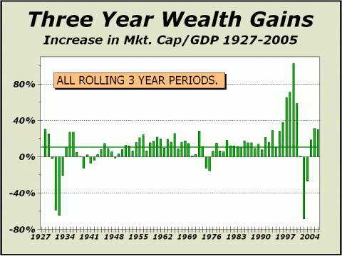
However, there has been no perceptible slowdown in institutional and individual investor activity. Why would there be? As our next chart shows, three-year wealth gains as measured by the expansion in total market cap vs. gross domestic product, have rebounded quite nicely from the downwards spike of 2002. It is our view that the Federal Reserve acted forcefully to alleviate stress in the market, in effect, manipulating the market by cutting short term interest rates to the quick. The rapidity of the decline in rates was stunning, as the Fed Funds rate was cut 11 times from 6.5% in May 2000 to 1.25% by November 2002 (and eventually cut to 1% in June 2003). There was no competition for stocks as rates were slashed and the mania for stocks was re-ignited. Three-year gains are now over 30% versus a historical average of about 11.7%!
Since the bottom in October 2002, the pace of dollar trading volume has increased 88.6%, while total market cap advanced by only 64.7%. The higher prices go, more activity is required simply to support those prices and still more activity is required to push prices higher. Trading activity is already at the second highest level ever and is nearly double the level of 1929. Dollar Trading Volume clearly suggests that the mania for stocks is still very much in progress. But if we have any doubts that trading activity can expand significantly from here, then any notion of significantly higher prices must also be in doubt. And yes, we doubt that trading activity can expand significantly from here. The horizontal line we have placed on our first chart for "normal times" may be out of reach but we would eventually expect Dollar Trading Volume to return to levels that more closely approach GDP. We would also expect that in the future, three-year gains will approach their norm.
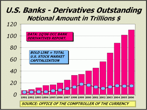
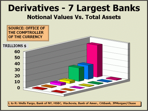
BELOW: THE LEAD ARTICLE FROM THE SEPTEMBER 25, 2006 ISSUE OF CROSSCURRENTS A Calamity Just Waiting To Happen The last time we checked the world of derivatives was in our February 27, 2006 issue when the total notional values of derivative contracts for U.S. banks was "$99 Trillion And Counting." That report was prepared with data from the Office of the Controller of the Currency (OCC) through the Third Quarter of 2005. Today's report is based on OCC data from the First Quarter of 2006, all that has been thus far released for the current year. As expected, total notional values for U.S. banks increased sharply and made it above the $100 trillion mark for the first time in history, reaching more than $110 trillion. Rates of growth from all perspectives is astonishing. Since 2000, total notional values are rising at the rate of 18.1% per annum and since 1996, growth has been 18.6%. Of course, the numbers are likely to be even greater when the OCC finally gets around to releasing data for Q2, Q3 and Q4 for the current year. Today's data is not at all comforting. Total notional values for derivatives are now 7.4 times the size of the entire U.S. stock market and are 8.6 times the size of our gross domestic product. Since the total value of notional values in derivatives are rising at a much faster rate than either the stock market or GDP, continued growth means an even more enormous spread in the future. Assuming the stock market rises at 8% per year and GDP at 5%, derivatives will be 11.5 times the size of the economy in five years and 17.9 times the size of the economy a decade from now. The same extrapolation takes derivatives to 15.4 times the size of the stock market in 2011 and to 27.5 times the size of the stock market in 2016. Can we actually accommodate this phenomenal growth? We know what occurs when GDP shrinks. A recession. Some of us suffer, most muddle through fairly well. We know what occurs when the stock market shrinks. Anything from a mild correction to a 2000-style collapse and possibly even a recession. In most cases, even if the pain endures, the market survives. Our simple question is what happens in a worst case scenario for derivatives, such as a replay of the Long Term Capital Management collapse in 1998, when the derivative market has reached such a monstrous size that no amount of brokering by the Federal Reserve can fix matters? Two-and-a-half years before their collapse, LTCM harbored $130 billion in assets, 30 times the size of its underlying capital (see "When Genius Failed," by Roger Lowenstein, ISBN:0-375-75825-9). In fact, LTCM's leverage on one stock trade was 20-1, far beyond what the Federal Reserve's Reg. T margin requirement would allow (50%, 1-1). Question: so how did they manage to accomplish such huge leverage? Answer: by arranging a "swap" where they would pay a fixed "interest" rate versus a fixed sum against the counter party's promise to pay the increase in the price of the shares worth the same sum. Today, derivative swaps total $67.5 trillion for the five largest holding companies. And to think, we were worried about $260 billion in credit extended to stock players for margin! Margin lending is now about 1.5% of total stock market capitalization, very high but not a record, which if we remember correctly, was roughly 11% of market cap back in 1929. But what percentage of the $67.5 trillion in swaps is devoted to leveraged stock bets? If the percentage is only 2%, that is the equivalent of another $1.35 trillion in margin and together with margin lending represents very nearly 10% of total stock market capitalization! It could be that swaps have far less to do with stock bets than we suspect or it may be that they have far more to do with stocks than our worst fears. We do not know and never will know because no one knows. All that we know are the reported totals for the category and not any of the details, which not even the Fed insists upon. However, as history has shown beyond any doubt, the devil is in the details. Bear in mind that total notional values were only 2.6 times the size of the stock market and 3.7 times the size of GDP in 1998. A derivative "event may have a far greater effect now than before. The LTCM fiasco ultimately impacted a daisy chain of counter party obligations $2 trillion long. How long will the daisy chain of contractual obligations amongst counter parties be in the next huge financial earthquake? $10 trillion? As of March 31st, total credit exposure from all contracts was $1.3 trillion, more than 10% of GDP and the total credit exposure to capital ratio for the top 25 commercial banks with derivatives was 103.9%.
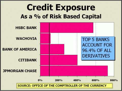
Cast your baby blues at our next chart, illustrating the credit exposure risk for the five U.S. banks with the largest derivative portfolios. Wachovia has assets of $497 billion. Sounds impressive. But their derivative portfolio is $4.08 trillion and if the stuff hits the fan, their credit exposure is estimated at 112% of assets. And that's the best comparison we can offer. For JPMorgan Chase, assets of $1.09 trillion support a derivative portfolio of $53.06 trillion. Actual credit exposure is estimated at 731% of assets! Although a worst case that wipes out either of these companies is probably extremely unlikely, we would have said the same about LTCM a year or two before things turned real ugly. We would have been way wrong.
The Fed has long complained that there is insufficient transparency in the details and although they would hope that banks use discretion in assuming the risks in derivative contracts, the more important imperative is competition. If Bank A declines an offer, there will surely be a Bank B to step in and assume the risk. Since Bank A does not wish to allow the competition to profit instead, they are inclined to accept the risk (pages 107-108 in Lowenstein's book outlines just such a circumstance that proved quite costly when LTCM imploded).
We have covered the derivative markets for several years now and have said repeatedly that situations like LTCM are inevitable. Eventually, every market will suffer a worst case scenario. The derivative market is a calamity - a financial earthquake - just waiting to occur and each calendar quarter the potential size of the catastrophe increases. Annual derivative growth of $15 to $20 trillion ensures that the details of contracts must remain hidden. There is simply too much to be revealed. At this point, there are so many wizards behind the curtain that we can only assume we live in an Oz where our yellow brick road is surrounded by a hall of mirrors. Which road do we take? Unfortunately, as we see it, all roads will eventually lead to a disaster. Its not a question of if, but when.
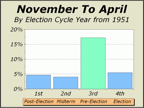
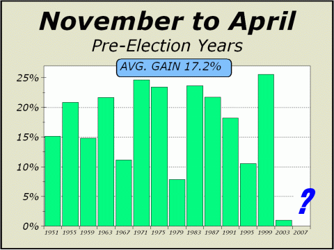
BELOW: THE LEAD ARTICLE FROM THE NOVEMBER 6, 2005 ISSUE OF CROSSCURRENTS A Perfect Record Comes Into View Twice each year, we explore the seasonal effects that have dominated the stock market for more than five decades. The Dead Zone from May through October typically results in a dramatic under performance for the Dow Industrials and other major averages, relative to performance from November through April. In 2006, the Dead Zone followed the pattern early on, topping on the eighth trading day of May, falling 8.3% in only 24 trading days and finally bottoming out modestly lower another month later. All told, the Dow fell 1006 points from print high to print low, sufficient to justify our fears and to further legitimize seasonal expectations. The remainder of the Dead Zone, however, turned out to be rather vibrant, to say the least. The markets bad season finished up 6.6% from the end of April. Nevertheless, an investment of $10,000 in the Dow for only Dead Zone periods since 1950 has been an exercise in futility. Even with the Dow's robust performance since the July low, the initial stake is now worth only $11,249 while the same $10,000 stake invested only in the good six month periods has grown to $539,794. The markets favorable season has accounted for 99.4% of all gains registered by the Dow since 1950. Thus, there would seem little point in remaining bearish for the six months ahead. Of the 56 good seasons since 1950, 45 (better than four in five), have been positive. Even in the last secular bear market, which we measure from the broad market highs of 1966 through 1982, prices were up 11 eleven times in 17 years, a 64.7% rate of success. Those are extremely good odds for bulls. And the record in recent times is nothing short of amazing. The last good six month period that finished lower was in 2001 and the most recent before then was in 1984! The record is almost spotless for the last 21 years. However, if we are correct that a new secular bear market is still underway, we cannot expect the string of success to continue indefinitely. So, what was the worst case scenario in the past? The most depressing of the good six month seasons in the prior secular bear market was a 14% drubbing in 1970 and the seven times the Dow declined, the average decline was 5.4%. Over the life of the secular bear market, the Dow nevertheless registered average gains of 4.5% during the good six month season. Clearly, while a secular bear market is in progress, our expectations should be somewhat muted while still somewhat positive. How then, can we estimate potential over the next six months? In the process of adding more depth to our analysis, we are giving strong consideration to the election cycle. As it turns out, this part of the election cycle combined with the markets good season is particularly robust and stands out prominently. The analysis and associated charts were catalyzed by an article appearing in the October issue of Stock Traders Almanac Investor (www.stocktradersalmanac.com). As our next two charts clearly illustrate, the record for the six month period into April of pre-election years measuring from 1951 is a perfect 14 for 14. We correctly argued against the continuation of the perfect 5th year of the Decennial Cycle, forecasting a down year in 2005, so we've certainly earned the right to be skeptical, but we're not as inclined to argue against the effects of the election cycle. The disparity of how the good six months play out for each year of the election cycle is nothing short of amazing. As the chart at bottom left shows, the market's good season in the first, second and fourth years of the cycle are obviously quite average. However, the good six months into pre-election years have previously been rather special, rising an average of 17.2%, or 34.4% annualized! Arguing against the market's good season is usually not a great idea; arguing against the perfect record of the good season into the third year of the election cycle would seem absolutely pointless. Thus, we must admit to being bulls, albeit cautious bulls, until the next segment of the Dead Zone comes into our view on May 1, 2007.
We hasten to remind readers that the worst of the good seasons into pre-election years was the last such cycle in 2003, up a scant 1%. Our vote is still firmly in the corner for a protracted secular bear market and it is indeed possible that the typical support and enthusiasm received at similar junctures will be quite restrained as it was four years ago. To add to the mix, the 7th year of the Decennial Cycle is just around the corner and years ending in "7" have a rather disappointing record. While years ending in "0" have a worse record, down an average of 6.7% since 1890, years ending in "7" have nevertheless averaged a 2.9% loss since 1887 and fully half of the cycle years ending in 7 have experienced negative returns. Thus, despite the perfect record of the stock market's good season into pre-election years, we will likely maintain only a mildly positive stance into the spring of next year.
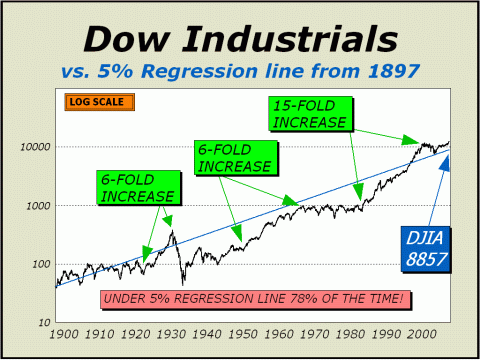
The 5% Regression Line Although history does not always repeat exactly, it nevertheless always repeats. Every bull market is followed by a bear market, which itself is followed by yet another bull market. Trends are inexorably exhausted and reversed. Over the course of time, asset groups experience periods of enormous sponsorship and suffer periods of disdain. As interest rises and ebbs, valuations expand and contract. But the same course of time enables investors to properly peg a norm for valuations. In the case of stocks, for the last hundred years, the average annualized rate of gain for the Dow Industrial over all ten-year rolling periods, a/k/a the "long term," comes in at 5.28%, ex-dividends. But the mania for stocks had an outsized effect! At the very top for the Dow in January 2000, the same average gain to date was only 4.88%. And from March 1995, roughly the time we estimate the mania truly commenced and the last time the Dow ever traded below 4000, average annualized gains for all rolling ten-year periods over the course of 88 years was only 4.39%. Thus, we have arbitrarily placed a 5% regression line as the "expected" long-term rate of gain ex-dividends, for the Dow. We believe this is a fair extrapolation of future prices, although at any given point along the line, prices will trade above or below the line. However, they should tend to trade nearer the line rather than further away. Currently, the regression line stands at Dow 8857, close to 27% below the actual Dow. Of course, the regression can be achieved without a severe decline since time itself will lift the regression line higher and higher. The regression to the mean is not a wish nor a hope, but a logical expectation based on our analysis and accepted scientific principle.
In 1 year, the regression line
will stand at Dow 9300
And in mid-September 2013,
"REGRESSION TOWARD THE MEAN"
We continue to maintain our forecast of a secondary secular bear market low target of Dow 8900 as our Regression line is at the very least, touched. These levels equate to SPX 1029 & Nasdaq 1809. We still believe it might be as much as another decade before a new secular bull market is capable of taking all of the major averages above the peaks achieved in 2000. While the Dow has obviously traded at a record new highs, the SPX is still 11% away and Nasdaq is still 105% from its all time high. However, we are offering 2007 high targets (see below) in recognition of the perfect record for the six months from November through April leading into pre-election years. Past the beginning of May 2007, when the "Dead Zone" returns again, all bets will be off and we would expect the longer term influences of the secular bear market to dominate. For now, the potential
upside is likely to be 5%
High
Targets for 2007
Low
Targets for 2007
The odds
greatly favor that a 15% correction
THE CONTENTS OF THE ENTIRE WEBSITE ARE COPYRIGHT 2006 CROSSCURRENTS PUBLICATIONS, LLC I hope you have enjoyed your visit and please return again. If you know anyone who might be interested in seeing what we have to offer, we'd be happy to have them visit as well! Alan M. Newman, December 3, 2006
All information on this website is prepared from data obtained from sources believed reliable, but not guaranteed by us, and is not considered to be all inclusive. Any stocks, sectors or indexes mentioned on this page are not to be construed as buy, sell, hold or short recommendations. This report is for informational and entertainment purposes only. Persons affiliated with Crosscurrents Publications, LLC may be long or short the securities or related options or other derivative securities mentioned in this report. Our perspectives are subject to change without notice. We assume no responsibility or liability for the information contained in this report. No investment or trading advice whatsoever is implied by our commentary, coverage or charts. |