|
- THE GREATEST STOCK MARKET MANIA OF ALL TIME - DATED AUGUST 28, 2006 A SPECIAL REPORT BY ALAN M. NEWMAN, EDITOR CROSSCURRENTS This feature is now published on a quarterly basis. Our next update will not be published until the end of November or early December 2006. |
| This is our
54th report on the ongoing mania since we first published this website
on January 15, 1999. Well over three million visitors have read our
free features and well over one million visitors have visited this particular
page.
A world map of our readers from 76 countries can be viewed HERE. Run your mouse over each country! This report is now mostly a compilation of articles that have previously appeared in the Crosscurrents newsletter. Our paid subscription stock market newsletter has only two rationales for its existence; powerful commentary and unique perspectives that cannot be found anywhere else. Please check out the testimonials on our Kudos page.
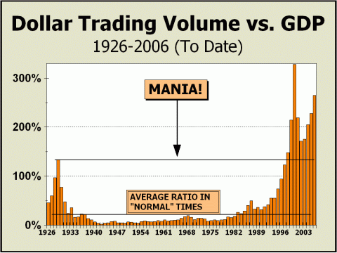
Every time we do the math for Dollar Trading Volume, we are blown away by the results. From 1997 to the fateful year of 2000, DTV more than tripled and even 1997 was four times the total of five years previously in 1992. Over the eight years leading into the greatest speculative blow off of all time, DTV increased by an annualized rate of 36.5% per annum. The math is simply mind boggling. Despite the tremendous collapse in prices following the manic peak in 2000, annualized growth in DTV from then to now is still a robust 12%, almost as if nothing had happened to deter interest in stocks. Indeed, from the low point of the Depression in 1932 to 1992, annualized growth in DTV was only 5%, roughly the same annual percentage gains recorded by the major stock averages. As our first chart clearly illustrates, DTV as a percentage of Gross Domestic Product (GDP) is once again in rarefied atmosphere, second only to the manic highs of 2000. On an absolute basis, DTV is on track to exceed the transactional velocity seen in 2000. Our data is somewhat suspect since we are forced to estimate the total for the American Stock Exchange. However, we do not include the totals of any of the other U.S. stock exchanges, so if anything, our estimate for total DTV is liable to be on the low side. Growth in DTV on the Amex can be directly traced to Exchange Traded Funds (ETFs), which now comprise roughly $335 billion in assets and are growing at a clip of close to 35% per annum. The largest of these are the Spyders (SPY), which represent the S&P 500. This ETF has achieved $50 billion in assets based on its advertised investment qualities, yet investment does not enter into the picture at all. Turnover in the SPY is grotesquely huge. Average daily volume for the last three months is 82.6 million shares and at an average price of roughly $129, annual DTV could reach $2.7 trillion alone. Can the SPYs be an investment vehicle if the trust completely turns over more than 50 times in a year? The U.S. stock market has morphed into our worst nightmare. Investment is no longer relevant, only trading is meaningful, and the entire financial industry is on the take for more volume and more turnover, regardless of the true cost to investors. It's all about product. We could easily throw in the Nasdaq 100 Trust (QQQQ) to bolster our case. This trust will likely generate $1.2 trillion in DTV. The SPY and QQQQ together are inordinately popular trading vehicles and are responsible for one of every nine dollars changing hands in the U.S. stock market!
DTV will likely be 280 times greater this year than in 1929 while the economy in the form of GDP will only be about 140 times as large as it was in 1929. By almost any measure, the stock market will have twice the influence, clout and importance that it had in 1929. However, as similar measures in 2000 amply
proved,
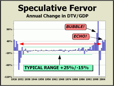
More trading means more speculation. One way we measure speculation is to divide the annual change in total DTV by the change in GDP. As the chart below indicates, the typical range bounded by the green horizontal lines was between -15% to +25% from the early 1930s to the mid-1990's, when stocks commenced their near vertical rise. Our red horizontal line is an arbitrary demarcation for "bubble" behavior and the Roaring Twenties were exceeded by only 1997-2000 but have now again been challenged by the last three years. Speculation feeds upon itself. It did in the roaring Twenties and it did as the 1990s came to a close. The bubble of 1999-2000 has new been followed by a distinct echo. Speculation is visibly in place now.
In our view, the combination of the huge increase in transactional velocity and speculation must create stress. Simply put, the urge to trade equates to a constant need for reinforcement in the form of short term profits. As the two prior bubbles amply proved, as the urgency to profit builds, stress increases.
BELOW:
THE LEAD ARTICLE FROM THE JUNE 26, 2005 ISSUE OF CROSSCURRENTS
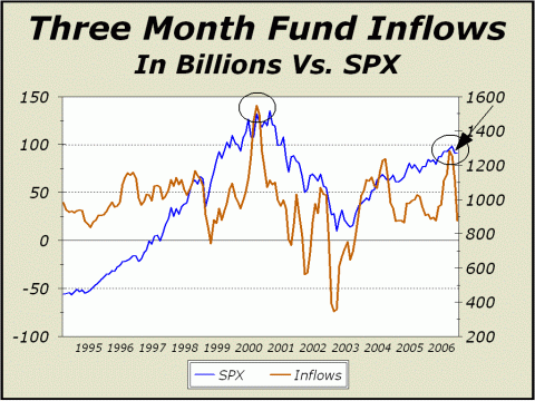
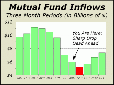
Over the years, our analysis has shown conclusive evidence that the performance of the U.S. stock market is predicated primarily upon mutual fund inflows. Our "Dead Zone" research is a large part of the equation, clearly illustrating that the period from May 1st to October 31st is a barren wasteland, almost entirely devoid of profits for the long term investor. Essentially, all that is secured during the Dead Zone period is risk exposure and the passage of time. But there is always more to the story and in recent years, we have shown that market performance is also very much a mirror of how inflows vary from month to month. Over the last 22+ years covered in our spreadsheets, the Dow has increased in value in 61.8% of all months, yet inflows have risen from one month to the next only 49.4% of the time. As you might suspect, this means when inflows rise from month-to-month, there is a distinctly positive impact upon prices. Five of every six months of rising inflows are up on average, certainly an enviable track record. On the other hand, when inflows decline from month to month, prices only rise 40.7% of the time on average. Since inflows during the Dead Zone period tend to decline, there is every expectation for stocks to under perform. There is no guarantee that prices will actually fall, but clearly, there is every reason to believe that they will stagnate. But there is even more. The most recent issue of Robert Prechter's Elliott Wave Financial Forecast (www.elliottwave.com) sported a wonderful chart showing the effect of inflows over three-month periods, illustrating that peaks in inflows corresponded quite well with peaks in stock prices. Steve Hochberg's excellent technical analysis is always welcome on our desk, as evidenced by the revelation that "The three-month average net flow into stock funds hit $31.8 billion in March, a figure that is higher than every three-month period with the exception of February, March and April 2000, the top of the Great Bull Market." Neat. As our featured chart clearly illustrates, participants are on yet another bee line course with the manic top in 2000, just as we have shown in other measures, such as the Bulletin Board mania of 2006.
Three month inflows surged as high as $93.3 billion as of the end of March, but amazingly, even this enormous influx of cash was capable of generating only a 3.7% rise in the price of the S&P 500, the broadest of all indexes. It is clear to this observer that stock prices are still so rich that even sideways support and the maintenance of current prices requires huge inflows. Case in point; mutual funds have benefited from more than $800 billion in net inflows since March 2000, the absolute peak of the mania, yet the S&P 500 index is still down 12.6%! $800 billion bought no increase at all? Yes, the venerable Dow has risen, but by only 2.6%. If that is all $800 billion can buy, then what lies ahead if inflows begin to decline? And we do expect inflows to decline. As we have shown repeatedly, the historic tendency is for inflows to contract sharply into September. Stock prices should go nowhere this summer.
The combination of a probably peak in three-month
inflows
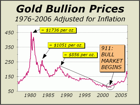
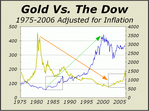
BELOW: THE LEAD ARTICLE FROM THE JUNE 5, 2005 ISSUE OF CROSSCURRENTS The recent sell off in bullion and gold stocks has a lot of folks worried. While the precious metal dive was clearly scary, the damage in gold stocks was enormous. In ten days, blue chip gold stock Newmont Mining (NEM) was down 17.4% from print high to print low, American Barrick (ABX) was down 18.4% and the smaller Goldcorp (GG) was crushed by 30.7%. Is this only a correction? In our view, the answer is an unequivocal yes. Not only are we still bullish on the prospects for gold and gold stocks, our outlook has been vastly boosted by the overwhelming optimism shown in recent months. Remember, gold is storming out of a bear market that endured for 21 years. The phrase "pent up demand" applies and in spades, at that. Even when gold bulls measured over 90% and most were calling for a correction on what one would have to admit was a sound contrarian basis, the metal not only remained firm but rose sharply again, until very recently. There seems to be much more to this market than meets the eye. Despite the many stories in recent weeks about commodity bubbles in oil, metals and particularly gold, we see this interest as a groundswell move, recognition that demand for oil and metals is going to increase quite dramatically in the decade ahead. We believe this recognition is just beginning. Our inflation adjusted chart clearly illustrates that gold's bull market commenced coincidentally with 911 (both of our featured charts today include the high print of $725 per oz. and the lows of the recent sell off). Some observers have pointed out that the world changed with the terror attacks on the World Trade Center, and it has. But in more ways than one. The Twenty-First Century has brought the Chinese economy into view as a new superpower that will someday easily exceed the influence of the U.S. And where China leads, India will eventually go. Between the two countries, three of every eight people on the face of the planet harbor the same wishes for the same goods and services enjoyed by Americans. The theme for the decade ahead is demand, demand and more demand. If you require any additional rationales, you might want to check out James Turk's comments in the May 29th issue of Barron's. Sandra Ward's interview with Goldmoney.com's founder reveals Mr. Turk's arguments that, "...There are problems with the dollar, an that's being reflected in a higher price for gold." Since Mr. Turk believes the dollar is going lower, much lower, he believes gold is going higher, much higher, to $8000 per ounce. While we are not anywhere near that pessimistic on the dollar nor that optimistic on gold, we are quite confident that our charted resistance points will be at the very least, tested. Our featured chart shows the next major resistance point is $856 per oz. We are confident the correction will not last very long and when it ends, watch out. We strongly believe that our former resistance point of $434 per oz. will not be seen again and that any decline that reverses sentiment will itself be reversed in very short order, suddenly viewed as a last ditch entry point by all those who have yet to board this super bull market. Please refer to our page three analysis and chart in the April 24th issue (see chart below) and our forecast of a correction based on time elapsed since the start of the bull market. The bottom for stocks in 1987 was achieved in less than two months. The same period of time is likely the worst case for gold. We expect the correction to end by mid-July at the latest.
One other very important point. If demand for hard goods and commodities is on the kind of incline we believe it is, there will be sufficient residual demand for paper to maintain support for most of the world's financial markets. Any prospects for a huge breakdown or crash at some remote point likely now depends totally upon the derivative markets and the possibilities for a cataclysm like the one that befell Long Term Capital Management in the fall of 1998. There is never a free lunch and the one thing you can always count on in any market is risk. Any entity is capable of laying off risk with the construction of a derivative security, but it must be patently clear that the risk is only transferred. Even if the transferred risk is laid off, and transferred again and again along a long chain of interested parties, the risk remains in the system and can never be erased. The derivative wildcard will always be there and always threaten the financial markets. And if the worst case scenario ever arises, we can't imagine a safer place than gold.
Note: the above article and charts have not been updated. Also note the equivalent time frames highlighted for stocks into the 1987 high and for gold into this year's peal. We have already commented about the possibility of a correction in gold as a mirrored pattern and indeed, a correction in gold occurred. Our newsletter commentary also forecast that the timeframe for the collapse in stocks in 1987 would equate to the timefram for the slide in the price of bullion. That would mean a bottom for gold no later than the end of August. If gold again now rallies, we believe it will be another sign of stress for stocks.
BELOW:
A PORTION OF THE LEAD ARTICLE FROM THE AUGUST 26, 2005 ISSUE OF CROSSCURRENTS
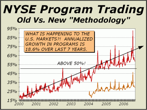
In the week ending June 30th, the New York Stock Exchange abruptly changed the way program trading activity is calculated. We quote from their news release (see http://tinyurl.com/hnp84), "Program Trading as a percent of NYSE volume was formerly calculated as program buy volume + program sell volume as percent of NYSE volume. A more accurate calculation would be program shares bought, sold, and sold short as a percentage of NYSE shares bought, sold, and sold short." In other words, the NYSE will essentially now multiply all volume transacted on the exchange by two for their calculations. All other volume statistics, such as daily and weekly volume reported by the exchange, remain as they always have been reported. So, why double reported volume? Doubling volume for program activity calculations effectively halves the percentage of trading devoted to programs, which clearly presents the statistic in a far more palatable form to the public. Program activity had risen from an average of 19% of daily trading in 1999 to over 62% this year and there was ample concern that analyses such as ours were finding their mark - simply put, the more programs ruled our market, the less impact fundamentals could possibly have on stock prices. The fear was that eventually, the stock market would necessarily be overwhelmed by inefficient and unrealistic prices. Eight years of extremely high price earnings ratios and extremely low dividend yields would appear to have confirmed those fears. When program activity pushed towards this year's highest levels, we commented repeatedly that fundamentals were completely disappearing behind activity based on index arbitrage and tactics and strategies designed to take advantage of fleeting and almost infinitesimal price anomalies. Throw in the mass purchases and sales of indexed securities by both passively managed index funds and index and sector ETFs plus the catch up moves practiced by actively managed funds, a/k/a "closet indexers," and the pursuit of value is perhaps nowhere to be found. As our featured chart clearly illustrates, growth in program activity has been on a rather fast track for quite some time. The lower line comprises the only data released by the NYSE thus far for activity under the "new calculations." In the week ending June 2nd, program activity had risen to a record 73.3% of all trading using the old computation, thus the concerns about public perceptions were raised higher than ever before. The NYSE had in fact, previously stated a few months ago that the effect of programs were overstated if one used the new calculation that simply multiplied trading volume by two. Thus, when program activity under the old calculation achieved yet another and rather dubious record of 92.8% of all trading volume during the week of June 30th, the change was immediately made and the NYSE managed to rewrite history. In retrospect, there was undoubtedly a huge surge in index related activity as the second quarter was coming to a close. The Russell and S&P 500 index rebalancing acts were likely candidates for the blame. But even under the supposedly more accurate new calculation, we know without any doubt that roughly half of all shares did not trade on the basis of individual corporate fundamentals and prospects. The important question: under the circumstances, how can prices reflect reality? The only answer: to a very significant degree, they cannot..... [THE MIDDLE PORTION OF THE ARTICLE HAS BEEN EXCISED] .....If you are an investor in the 21st century, all you need to know is that you are probably better off not believing anything you hear and only half of what you see. Trust is no longer on the table for you and I. Trust has been sacrificed so that the industry can do additional business. As far as this writer is concerned, it's all about product. Individual companies no longer matter because for the most part, they are now too small to matter and in the final analysis, there are way too many of them to research and follow. In one recent week, more than 8000 issues traded on the American markets, of which we estimate at least 60% were individual entities in the form of operating companies. With so many complications at hand, active managers are accepting the cost efficiency of sector and index ETF purchases. ETFs now number 263, of which 194 are domestic equity and 63 global and international (six are bond index ETFs). As late as 1995, there were only two ETFs. Since the manic peak of 2000. new ETFs are appearing at the rate of 22% per annum. Thus, the U.S. market is now very much a market comprised primarily of indexes and sectors, rather than a market of individual common stocks. Since the analysis of individual companies has become less relevant, the concept of divining a fair value for individual corporation prospects has also become less relevant. As a result, the prices of the component issues must be considered suspect. If the prices of the component issues are suspect, then so must be the prices of the indexes and sectors that accommodate them. We still believe U.S. stock prices are headed much lower into the autumn and that prices are destined to remain under pressure for several years to come, burdened by the tremendous apathy shown toward investment in individual stocks and the reliance instead on sector and index analysis and in particular, the enormous amount of trading dealing with strategies and tactics that otherwise have nothing to do with individual corporate prospects. No matter how you slice them, the NYSE program trading statistics offer proof that investors cannot trust the prices of component issues to reflect fair value. If a more accurate rendering of programs illustrates that they constitute only one-third of all trading, rather than two-thirds, should we be mollified? Remember, program activity is growing at a pace of 18.6% per annum. Take the current growth in programs out to 2009 and no matter how you calculate, programs will account for well over half of all trading. Take the current growth in programs out to 2011 and programs will account for well over three-quarters of all trading. Another year and it will be more than 90% and no amount of new math nor novel methodology will suffice to ease concerns. The American market will be for all intents and purposes, a trading vehicle and nothing more. Investment per se will have ceased to be ..
If the rationales for investment are
decreasing.
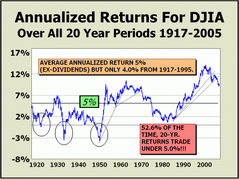
Despite the obvious transformation of the U.S. stock market from investment to trading vehicle, the marketing pitch overwhelmingly remains "buy for the long term." Ask any brokerage firm for the facts and they gladly sport statistics that show the long term is practically a guarantee. Well, it is not. As our final chart clearly illustrates, there have been many 20-year periods where the right choice was to be out of stocks. Indeed, returns over all rolling 20-periods were negative 5.4% of the time and returns were under a 2% annualized rate almost one-quarter of the time. A prior break down in the trend in the late Sixties led to a devastating secular bear market. We believe the break down in the trend from the 2000 peak indicates the same circumstance, a secular bear market firmly in control at this time. Certainly, it must be conceivable that returns will once again fall to zero at some point. And clearly, it makes sense that returns could easily fall as low as 2%. However, our minimum expectation is that the long term 20-year trend will return to the average of the last 90 years at 5%, which still equates to major damage, either in price or in time, as investors patiently wait for a secular bull cycle to commence. For instance, our 5% target could be achieved if we postulated an eventual secondary bear market low at Dow 8500 in November 2011. However, if stock prices simply traded sideways from the August 18th close above Dow 11,300, the 5% long term number would not be achieved until April 2015. Either way, we see investors as screwed. But then again, the U.S. stock market is not for investors any more, is it?
There is nothing like the downside to increase stress. And the longer the downside persists, the more stress impacts investors. Patience has not paid off over the last six0and0a0half years and is not likely to pay off for quite some time to come. Stress will continue to build.
The Dow now stands at 11,284.
The S&P 500 now stands at 1295.
The Nasdaq composite now stands at 2140.
Investor patience will not endure forever Stress is building....
We continue to maintain our forecast of a secondary secular bear market low target of Dow 8500. These levels equate to SPX 970 & Nasdaq 1610. Caveat: these levels could be achieved several times in the next few years and it might be as much as another decade before a new secular bull market is capable of taking all of the major averages above the peak achieved in 2000. While the Dow obviously maintains the best chance of achieving new highs, the SPX is still 20% away and Nasdaq is a resounding 136% from the all time highs.
High
Targets for 2006
Low
Targets for 2006
Odds greatly favor that the highs for 2006 have already been achieved THE CONTENTS OF THE ENTIRE WEBSITE ARE COPYRIGHT 2006 CROSSCURRENTS PUBLICATIONS, LLC I hope you have enjoyed your visit and please return again. If you know anyone who might be interested in seeing what we have to offer, we'd be happy to have them visit as well! Alan M. Newman, August 28, 2006
All information on this website is prepared from data obtained from sources believed reliable, but not guaranteed by us, and is not considered to be all inclusive. Any stocks, sectors or indexes mentioned on this page are not to be construed as buy, sell, hold or short recommendations. This report is for informational and entertainment purposes only. Persons affiliated with Crosscurrents Publications, LLC may be long or short the securities or related options or other derivative securities mentioned in this report. Our perspectives are subject to change without notice. We assume no responsibility or liability for the information contained in this report. No investment or trading advice whatsoever is implied by our commentary, coverage or charts. |
|
|