|
- THE GREATEST STOCK MARKET MANIA OF ALL TIME - DATED AUGUST 10, 2005 A SPECIAL REPORT BY ALAN M. NEWMAN, EDITOR SAMEX CAPITAL'S STOCK MARKET CROSSCURRENTS This feature
is now published on a quarterly basis.
|
| This is our
50th report on the ongoing mania since we first published this website
on January 15, 1999. Well over three million visitors have read our
free features and well over one million visitors have visited this particular
page. At first, we published monthly, then every other month, and
we now publish this feature quarterly. It is an incredibly huge task
to put together a free report of this size while composing several other
free features and then to publish a paid subscription stock market newsletter,
where our only rationales for existence are powerful commentary, unique
perspectives and reality checks that cannot be found anywhere else.
Check out the testimonials on our Kudos page.
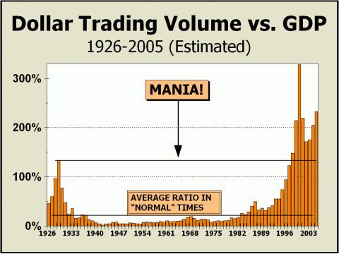
ACTIVITY STILL AT MANIC LEVELS We're not sure how much longer we will be able to run our Dollar Trading Volume charts. Although Nasdaq again publishes the data it temporarily witheld a couple of years ago, the data is never easy to find. Our prior estimates via whatever data we could get a handle on were never off by more than 2% but estimating is an onerous task. Worse yet, there is also no way for us to get an easy handle on everything that is traded - such as Exchange Traded Funds - and there can be no question that the trading of individual issues has become much less important than before. We have gravitated to a derivative world and we must address whether our focus on DTV bears any resemblance to reality unless we include options, futures, and even single stock futures. Derivatives have grown to an extraordinary degree. Case in point: the fantastically popular QQQQs, which represent the Nasdaq Top 100 issues. This trust is comprised of 535.8 million shares and is so actively traded that a complete turnover is registered approximately every 5.67 days. In other words, the entire trust is traded over 44-fold during the course of the year. There are other very popular ETFs that trade significant volumes as well. Although none trade as prolifically as the QQQQs, they nevertheless represent speculative activity that has only been registered in very recent years. We now estimate that the trading in the QQQQ
entity alone
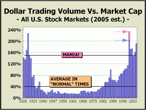
We believe the data presented below is accurate through the month of June. Total Dollar Trading Volume is apparently still raging at levels that exceed any year except the blowff peak established in 2000. DTV for the NYSE is up 17.1% over last year and is 23% ahead of the clip maintained in 2000. Nasdaq's DTV is ahead 16.6% of the pace of 2004 and is an amazing 44.6% ahead of 2003. Although Nasdaq's DTV still lags over 50% behind the pace of 2000, bear in mind that prices remain far, far lower than the manic peak. Even when the Composite Index briefly touched 2200 a few days ago (at the beginning of August), the index was still 56.4% off the peak! Total DTV is estimated at $28.321 trillion versus GDP (through June) of $12.183 trillion and total market capitalization of $14.733 trillion. This places DTV at 232.5% of GDP and at 192.2% of market cap. These measures are the second and third highest ever recorded respectively and clearly illustrate the the mania for stocks is ongoing and in fact, never really ended at all. It is extremely difficult to conceive that
trading activity can increase from here,
THIRD HIGHEST TRADING VELOCITY OF ALL TIME Our second chart measures total DTV versus total market capitalization. The extended pink bar for 2000 shows where the measure stood at the very peak in prices in March. By comparison, the bar for 1929 simply shows the final data for the year and we can only assume that at the prior manic peak, the bar for 1929 would have been somewhat higher. It is clear, however, that even if the peak DTV levels for 2000 were not quite as emphatic, they were at the very least, still indicative of an enormous stock market mania and quite possibly, the worst mania of all time. While the several years since the 2000 top for both indicators pictured here are well below their manic peak, these levels of activity continue to represent an intensity that belies any possibility of normalcy. Compare the fall off in activity after 1929 and the fall off today. The former mania definitively ended in 1929. The latter mania is still very much alive.
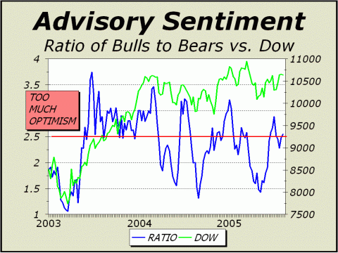
For more than a year, we have reprinted several articles originally published in Crosscurrents for this report. Presenting all new material on a public site only punishes subscribers for their loyalty. Meanwhile, looking back at our previous Mania reports, we are pleased that our desire to serve the public has been fulfilled with very powerful commentary and unique perspectives, despite presentation weeks or months after the original publication. After re-reading the material we published since the May 2005 mania report, we realized that most of our July 18th issue was perfect for this report. Charts and commentary have been updated. TOO MANY BULLS, TOO FEW BEARS We recently posted a new commentary to the website, claiming our impatience and dissatisfaction with the intense concentration of media exposure about a housing bubble to the complete exclusion of any coverage of a continuing stock market mania. But are stocks still in a mania? Given the collapse from the lunatic peak of March 2000 and a subsequent recovery that is still only halfway back to the price highs after two plus years of robust rally, one might be excused for believing that the game over screen appeared long ago. However, the vast majority still appear to be playing the game quite intently, even if on a slightly more modest scale than before. Public participation remains above the 50% level and institutions still cannot get enough of equities, taking cash reserves to levels that imply nothing can possibly go wrong. But when the overwhelming assumption is that nothing can possibly go wrong, something will often go horribly wrong. Our most important indicator of mania-like activity is Dollar Trading Volume versus Gross domestic Product, which now stands second only to the incredible manic peak of 2000 and is far higher than any other year in history [see first chart]. Yet all we hear about is a housing bubble? As we said in our July 6th commentary, give us a break! There remain a huge number of indications that the biggest stock market bubble of all time is still very much in progress. For one, the Investors Intelligence survey of investment advisors is now well into the silly season. As of last week, bulls ran as high as 57.3%. As of the end of June, bears plunged as low as 19.1% and the bull/bear ratio soared to 2.88 from a low only half that level just eight weeks earlier. Bulls were at the highest they have been since March 9th, when the Dow was 6.2% higher. Bears were at their lowest since December 29th when the Dow was 5.1% higher. The ratio was the highest it has been since January 5th when the Dow was 4.7% higher. Dating back more than two-and-a-half years, when advisors were this emphatic, it generally has not been a great time to buy stocks. Indeed, ten weeks later, the Dow was higher 19 of 30 times but the average gain worked out to a mere 1%, clearly not as robust as advisor sentiment would have indicated. Over the subsequent 13 weeks, the Dow was higher only 13 of 30 times and average gains came in at a measly 0.7%. Then again, measuring from the beginning of our chart is somewhat misleading since the huge move towards optimism after the March 2003 bottom almost certainly had to result in sharply higher prices. Such a rapid expansion in bullishness is typically a sign that prices are already going up. However, if we measure from 2004 on, just before the Dow initially peaked above 10,700, a different picture is visible, likely one that is far more applicable to the current environment. As our chart illustrates, even though the gap between bulls and bears has repeatedly grown to significant levels, the Dow is pretty much where it was before. The effect of the initial expansion in bullish sentiment has already been very much played out. Subsequent contractions to modestly complacent levels result in modest corrections while new expansions in bullishness are now insufficient to take prices to new highs. We arbitrarily chose a bull-to-bear ratio of 2.5 to 1 (weekly basis) to indicate a sentiment extreme and again looked at results out 13 weeks. Over the last 65 weeks, measured from 2004 through 13 weeks ago, there were 29 instances in which the bull/bear ratio surged as high as 2.5 to 1. Prices were lower 72.4% of the time averaging a 1.4% loss and on four occasions, the 13-week loss was in excess of 5.4%. As always, we would caution that bullish extremes in advisory sentiment do not always result in an immediate correction. However, the current ratio is a clear warning of excessive optimism. Bulls have outnumbered bears
for 145 weeks,
The logical expectation is that a major top is close by, if not already in hand. ED NOTE: AS THIS UPDATE WAS BEING COMPLETED, THE BULL/BEAR RATIO WAS REPORTED AT 3.06 ON AUGUST 10th, THE HIGHEST RATIO SINCE DECEMBER 29, 2004 AT DOW 10,829.
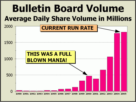
IF NOT A BUBBLE, WHAT IS IT? The last time we checked in on the OTC Bulletin Board was back on March 28th. Given the modest advance in the major averages, it seems appropriate to reflect upon how the minor leaguers are doing. They're doing quite well, thank you. Speculation as measured by Bulletin Board share volume is still on a tear, averaging more than 1.8 billion shares per day, more than the totals registered on Nasdaq's popular market! The pace of trading has gained 2.2% on 2004's frenetic activity and given the levels achieved during 2000, it seems certain that the stock market mania is still very much in force. Although Bulletin Board dollar trading volume and total transactions are below their peak levels, they are sufficiently high to presume that participants have gone off the deep end. Daily transactions are running at virtually the same rate as 1999, a year that ended less than three months from the biggest blowoff ever. Bear in mind that investors cannot readily obtain information for most Bulletin Board stocks, other than price and volume. Research, even on the internet, is not easy to come by and these issues are typically regarded as the most speculative of all. In a few recent cases such as Globalinks Corp., market action inferred the likelihood that there were more shares available to trade than actually existed! Does this sound like a vibrant arena for capitalism to flourish or a market where one must tread with constant suspicion? And yet, daily share volume is now four times as high now as it was in 2000. Talk about a bubble!
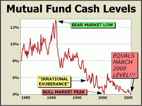
ANOTHER PORTRAIT OF OPTIMISM As the first half of the year closed out, the Investment Company Institute reported how mutual funds fared for the month of May. Inflows remained modestly positive at $11.2 billion, up 30% from April but still down 26% from March. Through the first five months of the year, inflows totaled $67.1 billion, down 38.2% from the same period a year earlier. Including the recent report for the month of June, inflows are down 38.4% for the first half of the year. Interestingly, in the 18 months since the end of 2003, inflows have totaled a huge $251.8 billion and have not only bought no price improvement for the Dow but the inflows of a quarter of a trillion dollars have resulted in a 2% loss through June. Fancy that. A quarter of a trillion bucks buys nothing. And the media are only worried about housing prices?! The bigger news is that the cash-to-assets ratio is now down to 4%, the lowest reading since the peak of the mania, when the ratio plunged to 4% in March 2000. The June level is tied for the lowest over the life of our chart and the 12-month moving average of the mutual fund cash-to-assets ratio is now down to another record low of 4.27%. There is no doubt that indexing in all its many forms, especially Exchange Traded Funds, have contributed to this phenomenon as active money managers spend literally every penny coming in (and more) since interest on cash generally cannot compete with a rising stock market. As well, absolute cash levels are anything but robust. At the end of February 2000, just days before the manic peak, total mutual fund cash was $186.7 billion. By October, cash levels had reached $256.7 billion, still insufficient to prevent much lower prices. But by the arrival of 2002, mutuals began spending down cash rapidly to support prices. By the end of February 2003, just days before an important bottom, cash had dwindled to only $109.1 billion. Absolute cash levels are now $178.8 billion, way too close to the levels reported in February and March of 2000 for investors to take comfort. It is now estimated that three-quarters of all inflows are going into ETFs, a telling factor in our analysis that we remain in the midst of a mania. Prices for individual stock issues are no longer relevantit is only the various and sundry indexes that count. In such an environment, there cannot be any assumptions that constituent issues are fairly valued, thus there can be no assumptions that the index itself is fairly valued. The stock market has become a game where indexing and other games totally govern prices, rather than a capital market based upon studied perceptions of value. None of this rates even a few lines in the evening press, which is now fully devoted to nothing other than the housing bubble. How incredible is that?!
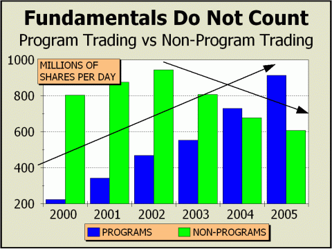
WHAT IS FAIR VALUE? Are studied perceptions of value at all possible when Program Trading encompasses as much as two-thirds of all trading on the New York Stock Exchange? Over the last couple of months, programs have surged to 62.1% of all NYSE volume, as the rebalancing of several major indexes took place, including the Russell and S&P. In these maneuvers, certain stocks must be sold and other purchased to more effectively represent the actual index. During the week of June 24th, a daily average of 1.34 billion shares were traded on the NYSE to achieve the desired mix, more than three-quarters of all shares traded! Not one of these programmed shares were traded on the basis of value. What the share might be worth according to the companys prospects was simply not a part of the decision making process. Such trading might not be a concern if limited to a very small fraction of overall share volume, but with programs now accounting for close to 60% of all NYSE volume, it is clear that whatever transactions are catalyzed by judicious analysis of company prospects, far more are not subject to analytical scrutiny. We do not believe stocks are fairly valued, simply because most are traded without regard to value. The current environment is unique in history and is worsening. Our chart below clearly illustrates that the small investor is rapidly disappearing as a factor in determining how much stocks are worth. Instead, indexing and mechanical procedures have overwhelmed the arena. The NYSE is quite happy with the results, since the business generated by programs is clearly counterbalancing the losses from traditional trading. The trend in program trading is rising rapidly. The trend in non-program trading is falling rapidly. Does algorithmic trading really add anything to the efficiency of prices? According to Mike Santolis piece in Barrons over a year ago, The use of statistical formulas [determines] which stocks to trade, when to trade them, and at what price. Big securities firms are making aggressive use of this approach and sharing their systems with institutional clients. Its all about generating business and commissions. But the more commissions dwindle, the more volume must be generated. Add in statistical and index arbitrage and the massive trading of exchange traded funds and it is clear that only volume counts, not investors and not prices. So what about the bubble in Program Trading?!
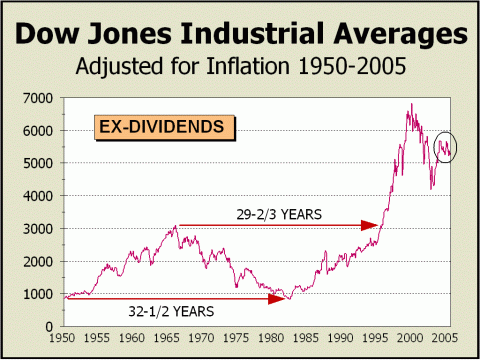
LONG TERM PRICE CORRECTIONS The common wisdom is that stocks always go up in the long term, but unfortunately, they do not. The long term "guarantee" is a myth. How so? Via the erosive impact of inflation. As our final chart clearly shows, there have been at least two extremely lengthy periods in the last six decades when inflation ate away at returns and investors would have been better off just stuffing their lucre in the mattress. Consider the poor soul who bought stock reasonably cheap in 1950. By 1966, stocks had achieved an extraordinary peak. However, if our hapless investor had hung on for the "long term," his fortune would have sunk as inflation rose. By the bear market bottom of 1982, 32-1/2 years later, he would have nothing to show for his patience. Then consider the unlucky wretch who bought at the top in 1966. It took 29-2/3 years before he saw sunlight! Inflation plays nasty tricks. If you do not agree with how inflation can ravage purchasing power, compare how much you paid for your very first car and for your most recent auto. Inflation has been relatively tame for quite awhile. There has not been a year-over-year increase of 4% since 1991 and the increase from May of last year to May of this year is only 2.8%. However, inflation still has a nasty way of cutting the purchasing power of dollars, whether they are in your pocket or in the stock market. Take another look at our chart. The circled area shows very strong evidence that the countertrend rally from the October 2002 bottom has completely played itself out. We can now see a lower high and a lower low in the constant price of the Dow. Although a back of the hand computation shows the Dow off only 11% or so from the all-time high, when you adjust for inflation, it's more like a 23% hit. Equally horrific is that the adjustment means investors have gone nowhere since February 1998, when the Dow first hit the level it trades at today! That's seven years plus and no gain, in a low inflationary environment. Just think of how investors may be punished if and when inflation really begins to pick up. While we're at it, the aforementioned scenario is the likely method by which any housing bubble will undergo a price correction. No gain over a prolonged period. Inflation
and time should do the damage,
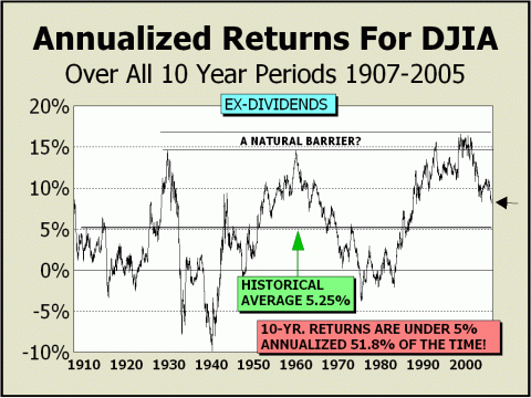
10 YEAR RETURNS SHOULD DECLINE DRAMATICALLY Twice in the last year, we showed our 20-year return chart and for the sake of diversification, this time we present the 10-year return chart (ex-dividends). Please note that returns are still well above the historical average of 5.25%. This statistic has of course, expanded throughout the mania and will continue to do so until ten-year returns drop to below 5.25%. Bear in mind that until the beginning of 1999, ten-year returns were only 4.76% on average. 10-year returns have been below 5% more often than not. In fact, until 1999, a hefty 55.5% of all ten-year periods averaged a return of less than 5%. Although returns have forged as high as nearly 17% in the mania, there appears to be a natural limitation on what stocks are capable of over the course of a decade. Of course! If long term returns consistently remained as solid as 15% or more, no one would ever invest in any other type of asset. But since the assumption of lower demand for other assets would drive the prices of those assets consistently down, they would necessarily at some point, be far more attractive that stocks and stocks would then lose their appeal. Why else would our chart show huge moves in both directions over the course of time? Clearly, ten-year returns hit a brick wall during two earlier secular bull markets and given the subsequent slides towards zero, there is no reason to assume a repeat condition will not occur. Thus, we will make two assumptions for the sake of our argument; 1) that ten-year returns must eventually fall at least to the historical average of 5.25%, and 2) that ten-year returns can very likely fall to zero at some point. The latter assumption is justified by the fact that ten-year returns have fallen to zero or worse fully 17% of the time. We can extrapolate any number of price or time targets for our assumptions, but for the sake of simplicity, we'll use only the Dow's recent level of approximately 10,700. Thus if prices remain
at their current levels, a ten-year 5.25% return
A ten-year 0% return would be achieved by late April 2009. These extrapolations
are relatively best case scenarios,
The odds favor the secular bear market has further to run.
Our high side targets for 2005 have been modestly adjusted. Although the Dow's 10962 target has not yet been breached, the SPX target of 1229 and the Nasdaq target of 2199 have both been exceeded by very nominal amounts (1.3% and 0.9% respectively, print basis highs). We believe these recent highs represent the highs for the remainder of calendar 2005. Our low targets have been changed. The odds for reaching the targets formerly set have diminished and the targets are no longer realistic or practical. We still believe a 20% decline is possible from the highs but given that particular parameter and the relative outperformance of the SPX and Nasdaq, we have adjusted all our low side targets upwards. Low side targets with better odds are modestly higher at Dow 9000, SPX 1050, Nasdaq 1850. We also believe prices are capable of rallying as much as 17% off a September/October '05 bottom into the spring or summer of 2006, to be followed by the worst decline since 2000, one that may very well mark the secular bear market price low. If our 2005 low side targets are not achieved this fall or if the recent highs are exceeded before the end of the year, we will likely have to adjust our long term targets for 2006 upwards as well. That said, our work still points to an eventual break below the 2002 lows at some point in the next two years, at the very latest in 2007.
High
Targets for 2005 - high odds that the tops are in:
Low
Targets for 2005 - diminished odds
Long
Term Targets for ultimate secular bear market low - most likely to occur
in autumn 2006
THE CONTENTS OF THE ENTIRE WEBSITE ARE COPYRIGHT 2005 ALAN M. NEWMAN I hope you have enjoyed your visit and please return again. If you know anyone who might be interested in seeing what we have to offer, we'd be happy to have them visit as well! Alan M. Newman, August 10, 2005
All information on this website is prepared from data obtained from sources believed reliable, but not guaranteed by us, and is not considered to be all inclusive. Any stocks, sectors or indexes mentioned on this page are not to be construed as buy, sell, hold or short recommendations. This report is for informational and entertainment purposes only. Samex Capital, Alan M. Newman and or a member of Mr. Newmans family may be long or short the securities or related options or other derivative securities mentioned in this report. Our perspectives are subject to change without notice. We assume no responsibility or liability for the information contained in this report. No investment or trading advice whatsoever is implied by our commentary, coverage or charts. |
|
|